Code
library(ggplot2) # for simpler plots
library(plotly) # for the plots
library(dplyr) # for pipes and data management
library(kableExtra) # for nice tableslibrary(ggplot2) # for simpler plots
library(plotly) # for the plots
library(dplyr) # for pipes and data management
library(kableExtra) # for nice tablesSee the code block above? Click to expand it and see how I produce the various images and results that I display.
These course notes should be used to supplement what you learn in class. They are not intended to replace course lectures and discussions. You are only responsible for material covered in class; you are not responsible for any material covered in the course notes but not in class.
In this unit, we will be discussing statistical inference using categorical variables. We’ll be covering the following topics:
By the end of this unit, you should know what categorical data are and how to summarize them. You should have a sense of what a null-hypothesis is, although we’ll come back to that concept many, many times in the course1. You should understand how we tested the null-hypothesis in this example, and why we reached the conclusion we did. Finally, you should understand at least vaguely what a probability distribution is, and how we used it in this case.
Categorical data are data which can be assigned to one of a finite (and usually small) set of categories, where the categories have no numeric meaning. For example, the state of Massachusetts categorizes high-school students as failing, in need of improvement, proficient, or advanced based on their scores on various Massachusetts Comprehensive Assessment System (MCAS) subject exams. The number of categories used by the state are somewhat arbitrary, as are the labels; Massachusetts could instead have chosen to label all students as proficient or not proficient. This is a common feature of categorical data: the researcher has to decide what the categories are, and this decision can have repercussions for the analysis. For example, in the past surveys would typically ask respondents their race, and give them the option to select one category, often African-American, American Indian, Asian-American, Hispanic, White, or other. More recent approaches ask respondents to select as many categories as apply to them, so a person could select both African-American and White. Changing the categories used to categorize race has changed what race means in this context. Similarly, in the past surveys have typically asked respondents to identify their gender as either female or male. More recently, survey designers have moved to measure gender in richer, more complex ways, including allowing respondents to identify outside the gender binary and to identify as either cis- or trans- men or women. This can change the experience of the survey-taker, but also changes what “gender” is actually measuring on the survey.
Categorical variables are either ordinal or nominal. This achievement label is an ordinal variable because the categories are ordered; students who are failing have lower test scores than students who are in need of improvement, etc…. However, although the categories are ordered, they have no numeric meaning. We can’t, for example, calculate the difference between “advanced” and “proficient”. Other categorical variables are nominal (from the Latin for “name”). Nominal variables have no order. An example of a nominal variable would be religion. People could be categorized according to their religion. Categories might include agnostic, atheist, Buddhist, Christian, Hindu, Jewish, Muslim, Sikh, or other,2 but there is no straightforward and substantively meaningful way to order these categories. Our best bet will be to order them alphabetically.3
In summarizing a categorical variable in a sample or population, we usually use counts and proportions or percentages. The count is equal to the number of people who fall into each category. In 2013, Malden High School, located in Malden, Massachusetts, had 1800 students. Of these students, 437 identified as African-American, 418 identified as Asian-American, 319 identified as Hispanic, 14 identified as Native-American, and 565 identified as White. 47 additional students identified as two or more races.4
Counts are very intuitive measures of a categorical variable and have nice statistical properties. However, we are frequently less interested in the exact number of people who fall into each category, which is a function of the number of people in the sample, and more interested in the relative size of the category. In this case we use a proportion or a percent. The proportion of people who fall into a category is the number of people who fall into that category divided by the total number of people. So in Malden High School the proportion of students who identified as African-American is approximately \frac{437}{1800}=.24. The lowest a proportion can be is 0 and the highest is 1. To turn a proportion into a percent, multiply by 100%. .24*100\%=24\% of Malden High School students identified as African-American.
malden_df <- data.frame(race = factor(c('African-American', 'Asian-American', 'Hispanic', 'Native American', 'Multiracial', 'White'),
                                      levels = c('African-American', 'Asian-American', 'Hispanic', 'Native American', 'White', 'Multiracial')),
                        count = c(437, 418, 319, 14, 47, 565)) # set up the dataframe
malden_df$proportion <- malden_df$count/sum(malden_df$count) # compute the proportions

malden_df %>% plot_ly(color = ~race, x = ~race, y = ~count) %>%
  layout(xaxis = list(title = 'Race'),
yaxis = list(title = 'Count'))malden_df %>% plot_ly(color = ~race, x = ~race, y = ~proportion) %>%
layout(xaxis = list(title = 'Race'),
yaxis = list(title = 'Proportion'))We can also display categorical data using figures. A natural display is a barplot, which assigns a bar to each category, with the height of the bar (or the width of the bar for a horizontal barplot) being proportional to the number of observations that fall into each category. Barplots can also show proportions. Figure 1 shows two barplots for the data described above. Notice that the figures are almost identical, only the y-axis has changed. Plots are made using the ggplot2 package in R, the free statistical software. Code for these notes is available on request.
Counts and proportions are somewhat limited in what they tell us. We can say that Malden High School has slightly more White students than students of any other race (White students are a plurality of students), though it also has substantial numbers of students who are African-American, Asian-American, and Hispanic. Only a few students identify as multiracial, and almost no students are Native-American. There is no majority race at the school. This is a univariate summary, because it involves a single variable. While univariate analyses can be important and extremely interesting, they will not be sufficient for most of our purposes; we are typically interested in how multiple different variables relate to each other.
Sometimes we’re interested in how two categorical variables are associated with each other. We might want to know, for example, how a student’s gender is associated with whether or not they are proficient (or higher) on the MCAS English 10th grade English-Language Arts exam (ELA). In this case a student’s gender would be a nominal variable, while her or his proficiency would be an ordinal variable.5 According to the state of Massachusetts, in 2014 35,637 boys took the 10th grade MCAS ELA, and 30,957 were either proficient or advanced. 34,828 girls took the test, and 32,257 were either proficient or advanced. To represent this, we can create a contingency table, where, in this case, the rows are student gender, the columns are MCAS outcomes, and the cells are the number of students who fall into each category. Another name for this is a cross table or cross tabulation. A contingency table shows how two (or, rarely, more than two) categorical variables are associated with each other. This is our first bivariate analysis.
Our contingency table is given in Table 1.
# sex_df <- data.frame(sex = c('Boys', 'Boys', 'Girls', 'Girls'),
#                      status = c('Proficient', 'Not proficient', 'Proficient', 'Not proficient'),
#                      count = c(30957, 4680, 32257, 2571))
sex_df <- data.frame(sex = c('Boys', 'Girls', 'Total'),
                     proficient = c(30957, 32257, 30957 + 32257),
                     not_proficient = c(4680, 2571, 4680 + 2571))
sex_df$total <- sex_df$proficient + sex_df$not_proficient
kbl(sex_df, col.names = c('Sex', 'Proficient or advanced', 'Lower than proficient', 'Total'), align = 'lrrr', format.args = list(big.mark = ",")) %>%
kable_styling(bootstrap_options = c("striped", "hover"))| Sex | Proficient or advanced | Lower than proficient | Total |
|---|---|---|---|
| Boys | 30,957 | 4,680 | 35,637 |
| Girls | 32,257 | 2,571 | 34,828 |
| Total | 63,214 | 7,251 | 70,465 |
The final row shows the total number of students who are proficient or advanced, while the final column shows the total number of girls and boys. These are referred to as the table margins, and show the univariate distributions of the two variables. Notice that, although fewer girls took the test than boys, more girls were proficient or advanced. However, it’s hard to see exactly how large the disparities are since the number of girls is slightly different from the number of boys. One thing we might do is convert the numbers to proportions to make it easier to compare girls and boys. One way to do that would be to make the rows into the proportions of boys and of girls who fell into each achievement category. That would look like Table 2.
row_df <- sex_df
row_df[1, 2:4] <- round(row_df[1, 2:4]/row_df[1, 4], 2)
row_df[2, 2:4] <- round(row_df[2, 2:4]/row_df[2, 4], 2)
row_df[3, 2:4] <- round(row_df[3, 2:4]/row_df[3, 4], 2)
kbl(row_df, col.names = c('Sex', 'Proficient or advanced', 'Lower than proficient', 'Total'), align = 'lrrr') %>%
kable_styling(bootstrap_options = c("striped", "hover"))| Sex | Proficient or advanced | Lower than proficient | Total |
|---|---|---|---|
| Boys | 0.87 | 0.13 | 1 |
| Girls | 0.93 | 0.07 | 1 |
| Total | 0.90 | 0.10 | 1 |
From this table we can see that 87% of boys were proficient or advanced compared to 93% of girls, a difference of 6 percentage points. Another way to think of this is that almost twice as many boys as girls were below proficient. Notice that the last column of this table isn’t very useful, since it’s obvious that 100% of both boys and girls will be either proficient or advanced or lower than proficient; that’s not an interesting quantity to display.
We could do the same thing by converting the columns into the proportion of students proficient or advanced who were boys or girls. That would look like Table 3.
col_df <- sex_df
col_df$proficient <- round(col_df$proficient / col_df$proficient[3], 2)
col_df$not_proficient <- round(col_df$not_proficient / col_df$not_proficient[3], 2)
col_df$total <- round(col_df$total / col_df$total[3], 2)
kbl(col_df, col.names = c('Sex', 'Proficient or advanced', 'Lower than proficient', 'Total'), align = 'lrrr') %>%
kable_styling(bootstrap_options = c("striped", "hover"))| Sex | Proficient or advanced | Lower than proficient | Total |
|---|---|---|---|
| Boys | 0.49 | 0.65 | 0.51 |
| Girls | 0.51 | 0.35 | 0.49 |
| Total | 1.00 | 1.00 | 1.00 |
From this table we can see that boys constitute only 49% of students who were proficient or advanced, but a full 65% of students who are lower than proficient. Notice that this, much like the previous table, demonstrates that boys are less likely to be proficient than girls. However, the two tables are showing this in slightly different ways. The first table is reporting what proportion of boys are proficient and what proportion of girls are proficient, while the second table is reporting what proportion of proficient students are boys and what proportion of non-proficient students are boys. The first table corresponds to thinking about student gender as a predictor and student proficiency as an outcome, and is probably more natural in this context, though the second table makes the difference between girls and boys seem substantially more dramatic.
A last contingency table that we could make would show the proportion of all students who fall into each of the cells. We’d get that by taking Table 1 and dividing each cell by the total number of students. That table would look like Table 4.
cell_df <- sex_df
cell_df$proficient <- round(cell_df$proficient / cell_df$total[3], 2)
cell_df$not_proficient <- round(cell_df$not_proficient / cell_df$total[3], 2)
cell_df$total <- round(cell_df$total / cell_df$total[3], 2)
kbl(cell_df, col.names = c('Sex', 'Proficient or advanced', 'Lower than proficient', 'Total'), align = 'lrrr') %>%
kable_styling(bootstrap_options = c("striped", "hover"))| Sex | Proficient or advanced | Lower than proficient | Total |
|---|---|---|---|
| Boys | 0.44 | 0.07 | 0.51 |
| Girls | 0.46 | 0.04 | 0.49 |
| Total | 0.90 | 0.10 | 1.00 |
Notice that due to rounding some of the sums don’t work out perfectly. We can see from Table 4 that 46% of all students are girls who scored proficient or advanced, while 7% were boys who scored less than proficient.
Note: some of the following material may seem technical or difficult to understand. Please keep in mind that we’ll be revisiting these concepts again and again throughout the course (so many times), so you’ll have many opportunities to make sense of them. Also, there are many skilled analysts who have difficulty with the concepts of null-hypotheses and p-values, so you’re in good company.6
One thing you might be wondering is whether boys are less likely than girls to be proficient on the 10th grade MCAS ELA exam. On the face of it the answer is clearly yes. 93% of girls were proficient or advanced, while only 87% of boys were. However, this is only true of the students who actually took the test. We might wonder if the same would be true of the larger population of all students who might have taken the test.7 Perhaps boys are doing badly in this sample just by chance. Perhaps if we took another sample (for example the 2015 MCAS ELA exam results, or another test in 2014 with slightly different questions, or the exact same test just administered on another day) we would find that boys actually outperformed girls, or maybe no difference at all. After all, 93% is not hugely different from 87%.
Ultimately this is a question about the existence of an association. We’re asking whether two variables are related to each other in some imagined population from which our sample is drawn. Since we can never see the full population which we’re interested in studying, we’ll always have some uncertainty about the true association of interest. A major goal of statistical inference is to quantify this uncertainty. How different might the sample we took reasonably be from the wider population? Is it plausible that we would draw a sample with this association if there were actually no association between the variables in the population? To do this quantification, we need to understand the concept of a hypothesis test.
A key concept in frequentist statistics (which is the most common approach to statistics in the social sciences and what we use in this course) is that of a null hypothesis. A null-hypothesis is an assumption we make about the population (in this case the population of all potential 10th-grade MCAS ELA exam takers). Typically the null-hypothesis is a hypothesis that two variables, here student gender and proficiency status, are not associated. The null-hypothesis is typically not what we actually believe, it’s what we’re trying to show is false. If we can provide evidence that a null-hypothesis is false, we can infer that there actually is a relationship between the observed variables. It’s also a handy tool which allows us to do statistical inference, not an actual belief we hold about the world.
In this example we might adopt the null-hypothesis that there is no association between a student’s gender and whether she or he scored proficient on the MCAS in 10th grade. I.e., we might hypothesize that, in the population from which we have sampled, girls and boys are equally likely to be proficient on this exam. We could also phrase this as a null-hypothesis that proficient students and non-proficient students are equally likely to be boys; although they may sound different, these two null-hypotheses are actually identical. In that case, the fact that a greater proportion of girls in our sample are proficient than boys would just be due to chance sampling. We would then try to demonstrate that the null-hypothesis was incorrect, in which case we could infer that there is an association.8
When we’re working with contingency tables, the most common null-hypothesis to use is that there is no association between the row variable (student gender) and the column variable (student proficiency). Again, two ways to think of that are that
This doesn’t mean that half of the boys are proficient and half are not; there are far more proficient students in the sample than non-proficient. It means that the proportion of boys who are proficient should be equal to the proportion of girls who are proficient and therefore equal to the overall proportion of students who are proficient. Alternately, it means that the proportion of proficient students who are boys is equal to the proportion of non-proficient students who are boys and therefore equal to the overall proportion of students who are boys. Obviously this is not true in our sample, where 93% of girls and 87% of boys are proficient, but it still might be true in the population from which this sample came.
We need a way to express this idea mathematically. To start with, we’ll define a few terms. We’ll call the proportion of students (girls and boys) who are proficient \pi_{prof}.9 In that case, 1-\pi_{prof} must be the proportion of students who are not proficient, because every student is either proficient or not proficient and the proportions have to sum to 1. We’ll call that proportion \pi_{nonprof}. Also, we’ll call the proportion of students who are girls \pi_{girls} and the proportion of students who are boys \pi_{boys} (once again, \pi_{boys} = 1 - \pi_{girls} and \pi_{girls} = 1 - \pi_{boys}; if we had a different measure of gender which included categories other than boys and girls this would not be true).
Then the null-hypothesis of no association between student gender and proficiency can be expressed by saying that, e.g., the proportion of students who are boys and proficient is equal to the proportion of students who are boys multiplied by the proportion of students who are proficient. Similarly, the proportion of students who are girls and not proficient should be equal to the proportion of students who are girls multiplied by the proportion of students who are not proficient. All that this does is guarantee that the same proportion of girls and boys are proficient (\pi_{prof}) and not proficient (\pi_{nonprof}), or, equivalently, the same proportion of proficient and non-proficient students are boys (\pi_{boys}) and girls (\pi_{girls}). Table 5 shows the cell proportions implied by the null-hypothesis.
| Proficient or advanced | Lower than proficient | Total | |
|---|---|---|---|
| Boys | \pi_{boys}*\pi_{prof} | \pi_{boys}*\pi_{nonprof} | \pi_{boys} |
| Girls | \pi_{girls}*\pi_{prof} | \pi_{girls}*\pi_{nonprof} | \pi_{girls} |
| Total | \pi_{prof} | \pi_{nonprof} |
This table corresponds to Table 4, where each cell shows the observed proportions of all students who fall into each cell; note that in Table 4 we can’t guarantee that the null-hypothesis is true; this is based on our sample data and even if the null-hypothesis is true in the population, there’s no reason these proportions should work out perfectly in our particular sample.
This might seem abstract, so let’s try to make it a little more concrete. If you look at the table with the row proportions (Table 2) and the table with the column proportions (Table 3), you’ll see that 90% of all students scored proficient or higher, while 10% did not, and that 51% of students are boys and 49% are girls. This is true in the sample that we selected, but for now, let’s assume that the population as a whole has the same proportions. Putting this into the mathematical symbols that we used before, we know that
\pi_{prof}=.90 \pi_{nonprof}=.10 \pi_{boys}=.51 pi_{girls}=.49
From these quantities, if gender is independent of (i.e., not associated with) proficiency, then it should be true that the proportion of all students who are both girls and proficient should be equal to \pi_{prof}*\pi_{girls}=.90*.49=.441, and the proportion of all students who are both boys and not proficient should be \pi_{nonprof}*\pi_{boys}=.10*.51=.051. We can replicate Table 4, this time showing the proportion of students who should fall into each cell based on the null-hypothesis that girls and boys are equally likely to be proficient. That’s what we see in Table 6.
| Proficient or advanced | Lower than proficient | Total | |
|---|---|---|---|
| Boys | .459 | .051 | .51 |
| Girls | .441 | .049 | .49 |
| Total | .90 | .10 |
This table is a little bit different from the actual observed cell proportions. Based on the column and row proportions, we expected that roughly 5% of students would be non-proficient boys, and roughly 5% would be non-proficient girls. But actually, as we see in Table 4, a full 7% of all students are non-proficient boys, while only 4% are non-proficient girls. The other cells show similar differences.
What we need to decide is whether this discrepancy means that our null-hypothesis of no association between gender and proficiency is incorrect. If the null-hypothesis is correct (and if we’re right about the proportions of students who are proficient and non-proficient, and who are boys and girls), then in the larger population10 it should be the case that 5.1% of all students are non-proficient boys. But that doesn’t mean that a sample we take from the population has to have exactly that number. Just by chance we might happen to sample too many non-proficient boys and too few non-proficient girls.
We need a way to decide exactly how improbable our sample results are if the null-hypothesis is actually true. If the null-hypothesis implies that our sample is extremely unlikely, then we reject the null-hypothesis and conclude that there is some association between gender and proficiency in the wider population. If the null-hypothesis doesn’t make the sample too unlikely, then we fail to reject or retain the null-hypothesis, and conclude that there is no evidence of an association between gender and proficiency in the larger population. Note that we never accept the null-hypothesis,11 because all we can say is that the observed data are consistent with the null-hypothesis; that’s hardly a ringing endorsement.
We want to determine how unlikely the observed contingency table is under a null-hypothesis of independence between the row variable (gender) and the column variable (proficiency). Our first step will be to see how different the observed results are from the results we would expect to have gotten if the null-hypothesis were in fact correct.12 We’ll do this by
The expected cell counts are easy enough to calculate. From Table 6 we know the expected proportion of students who should fall into each cell, and we know that there are 70,465 students in total, so we can calculate, e.g., the expected number of boys who are not proficient by taking the expected proportion of students who are boys and not proficient (.051) and multiplying it by the total number of students. Applying this procedure to each cell gives us Table 7 (after rounding all cell entries to the nearest whole number; in fact there’s no need for the expected counts to be whole numbers).
| Proficient or advanced | Lower than proficient | Total | |
|---|---|---|---|
| Boys | 31,970 | 3,667 | 35,637 |
| Girls | 31,244 | 3,584 | 34,828 |
| Total | 63,214 | 7,251 | 70,465 |
You might have noticed that the row and column totals are the exact same as in Table 1. This is because we used the row and column proportions that we calculated from the observed data, but not the observed cell-proportions. Multiplying the observed column and row proportions by the total count is guaranteed to reproduce the observed column and row totals. However, the cell counts are different because the actual cell proportions are not equal to the product of the column proportions and the row proportions.
In statistics, the difference between the value we observed and the value that we expected or predicted is frequently referred to as a residual. Positive residuals indicate that the observed value is larger than expected, negative residuals that it is less than expected. With contingency tables, this means the observed value is larger than the null-hypothesis implies it should be. In this case, we expected to observe 3,667 non-proficient boys, but actually observed 4,680, so the residual for the count of non-proficient boys is 4,680 - 3,667 = 1,013. Negative residuals indicate that the observed value is smaller than expected. For non-proficient girls the residual is 2,571 - 3,584 = -1,013 because we actually observed fewer non-proficient girls than we expected.
Table 8 shows a table of residuals for the current analysis.
| Proficient or advanced | Lower than proficient | Total | |
|---|---|---|---|
| Boys | -1,013 | 1,013 | 0 |
| Girls | 1,013 | -1,013 | 0 |
| Total | 0 | 0 |
An interesting aspect of this table is that the residuals in each row and column sum to 0; this is because we know that we’ll get the observed row and column totals right because we used them to calculate the population proportions. Every extra non-proficient boy we have has to be offset by a missing non-proficient girl so that the total expected number of non-proficient students is equal to the observed total. Similarly, every extra proficient girl has to be offset by a missing non-proficient girl so that the total expected number of girls is equal to the observed total.
One way to think of the cells in Table 8 is as measures of the extent to which the observed counts depart from the counts we would have expected under the null-hypothesis. The larger they are, the more evidence we have against the null-hypothesis. The smaller they are, the more consistent the observed data are with the null-hypothesis.
So we know that the observed number of proficient girls is 1,013 larger than we predicted and the observed number of non-proficient girls is 1,013 smaller than we expected based on the null-hypothesis, but we still don’t have a way to determine if this discrepancy is large enough to reject the null-hypothesis. Intuitively, this should have something to do with the number of people we expected to be in a cell in the first place. For example, if we expected there to be 1,013 non-proficient girls but we actually observed 0, that would be a big discrepancy. If, instead, we expected 1,001,013 non-proficient girls and actually observed 1,000,000 we might consider that to be just due to chance.
If there is an association between gender and proficiency in the population, the residuals help us understand the direction of the association. Notice that under the null-hypothesis we expect more proficient boys and more non-proficient girls than we observe. We also expect fewer proficient girls and fewer non-proficient boys than we observe. So we have some evidence that girls are more likely than boys to be proficient and that non-proficient students are more likely to be boys than proficient students. The proportions in Table 2 and Table 3 show the same thing.
The next step we’ll take is hard to justify without using mathematical statistics, so instead we’ll simply explain what to do. In each cell, we’ll compute what is known as the standardized residual by taking the residual in each cell (i.e. the difference between the observed and the expected cell counts) and dividing by the square root of the expected cell count (in statistics we’ll frequently see the square root of the sample size in the denominator of a fraction; we’ll explain a little more in later chapters). This is called standardizing because we’re dividing the observed value by its standard deviation (also covered in the next chapter); if the expected cell count is C, the standard deviation of the cell count is \sqrt{C}. The intuition is that if we expect a lot of people in a cell, it’s not unusual to have large residuals. In contrast, if we only expect a handful of people, a large residual is surprising. Table 9 shows a table of standardized residuals. Notice that although the residuals were perfectly symmetric, the standardized residuals are larger in the cells with lower expected counts; the fewer people we expected in a cell, the more “important” or surprising the differences are.
| Proficient or advanced | Lower than proficient | Total | |
|---|---|---|---|
| Boys | -1,013/\sqrt{31,970}=-5.66 | 1,013/\sqrt{3,667}=16.73 | 0 |
| Girls | 1,013/\sqrt{31,244}=5.73 | -1,013/\sqrt{3,584}=-16.92 | 0 |
| Total | 0 | 0 |
The last step we have to take is to find a simple way to combine all of these residuals into a single number, which we call a test-statistic, which can summarize how different the observed data were from the expected data implied by the null-hypothesis. The basic idea is to sum up all of the standardized residuals to calculate the test-statistic; the larger it is, the further the observed data are from the expectation under the null-hypothesis. On the other hand, we don’t want positive residuals to cancel out negative residuals; overestimating a cell count is just as bad as underestimating. Our approach will be to square the standardized residuals,13 making them all positive, and then sum them together. In our case, this gives a value of (-5.66)^2 + 16.73^2 + 5.73^2 + (-16.92)^2 = 32 + 280 + 33 + 286, which is close to 630, and which we refer to as the \chi^2 (chi squared, pronounced kai squared) statistic for the table. This is our test-statistic of interest. Remember, this test-statistic is a single number which summarizes how different our observed sample is from the sample we would expect if the null-hypothesis were true.
But we still don’t have a way to determine if this is big enough that we should reject the null-hypothesis (but it totally is). To make that decision, we’ll need to introduce the concept of a probability distribution.
We’ll motivate this discussion by doing a little simulation. If you’re interested in the code to run the simulation or any other part of the code in these examples, write to Joe at jcm977@mail.harvard.edu (or maybe I will be less lazy and just post things to the course Canvas site. It’s hard to predict, because my laziness knows few bounds).
Imagine that the null-hypothesis is true and that there’s no association in the population between gender and proficiency. Given this, we want to know if the \chi^2 value we obtained in this sample is unusual enough to make us reject the null-hypothesis. One way to determine this is to do the following:
This basic approach, seeing how unusual the observed test-statistic is compared to the test-statistics we would have gotten by chance if the null-hypothesis were true, is a common one. We’ll be a little more explicit about these steps later in the course. This is not what your software is actually doing when it conducts a null-hypothesis test, but it’s a motivating description.
In the current case, we did the following: we generated a population (of infinite size), where the null-hypothesis held and the different cell proportions were equal to those in Table 6. We know that the null-hypothesis is true in this population, because we created the population using the null-hypothesis. Then we drew 10,000 replicates, each of size 70,465. In each replicate, we calculated the value of \chi^2. For example, in the first ten replicates, we observed \chi^2 values equal to 0.31, 0.33, 0.59, 0.04, 0.99, 4.11, 2.81, 1.05, 2.33, and 0.52. After obtaining observed statistics from all of the replicates, we created a histogram showing the values of the test-statistic from each of those 10,000 replicates. Figure 2 shows the results of this simulation.
chisqs <- data.frame(value = rchisq(1000, df = 1))

chisqs %>% plot_ly(x = ~value, type = 'histogram',
                   xbins = list(start = 0)) %>%
  layout(xaxis = list(title = 'Values'),
yaxis = list(title = 'Count'))Notice that in none of the 10,000 replicates did we draw a sample with a \chi^2 value greater than 20. But the observed value of the \chi^2 statistic was 630. Recalling that the \chi^2 statistic can be thought of as a summary of how far the observed data departed from the expected values, it appears that our sample observed data are much further from the expected values than we could realistically get if the null-hypothesis were actually true and there was no association between gender and proficiency in the population. The p-value associated with a test-statistic is the probability of getting a test-statistic as extreme as or more extreme than the observed one if the null-hypothesis is true. Since 10,000 replicates failed to produce even a single \chi^2 statistic greater than the observed statistic, we estimate that the p-value is less than 1/10,000=.0001; in 10,000 samples we took from a population where the null-hypothesis holds, we didn’t get a single one in which the observed contingency table diverges from the expected one by as much or more than our actual sample does.
If the null-hypothesis is false, then the observed \chi^2-statistic might not be so improbable. If girls actually are more likely to be proficient than boys are, then the observed test-statistic may in fact be highly probable.
Given how unlikely our sample is if the null-hypothesis is true, we say that we reject the null hypothesis and conclude that there is an association between gender and proficiency in the population. Specifically, we conclude that girls are more likely to be proficient than boys, because in our sample a greater proportion of girls are proficient than boys.
Writing code to draw 10,000 replicate samples from a null-population is time-consuming and requires a little coding skill. If you want to learn how to do it in R, contact me and I’ll help. Simulations can be an important tool when we’re working with brand new analytic techniques. However, it turns out that we usually don’t need to conduct the simulation to get a p-value. If the null-hypothesis of no association between a pair of categorical variables is true (i.e., there’s actually no association) and the sample is largish, the \chi^2 statistic follows what’s known as a \chi^2 distribution.14 One additional requirement is that the people who make up the sample should be independent of each other. We’ll talk about this later in the context of regression. As a brief illustration, suppose that we conducted our sampling by finding two schools and selecting all of the girls in one school and all of the boys in the other. We probably wouldn’t be too impressed at finding that girls in our sample were more likely to be proficient than boys, because this might just be a function of the two schools from which the girls and boys were sampled.
Figure 3 shows the \chi^2_1 distribution.15 Notice how similar its shape is to the histogram of the replicates that we saw in Figure 2. It has several features common to all probability distributions. Imagine that we’re once again drawing samples from a population where the null-hypothesis is true. For each sample we make a contingency table and calculate the value of \chi^2. The x-axis represents different possible values of the sample \chi^2 statistic. The height of the curve is proportional to how probable each value is. Where the curve is higher, values are more probable. Anywhere the curve touches the x-axis (and has a height of 0) is an impossible event. We only show positive values of \chi^2 because there’s no probability of getting a negative \chi^2 value (for other distributions, negative values are perfectly acceptable). This makes sense because we compute \chi^2 by adding together a bunch of numbers that we’ve squared; there’s no way for it to be negative.16 The curve can never go below the x-axis, because that would mean that samples with that particular value of \chi^2 had a negative probability of being drawn, which is impossible.
xs <- seq(.01, 10, by = .01)
heights <- data.frame(xs = xs,
                      values = dchisq(xs, 1),
                      colors = rainbow(length(xs)))

heights %>% ggplot(aes(x = xs, y = values)) + geom_line() +
  geom_segment(data = heights %>% filter(xs >= 1, xs <= 3),
               aes(x = xs, xend = xs, y = 0, yend = values),
               color = rainbow(300)[50:250]) +
  scale_color_identity() + labs(y = 'Density', x = expression(chi^2))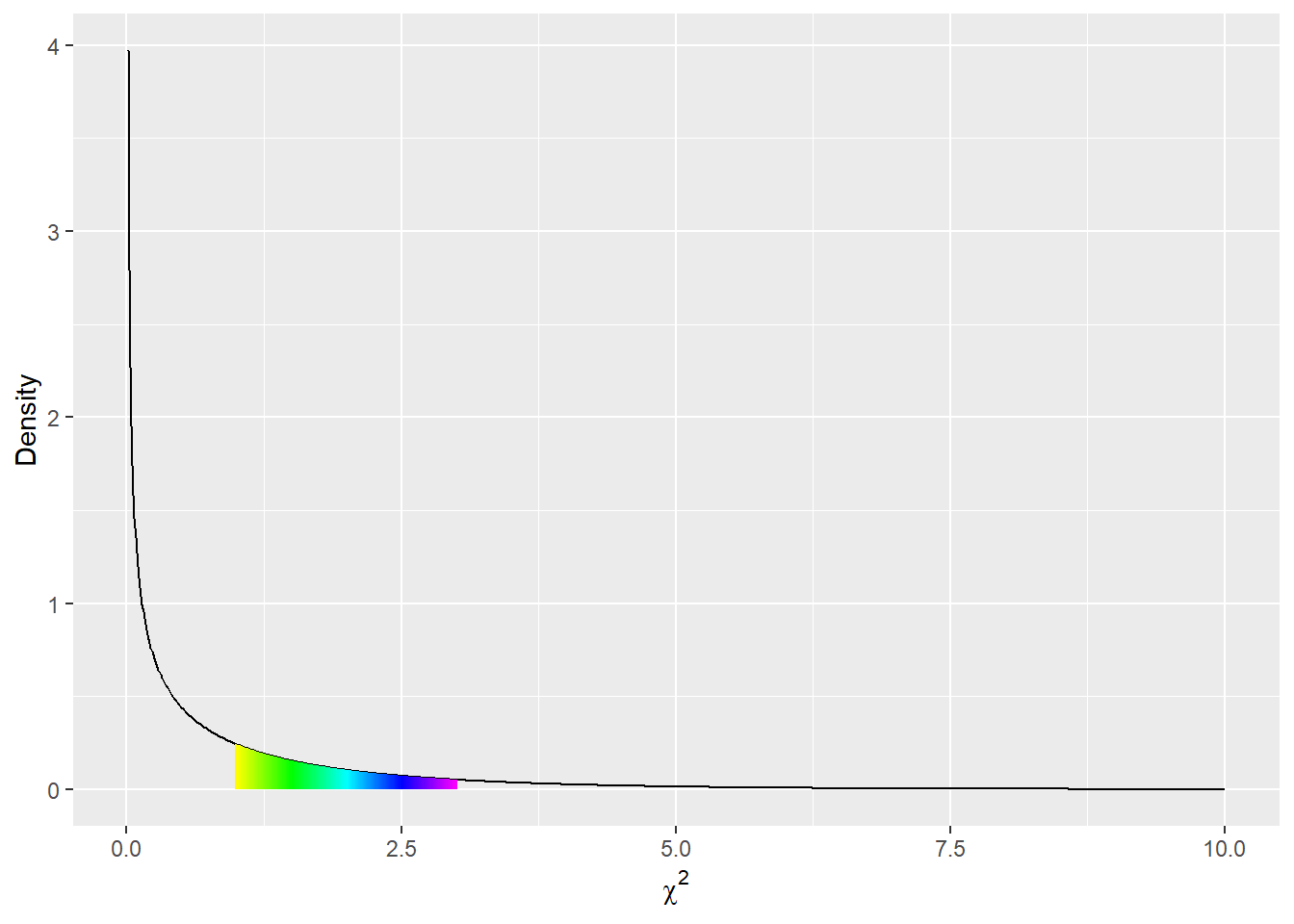
To find the probability of drawing a sample with a \chi^2 value in a certain range, say between 1 and 3, we can simply take the area under the curve between those two endpoints.17 In this case, that works out to be approximately .23. What this means is that, if we draw a sample from a population where the null-hypothesis is true, there’s a 23% chance that the \chi^2 value for the sample will fall between 1 and 3. To find the probability of drawing a sample with a \chi^2 value of greater than 3, we can calculate the area under the curve between 3 and infinity.18 This turns out to be close to .08, meaning that there’s an 8% chance of drawing a sample from a population where the null-hypothesis is true and getting a value of \chi^2 as extreme as, or more extreme than, 3. Recall that this is referred to as the p-value for the test-statistic, and summarizes how unusual the observed value is if the null-hypothesis is true (in this case, if we observed a value of \chi^2 of 3). The probability that the \chi^2 value for any sample will fall between 0 and infinity has to be 1 (or 100%), which means that the total area under the curve has to be equal to 1. This is another feature of probability distributions: the total area under the curve has to be 1, meaning that there’s a 100% chance of getting some value.
Returning to our running example, recall that we observed a \chi^2 value of 630 and we wanted to determine how improbable that value would be if the null-hypothesis were true. We took 10,000 replicate samples and didn’t come close to a \chi^2 value of 630, so we can say with some confidence that the true probability is less than 1/10,000. But how much less? The \chi^2 distribution gives us a way to determine the probability without having to draw samples until we finally get a 630; as we’ll see, that would take a wicked long time. All we need to do is calculate the area under the \chi^2 curve from 630 to infinity, or rather to get a computer to do it for us. The value is close to 3\times10^{-139}, or a decimal point followed by 138 0’s and then a 3.19 Essentially, it would be impossible to get a result this or more extreme if girls and boys in the population were equally likely to be proficient.20 Thus, we reasonably conclude that girls and boys are not equally likely to be proficient.
A convention we frequently use in social sciences is that if the p-value under a null-hypothesis is less than or equal to .05, then we reject the null-hypothesis. This level of evidence we require is called \alpha (alpha, pronounced al-fa) and is something we establish before beginning our analyses. We refer to associations for which we reject the null-hypothesis as statistically significant. We’ll talk more about these concepts in a later unit.
The \chi^2 distribution is not the only probability distribution that we’ll use in this course. The reason we used it in this example is that, if the null-hypothesis of no association between gender and proficiency is true, then the \chi^2 statistic will actually (approximately) follow a \chi^2 distribution. We’ll use other distributions, particularly the t and F distributions, to evaluate other null-hypotheses. All of them will be used in more or less the same way, to calculate the probability of a test-statistic as or more extreme than the one we actually observed if the null-hypothesis is in fact true. Again, the distribution we select will be based on how the test-statistic in question would be distributed if the null-hypothesis were true. Your software will select the correct distribution for your analysis; this isn’t something you need to decide.
We were interested in determining whether girls in Massachusetts are more likely than boys to achieve a score of proficient or above on the 10th grade MCAS ELA exam. Using data provided by the state, we determined that 93% of girls in our sample scored proficient or above compared to only 87% of boys. The difference in proficiency rates was statistically significant (\chi^2(1, N = 70,465)=630,p<.001), leading us to conclude that there is an association between student gender and proficiency status on that test, and that girls are more likely than boys to score proficient or advanced. The sample difference in proficiency rates was 6 percentage points, indicating that girls are slightly more likely to score proficient on the MCAS ELA exam than boys, though a substantial majority of both girls and boys are labeled proficient.
According to the APA guidelines \chi^2 tests should be reported as follows: (\chi^2(df,N=N)=value,p=p-value). For example, if the observed \chi^2 is equal to 5.34, the degrees of freedom are 2, the sample size is 134, and the p-value is .021, we would write (\chi^2(2,N=134)=5.34,p=.021). Your statistical software will report the correct degrees of freedom (df). To write this in recent versions of Word, type Alt+= (to get the equation editor; Alt+= means hold down the Alt key and hit the = key; don’t use the + key; on a Mac I think you replace the Alt with either Cmd or Ctrl), then \chi^2(2,N=134)=5.34, p=.021. It’s traditional to report values of \chi^2 to two decimal places, and to report p-values to three decimal places (if the p-value is less than .0005, report p<.001. Never report p=0 unless the probability of the observed test-statistic is actually equal to 0 under the null-hypothesis; this will almost never be true). APA style requires that you not leading 0 for reporting p-values because p-values are always less than 1. .021 is correct; 0.021 is not (but we won’t penalize you). In this analysis we report \chi^2 with no decimals because the value is so large that the decimals don’t add any real precision, but in a paper we would probably use two decimal places.
We’ll cover this at several points in this course, but here is a list of the steps we take in conducting a null-hypothesis test:
The \chi^2 distribution is a good approximation of the distribution of the test-statistic obtained from a contingency table as described above (and a number of other situations). On the other hand, it performs very poorly when the expected count in any cell is low. As a rule of thumb, when any cell has an expected count of 5 or less, the \chi^2 distribution does a bad job of representing the actual distribution of the \chi^2 statistic under the null-hypothesis. An alternative to the \chi^2 test is the Fisher exact test. We don’t cover the test in this course because it’s harder to illustrate, but the basic principles are similar to those of the \chi^2 test. Keep it in mind as an alternative when expected cell counts are small. Some software (R) will remind you when you’re using a \chi^2 test inappropriately; other software (Stata) will not.
We can also use the \chi^2 distribution to test null-hypotheses about univariate distributions. If we have a null hypothesis that, e.g., 50% of students in the population are girls, we could use our sample to test the hypothesis. The basic approach (find the expected counts of girls and boys implied by the null-hypothesis, find the residuals, divide the residuals by the square root of the expected counts, square these values, sum them together, and compare to a \chi^2 distribution with degrees of freedom equal to the number of categories - 1) remains the same. Here the null-hypothesis is that the proportions of units falling into a given category is equal to a given number, usually but not always 50%.
Statistical inference can be tough to wrap your head around. One of the most puzzling paradoxes arises when our sample is the entire population, as in the unit. After all, we’ve seen every student in the state, and we know the exact percentage by which girls outscored boys. Why bother with null-hypotheses and p-values?
One solution to this paradox is that what we’re testing is a probability model. We assume that girls and boys performances on the MCAS are random, and that girls pass with a certain probability, \pi_{girlspass}, and boys pass with a certain probability \pi_{boyspass}. In this case there’s no actual population about which we’re making inferences, we’re only trying to estimate the parameters of a model; our null-hypothesis being that \pi_{boyspass} = \pi_{girlspass}. We’ll talk more about models in a later unit, but keep in mind that this reflects a more theory/science based perspective. From this perspective we do inference because we can never observe the model parameters, even if we can see the full population.
Another possible solution is to insist that we’re trying to make inferences about 10th grade students in Massachusetts; since we’ve observed the entire population, we know \pi_{girlspass} and \pi_{boyspass}, and there’s no need to conduct tests; we’re more concerned with how large the difference in the rate of passing is, and whether it’s substantively important. This reflects the perspective of survey statistics, and reflects a more pragmatic perspective. Another place where this perspective shows up is in political polling; if we could conduct a poll of every American and find out for whom they intended to vote in a certain election, there would be no need to report margins of error. Similarly, in theory the census is intended to sample every American, so there’s no need to do inference on census data (though statisticians argue that a sampling approach would be cheaper and more accurate, since the traditional census misses lots of people, especially the homeless and college students). From this perspective, we do inference because we can (almost) never afford to sample the entire population.
Maybe the simplest solution is that no one will take you seriously if you don’t. Do you want all of the other social scientists to laugh at you?
If a null-hypothesis is true, it should be the case that the proportion of samples from the population with a test-statistic that gives a p-value of p or less is equal to p. The p-value is the probability of drawing a sample with a test-statistic as or more extreme the the one observed; we should draw a sample with a test-statistic that gives a p-value of .25 or less 25% of the time.
The technical way to state this is that p-values follow a uniform distribution, i.e., a distribution where every number from 0 to 1 is equally likely. @fig:p_vals shows the observed distribution of p-values in our 10,000 samples from a null-population and the theoretical distribution. If we had taken more samples, the observed distribution would have been closer to the theoretical distribution, but they’re already quite close. This is one of the key properties that makes a given test-statistic appropriate for testing a null-hypothesis.
draws <- data.frame(pvals = runif(10000, 0, 1))
draws %>% ggplot(aes(x = pvals)) + geom_histogram(breaks = seq(0, 1, .05)) +
  geom_hline(yintercept = 500, color = 'red')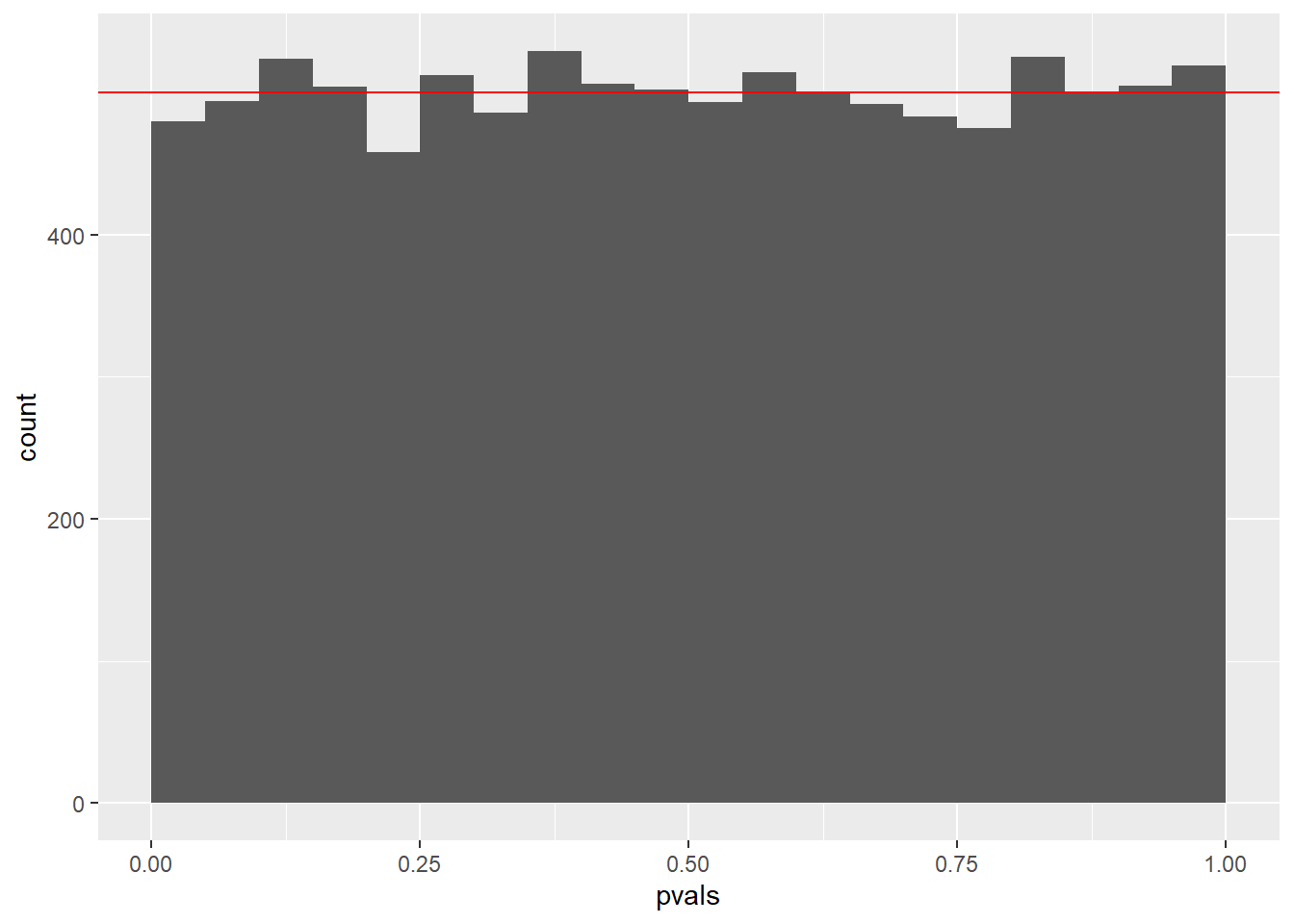
Here are some common misconceptions that you might have coming into the class.
The p-value is the probability that the null-hypothesis is true. This is not correct. The p-value is the probability of drawing a sample with a value of the test-statistic as or more extreme as the one observed if the null-hypothesis is true. It’s sort of like the probability of the data if the null-hypothesis is true. The null-hypothesis is a statement about the population and is either true or not; it doesn’t have a probability.
We’ve shown that 10th-grade girls in Massachusetts are better at English than 10th grade boys. This is not correct. We’ve shown that 10th-grade girls are more likely to score proficient or higher than 10th-grade boys. On the other hand, it’s possible that boys are more likely to score advanced than girls; we haven’t examined that (they’re not, though). Also note that performance on the MCAS isn’t a perfect measure of reading proficiency; it also measures, among other things, motivation to do well on a test. This may seem like an obvious point, but it’s crucial to always keep in mind exactly what it is that we’ve measured.
The p-value in this analysis is really small, which means that girls are much more likely to be proficient than boys. This is not correct. The p-value is a summary of the evidence we have that the null-hypothesis is false. It’s not a measure of the strength of the association, just the evidence we have that there is an association. We can get a sense of the magnitude of the association by noting that girls are about 6 percentage points more likely to be proficient than boys. Whether that seems like a big difference or not depends on our understanding of the context; to me it seems rather small. The p-value is the weight of the evidence against the null-hypothesis; it doesn’t speak to how badly the null-hypothesis has been violated.
Wow, so many times. Many more manies than I wrote, I just got tired of writing “many”. But there will sure be a lot more manies than I’ve indicated so far.↩︎
As before, the analyst or survey designer needs to determine which categories are appropriate for their specific research question.↩︎
As we’ll see in a later unit, classifying a variable as nominal or ordinal is frequently a matter of the researcher’s perspective and not something innate to the variable itself.↩︎
Here’s another place where our decisions impact the variables we’re measuring. In using the category Asian-American we’re choosing not to distinguish between Chinese-Americans, Japanese-Americans, Pakistani-Americans, etc… By using the category African-American, we may not be capturing Caribbean Islanders. We use these categories because they were supplied by the state, but they’re results of decisions made by analysts and data collectors.↩︎
More advanced techniques allow us to use an ordinal variable’s ordering to better characterize how it is associated with other variables. In this course, however, we’ll generally treat ordinal and nominal variables identically.↩︎
I personally understand this stuff so poorly that this whole section is just copied directly from Wikipedia with minor changes to word-choice and grammar so it doesn’t look so much like plagiarism. Thank goodness for thesauruses! Did you know that ``nothing-guess’’ is a synonym for null-hypothesis?↩︎
Defining the population we are studying is challenging in all research, and especially when using statewide data. This example is just used for illustration, so we’re being a little loose with the sorts of generalizations we make. We’ll cover statistical inference in much greater detail in unit 4.↩︎
This approach of assuming something that we expect is false and then trying to disprove it may seem very strange to you. The reason we conduct tests this way is that null-hypotheses make it possible to conduct formal statistical tests. What we really want to know is if there is an association; null-hypotheses are just tools to help us answer that question.↩︎
In statistics the symbol \pi typically stands for a proportion, not the number 3.1415….↩︎
Remember that we’ll be talking a lot more about populations and samples in future units.↩︎
Null-hypotheses never get any love which is why they’re so hateful.↩︎
Again, we won’t get exactly the expected counts in every single sample in part because samples will differ from each other just by chance and much more because it’s rare to draw samples with fractional people; these will be the counts we should expect to get on average across repeated samples.↩︎
This might seem like an arbitrary decision; why not take an absolute value, or raise the standardized residual to the fourth power? However, it’s actually motivated by results in mathematical statistics. What will be arbitrary are the color choices I employ in later units. So arbitrary! So garish↩︎
There are actually infinitely many different \chi^2 distributions, but when we look at contingency tables between two dichotomous variables, we can use a \chi^2_1 or \chi^2(1) distribution, or a \chi^2 distribution with one degree of freedom. We’ll a little talk more about degrees of freedom in a later unit. We suggest you just trust your software until you get a better understanding, but the formula for a contingency-table analysis is that df = (n_{col} - 1)(n_{row} - 1), that is, the degrees of freedom are equal to the number of column categories minus one multiplied by the number of row categories minus one.↩︎
The 1 refers to the degrees of freedom.↩︎
Unless we either observed or expected an imaginary count, lol. That would be really weird.↩︎
More precisely, we can get a computer to do that for us. Doing it by hand is a lot less simple.↩︎
Technically, the limit of the area under the curve between 3 and x as x goes to infinity.↩︎
Or, more explicitly, .0000000000000000000000000000000000000000000000000000000000000000000000000000000000000000000000000000000000000000000000000000000000000000003. Not especially likely, right?↩︎
To put this in perspective, imagine that every fundamental particle in the observable universe had been doing nothing but drawing samples from a null-population and calculating values of \chi^2 since the beginning of the universe, at a rate of one sample per Planck Time, which is a really short interval of time, and much less time than it takes your computer to draw a sample. By the present day, we should expect to have seen something like ten samples with a \chi^2 value of 630 or more. If that didn’t put things in perspective for you, that’s okay. If you’re wondering how we would convince those fundamental particles to draw samples, and how they would do that, we are too. Also, if every observable particle in the universe were drawing samples, what would they be sampling? So many questions.↩︎