library(ggplot2) # for simple plotslibrary(plotly) # for the plotslibrary(dplyr) # for pipes and data managementlibrary(kableExtra) # for pretty tableslibrary(gridExtra) # for arranging plots nicelyset.seed(5092014) # we're going to be making up data for this unit. So lazy. Setting a seed ensures that every time I run this script, R's pseudo-random number generator will generate the same values. It's kind of rare to generate random numbers as a part of a real analysis, so I don't know how important this will be for you to learn.N <-200## establish the number of girls and boys (total sample is 2*N)# take a random sample of girls from a normal distribution with mean 255 and standard deviation 10girls <-round(rnorm(n = N, mean =255, sd =10))girls[girls >280] <-280# ensure that no one has a score above the ceilinggirls[girls <200] <-200# or below the floor# repeat everything for boys. R will figure out that the sample size is 200 (N), the mean is 250, and the sd is 10 based on their position in the functionboys <-round(rnorm(N, 250, 10))boys[boys >280] <-280boys[boys <200] <-200boy_girl_df <-data.frame(scores =c(boys, girls),gender =c(rep('Boys', N), rep('Girls', N)))
These course notes should be used to supplement what you learn in class. They are not intended to replace course lectures and discussions. You are only responsible for material covered in class; you are not responsible for any material covered in the course notes but not in class. This unit has some material, specifically on t-tests, that is not tested in class. However, you may find it helpful to review this material, as it introduces concepts we’ll use in later units.
Overview
In this section, we’ll be talking about how to work with continuous/numeric data, including introducing statistical tests for these sorts of data. We’ll be covering the following topics:
Continuous (numerical) data
Central tendency
Spread
Describing a distribution
Graphical displays
Null-hypotheses and the t-distribution
Confidence intervals
Correlations
Communicating our results
Appendix
Continuous (numerical) data
Many constructs are best represented as actual numbers. For example, although we could measure people’s height by grouping them into categories of below or above 170 cm (about 5’7” for you Imperialists), it’s much more sensible to measure height as an actual number. This gives a great deal more precision and is a more natural way to think about height. Measurements that use actual heights also have the nice property that we can do arithmetic on them. For example, we can calculate the average height of people in a sample by adding together all of the individual heights and dividing by the number of people. This doesn’t work with categorical data; if we have a sample with two people who are less than 170 cm tall and two people who are above 170 cm tall, we can’t say that the sample average height is 170 cm.
Continuous is a commonly used misnomer for the property we’re describing. We don’t actually care whether the values we’re measuring can fall anywhere on a number line.[^discrete] What’s important is that the sort of data we’re describing are measured using actual numbers, and more specifically that it’s sensible to add and subtract those numbers; this requires variables to be numeric. For example, if we were measuring how many whole papayas a person could eat, those data would not be continuous, since we’re only allowing whole papayas. On the other hand, the data would be numeric, because it’s perfectly possible to add and subtract numbers of papayas. However, lots of people refer to this sort of data as continuous, so we will as well.
For our extended example in this unit, we’ll once again consider girls’ and boys’ performances on the 10th grade Massachusetts Comprehensive Assessment System (MCAS) English Language Arts (ELA) exam. However this time, instead of measuring whether a given student was proficient, we’ll use their actual score on the MCAS.[^madeup]
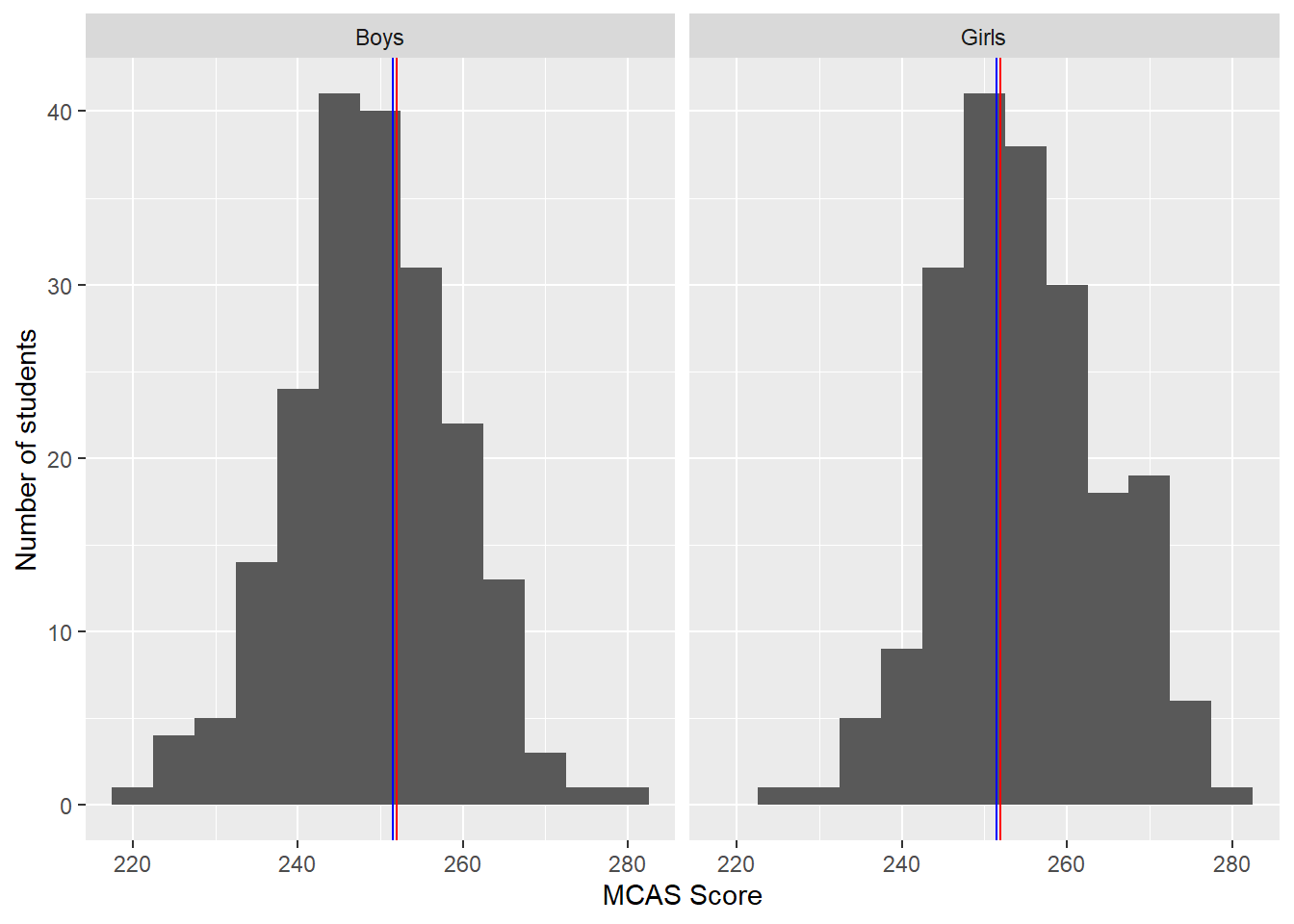
Scores on the MCAS ELA exam range from 200 to 280 (or at least they did when I wrote this). According to the state, scores from 200 to 219 count as failing; 220 to 239, as needs improvement; 240 to 259, as proficient; and 260 to 280, as advanced. We took a sample of 200 10th grade girls and 200 10th grade boys and recorded their MCAS scores. The sample results are displayed in the histograms in Figure 1. If you’re not familiar with histograms, we’ll talk more about what they show later in this unit. These data are not actually continuous, because all MCAS scores are integers. However, they are numeric.
Code
boy_girl_df %>%ggplot(aes(x = scores)) +geom_histogram(binwidth =5) +geom_vline(aes(xintercept =mean(scores)), color ='red') +geom_vline(aes(xintercept =median(scores)), color ='blue') +facet_wrap(~ gender) +labs(x ='MCAS Score', y ='Number of students')
Figure 1: Histograms of MCAS scores from 200 boys and 200 girls in Massachusetts in the 10th grade. The red line is at the sample mean and the blue line is at the sample median. We cover the mean and median in this unit.
As with categorical data, we’ll start by discussing some ways to summarize and describe continuous variables, and then consider how to conduct statistical tests.
Central tendency
A useful way to summarize continuous data is the central tendency. The central tendency is a single value which is representative of a typical member of the sample. The term typical is intentionally vague, because we have multiple ways to think about what it means. Here are three common definitions:
The mean. The mean is also known as the average. It can be calculated by taking the sum of all of the values and dividing by the number of values. Probability distributions also have means, sometimes referred to as expected values, although they’re slightly harder to define and calculate. If a sample of five students had scores of 2, 3, 3, 4, 8, the sample mean would be equal to \frac{2+3+3+4+8}{5}=4. The mean is the most commonly used measure of central tendency, and the one that we’ll use the most in this course.
The median. If we order the sample values from smallest to largest (or from largest to smallest), the median is the middle number. If the sample has an even number of values, the median is the average of the middle two.[^median] Once again, probability distributions also have medians. In the example above, the middle number is 3 (the second 3), which is therefore the median. If values in a population or sample are symmetric, or balanced, the median will be equal to the mean.
The mode. The mode is the most common value in the sample. The example above has one 2, one 4, one 8, and two 3’s, so the mode is 3.
Let’s look at each of these measures in a little more detail.
The mean
The mean is by far the most common measure of central tendency in statistics and data analysis. The mean is simple to calculate and easy to understand. It also has a number of very nice mathematical properties, and it’s usually (relatively) easy to determine the distribution the sample mean will follow if a null-hypothesis is true (i.e., the sampling distribution of the mean). We’ll use these nice mathematical properties a little later to conduct significance tests about means. We usually represent the population mean with the Greek letter \mu, pronounced “myoo”.
From this point on, we’ll refer to the population mean MCAS score for girls as \mu_{girls} (“myoo sub girls”) and the mean for boys as \mu_{boys} (“myoo sub boys”). We’ll refer to the corresponding sample means as \hat{\mu}_{girls}, and \hat{\mu}_{boys} (“myoo hat”), or, alternately, as \bar{y}_{girls} and \bar{y}_{boys} (“y bar”).[^hats] The \hat{} or “hat” indicates that the sample mean is an estimate of the population mean.[^parameters] Typically the population mean is more interesting to us than the sample mean, but the sample mean is our best estimate of the population mean. A nice property of the mean is that, if we take a large number of samples and calculate the mean in each one, the average of all of those means across the samples will be equal to the population mean. One way to say this is that the sample mean is an unbiased estimator of the population mean.
On the other hand, the mean is not always a typical sample value. For example, the mean wealth of people living in Medina, Washington, the hometown of Melinda and Bill Gates, is probably extremely high because the Gates household has 91 billion dollars.[^gates] This means that the average wealth of people in Medina is much larger than what most people have.[^medina] A related problem is that the mean wealth calculated in samples taken from Medina will be extraordinarily sensitive to whether or not the Gates household happened to have been selected. A sample which includes the Gates will have an extremely high mean wealth, and a sample which does not will have a much lower mean. We can express this idea by saying that the mean wealth in samples taken from Medina is not robust to the inclusion of the Gates household in the sample; the sample mean will vary drastically depending on whether or not the Gates household is included. When a population has extreme values (which is often true of distributions of wealth and income), means are frequently not good summaries of typical members.
In our sample, girls have a mean score of 254.84, while boys have a mean of 249.07.
The median
The median is another popular measure of central tendency. Unlike the mean, the median is robust to extreme values, meaning that the sample median doesn’t change much depending on whether an extreme value is sampled. Going back to the wealth example, the Gates household will definitely be in the upper half of any sample which includes it, but having that household won’t change the middle value very much, because the fact that the Gates household has an incredibly high wealth doesn’t matter; they just count as one more household above the middle. While the mean requires that the variable be numeric so that we can do arithmetic on it, the median only requires that the variable be ordered; we could calculate the median of an ordinal variable because we can still make sense of the idea of a “middle” value.
On the other hand, the median lacks many of the nice properties that the mean has. It’s very difficult to calculate how the sample median will be distributed. Unlike the mean, the sample median is usually a biased estimator of the population median. This means that if we take a large number of samples and calculate the median in each one, the average of these medians will not be equal to the population median; it will either tend to be too high or too low depending on what the population actually looks like. Finally, the median throws away a great deal of information; using the median, all we know about the Gates household is that their wealth is higher than most other people’s, but we lose the information about exactly how much greater. This tends to make our estimates less precise and sometimes less interesting.
Related to the median is the concept of a percentile (or quantile). The xth percentile is the value below which x% of the values lie. So, for example, the 99th percentile is the value below which 99% of the values lie. The median is also the 50th percentile. No one has a value in the 100th percentile, because no one has a higher score than themselves.[^deep] The 25th, 50th, and 75th percentiles are sometimes referred to as quartiles, since they divide the variable into quarters.
In our samples, girls have a median score of 254, while boys have a median of 250. These values are very close to the mean values, because the distributions of scores are approximately symmetric. If a distribution is perfectly symmetric, the median will be equal to the mean, except in some very unusual examples never encountered in social science research where the mean is not defined.
The mode
The mode gets a lot less use than either the median or the mean, and for good reason. For one thing, if our data are actually continuously distributed, there can never be a mode in a finite sample.[^infinite] For another, the sample mode is usually a biased estimator of the population mode and has an unpredictable sampling distribution. Finally, although the mode is the most common value in the dataset, it doesn’t have to be a central value; it’s entirely possible to have a sample where the mode is much, much smaller (or larger) than most of the other values. We usually use the term mode quite loosely to describe any distinct peaks we see in a histogram of the data, i.e. sets of values that many people have. If there is more than one distinct peak in the data, we can identify more than one mode and refer to the distribution as being multi-modal.
One advantage to the mode is that it’s defined for any variable. Although race is not numeric and not ordered, it’s possible to identify the race to which most people in a sample belong.
In our current example, both girls and boys have a single distinct mode somewhere between 245 and 255.
Spread
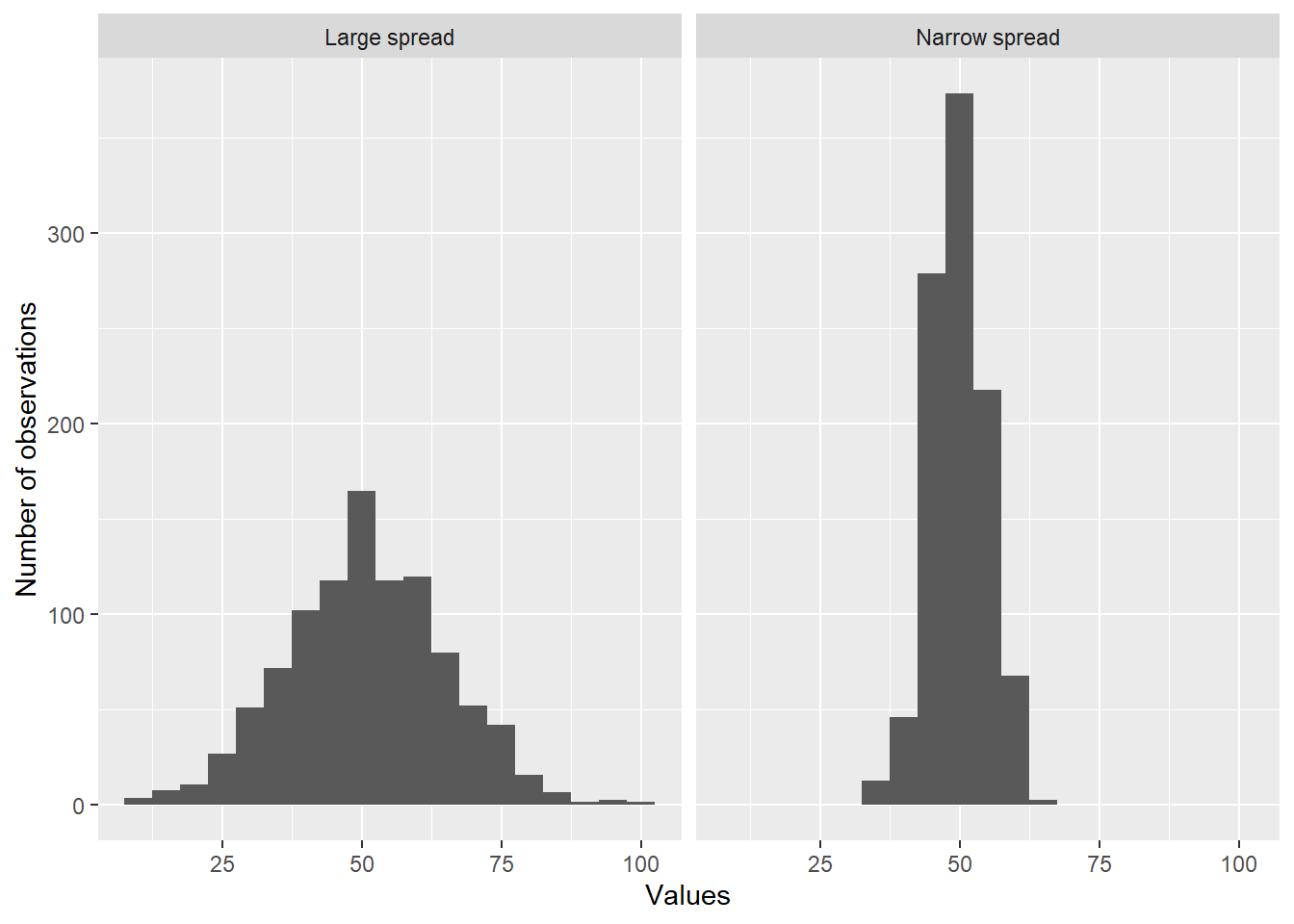
Another important concept with continuous variables is spread, or how closely the individual values are clustered together (usually around a central value). Figure 2 shows samples from two different populations. Both populations have the same mean (50), but the one on the left has a wider spread than the one on the right. Notice how the values in the sample on the left are much less tightly clustered around the center.
Code
## we'll take another sample, in this case of size 1000n <-1000sampa <-rnorm(n, 50, 15) ## take a sample (sampa) of size n (1000), with mean 50 and standard deviation 15sampb <-rnorm(n, 50, 5)samp_df <-data.frame(values =c(sampa, sampb), types =c(rep('Large spread', n), rep('Narrow spread', n)))samp_df %>%ggplot(aes(x = values)) +geom_histogram(binwidth =5) +facet_wrap(~ types) +labs(x ='Values', y ='Number of observations')
Figure 2: Histograms of samples, each of size 1000. The sample on the left comes from a population with a large spread, while the sample on the left comes from a distribution with a narrow spread.
As with the mean, we have three ways of measuring the spread of a variable:
The standard deviation. The standard deviation, sometimes abbreviated as SD, is similar to the mean in that it requires us to do arithmetic on the sample or population, so the variable has to be measured numerically. We’ll cover how to calculate the standard deviation later, because it’s a little involved. If you report the mean in an analysis, you should report the standard deviation as well. We’ll primarily work with this measure of spread.
The interquartile range. The interquartile range, or IQR, is the distance between the 25th percentile (the value below which 25% of the values lie) and the 75th percentile (the value below which 75% of the values lie). It’s called the interquartile range because the 25th and 75th percentiles are often referred to as the first and third quartiles (because they help break the data into quarters). The IQR also requires that a variable be numeric, because otherwise the concept of distance is ill-defined.[^howfar] When reporting an IQR, we typically also report the values of the first and third quartiles.
The range. The range is the distance between the largest and smallest values of a variable. While it often makes sense to report the theoretical range of a variable (for example, scores on the MCAS ELA exam can range from 200 to 280, which is a pretty bizarre range when you think about it, right?), the range is rarely used as a sample statistic because it’s extremely sensitive to the specific people sampled. Once again, the range can only be calculated for data which are measured numerically. When reporting the range, we typically also report the lowest and highest values.
We’ll explore the standard deviation in more detail because we’ll use it frequently in our analyses, especially once we get to regressions.
Variance and the standard deviation
Before we discuss the standard deviation, we’ll introduce the closely related concept of variance. To calculate the variance of a population, we do the following: first, subtract the population mean from each value. Then, square the resulting values. Sum together all of these squared values, then divide by the number of values (that is, take the average squared distance from the mean). The result is the variance of the population, which we frequently refer to as \sigma^2, or “sigma squared”. You’ll notice that this is also the average squared deviation from the mean. The standard deviation, or \sigma, is the quare root of \sigma^2. Notice that both the variance and the standard deviation are always positive because they involve averaging square numbers. Things are a little more complex for an infinite population, but this is the basic idea.
In mathematics, the symbol \sum, which is actually a capital sigma, means “add up everything that follows”. If we call the value of the variable for the ith person in our dataset y_i, call the mean \mu_{y}, and let n represent the number of people in the population,[^infinite2] then we can express the population variance as follows:
\sigma^2 = \frac{\sum(y_i-\bar{y})^2}{n}
And again, the population standard deviation is just the square root of this.
The sample variance, written as either \hat{\sigma}^2 or s^2, is defined almost the same way, except that we subtract the sample mean, \bar{y} from each value, and for technical reasons we divide the number of people in the sample minus 1 (the values in the sample are always closer to the sample mean than to the population mean, so if we used n in the denominator our estimated standard deviation would tend to be smaller than the population standard deviation. In even slightly largish samples this won’t make any real difference, but it’s what your statistical software is doing).[^sdbias] Once again, we calculate the sample standard deviation by taking the square root of the sample variance. We can write it as
\hat{\sigma} = s = \sqrt{\frac{\sum(y_i-\bar{y})^2}{n-1}}
Standard deviations and variances are large when the individual values are far from the mean (in which case x_i - \bar{x} is large, either large and positive or large and negative, for all or most i; when we square these, all the values will be large and positive). So a large standard deviation indicates that respondents tend to be spread out far from the center of the data. We’ll allow the computer to calculate these statistics for us.
In our running example, girls have a sample standard deviation of 9.83, while boys have a sample standard deviation of 9.98.
Standardization
In education, we frequently work with variables that lack well-understood scales. For example, on the MCAS, is a six-point difference big or small? Remember that in our samples boys scored about a 249, on average, while girls scored about a 255. Setting aside the issue of whether these sample differences reflect differences in the population, is this difference substantively meaningful?
One way to get a handle on this question is to express values in terms of standard deviations, rather than the original metric. To do so, just divide all values by the standard deviation. Then a 1-unit difference means a 1-standard deviation difference, which is frequently more meaningful. Taking this a little further, we can standardize a variable by first subtracting the mean from each value, and then dividing by the standard deviation. If y^{original}_i refers to the value on the original scale for observation i, and y^{std}_i refers to the value on the standardized scale, we can write
y_i^{std}=\frac{y_i^{original}-\bar{y}}{s}
This is also referred to as a z-score. On the standardized scale, a value can be interpreted as a number of standard deviations above or below the mean. If we knew the population mean and standard deviation we could replace \bar{y} with \mu and s with \sigma, but typically we won’t.
If we first standardize MCAS scores, we find that in our sample girls score about .6 standard deviations above boys. This is a moderately large difference, though we have not yet tested whether the difference exists in the population of all 10th grade girls and boys in the state of Massachusetts.
Describing a distribution
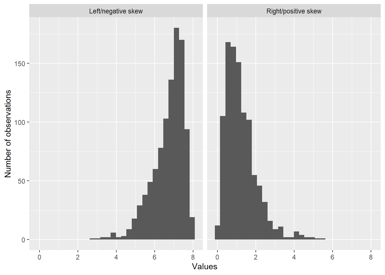
We’ve covered some of the key points to note in describing a distribution. We generally want to report a measure of the central tendency (usually the mean but sometimes the median) and a measure of the spread (standard deviation if we used the mean, interquartile range if we used the median). Additionally, we typically report the number and location of modes (remember that we refer to any distinctive peak in a distribution as a mode, not only the very highest peak). We also describe the general shape of the distribution, including whether or not it is symmetric and whether there are any extreme values (i.e., values which are substantially different from the other ones). We also usually comment on any skew that we observe. If a distribution is not symmetric, then it is generally skewed. The skew of a distribution is negative or positive, depending on the direction in which the distribution’s tails are pointing. If the tail points towards the left, we say the distribution has negative (or left) skew; if the tails point to the right, the distribution has positive (or right) skew. Figure 3 shows distributions with left and right skews.
Code
## we'll take another sample, in this case of size 1000n <-1000sampa <-rgamma(n, 2.5, 2) # the gamma distribution is skewed, but is not one we'll use in this classsampb <-8-rgamma(n, 2.5, 2)samp_df <-data.frame(values =c(sampa, sampb), types =c(rep('Right/positive skew', n), rep('Left/negative skew', n)))samp_df %>%ggplot(aes(x = values)) +geom_histogram() +facet_wrap(~ types) +labs(x ='Values', y ='Number of observations')
Figure 3: Demonstration of skew. The distribution on the right has positive (or right) skew, while the distribution on the left has negative (or left) skew. Notice how the tail of the distribution on the left trails off on the left; this is the defining characteristic of a distribution with negative skew. Distributions with positive skew are common when variables have a natural floor (e.g., a lowest possible value) but no ceiling (no highest possible value). They frequently appear in practice. Distributions with negative skew are somewhat less common.
Graphical displays
Two key components of data-analysis (and this course) are exploring your data and communicating your findings. One of the most effective ways to do both of these is using figures. Figures allow you to communicate more information than text and tables, and people process visual information differently than text, making figures an important tool for deepening your own understanding and helping other people understand your results. In this section we’ll discuss a few different graphical displays that you might find useful. Later in the course we’ll introduce others.
Histograms
Histograms are an excellent way to display univariate data. A histogram has the values of a variable on the x-axis, with a series of bars/bins of equal width extending up from the axis. The area of each bin, and therefore the height (assuming every bin has the same width), is proportional to the number of people whose value on the variable fall into the values on the x-axis covered by the bin. Figure 1 shows histograms of ELA scores for girls (on the left) and boys (on the right), with lines drawn at the sample medians and means. For girls, the height of the bin extending from 250 to 255 is 40, indicating that 40 girls in the sample had scores between 250 and 255. The y-axis is typically either the number of observations, which is called a frequency histogram, or else the proportion of observations, which is called a density histogram. In a density histogram the total area of the histograme is equal to 1. One drawback to histograms is that changing the bin width and the number of bins can drastically alter the impression that they give, so it may be worth varying the number of bins just to see if that reveals anything new about the distribution.
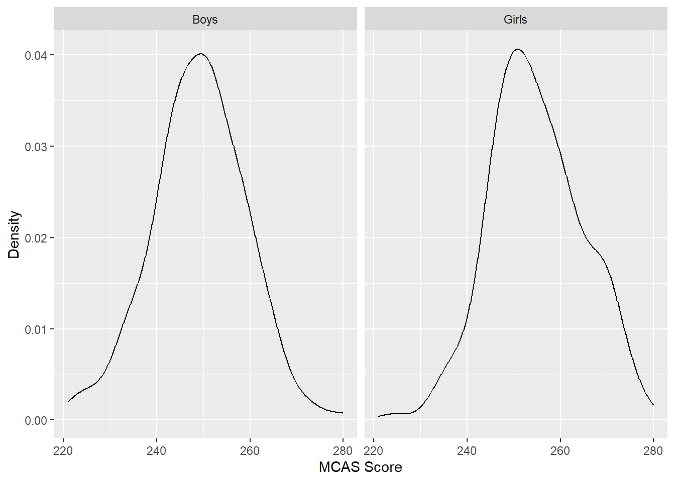
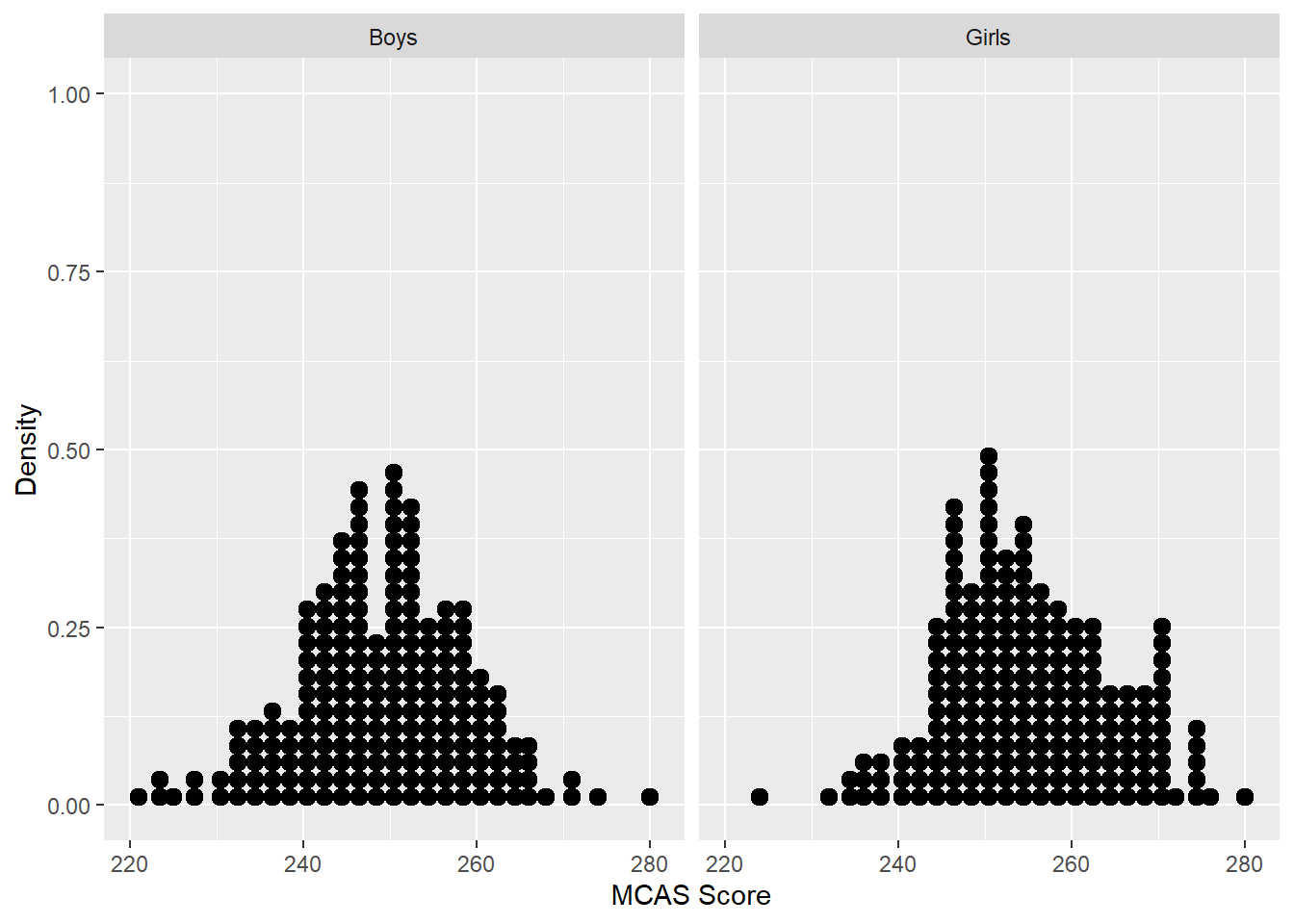
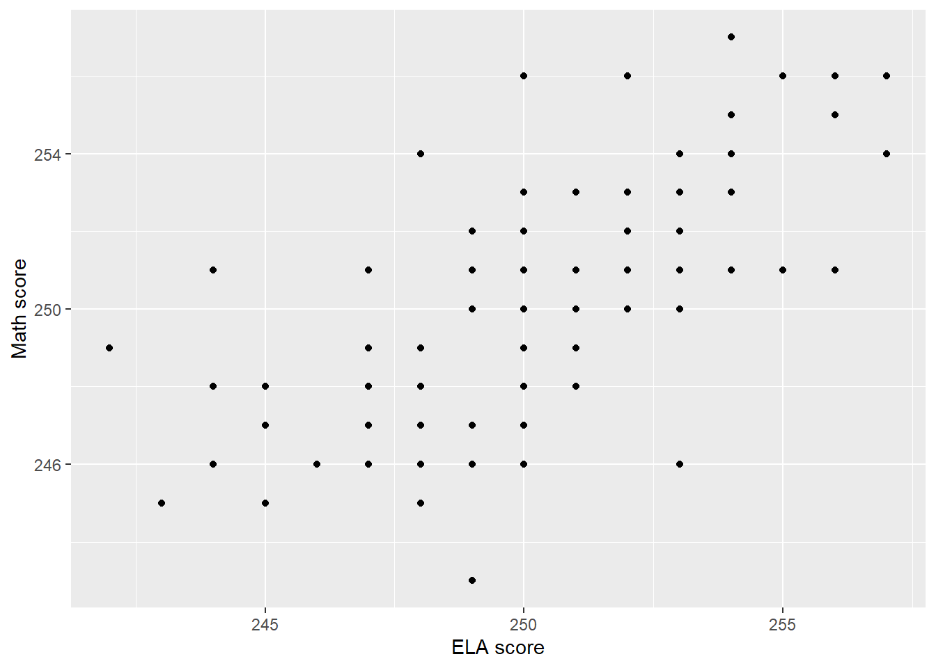
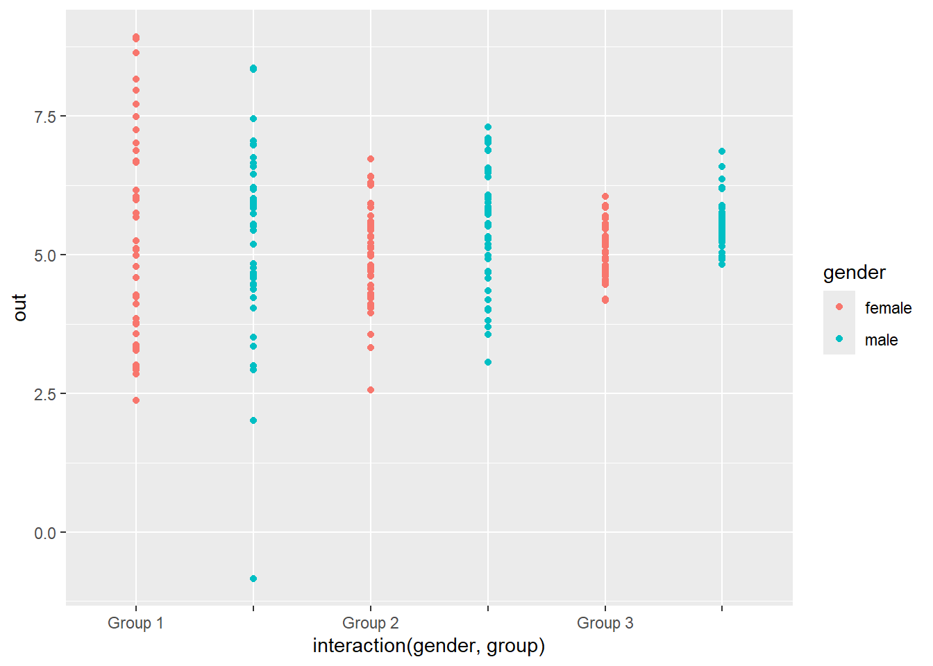
Alternatives to histograms, or really variants of the histogram, include density plots and dot-plots. Density plots are smoothed histograms, and we use them in a later unit (and in the code for this unit). They are less sensitive to the bins we choose. Dot plots show a single dot for every individual; they can contain more information than histograms, which bin people together, but are unwieldy and hard to read with large datasets. See Figure 4 and Figure 5 for examples. All of these plots try to give a detailed picture of the values people have for the variable in question.
Figure 5: A dot plot for MCAS math scores for boys and girls in Massachusetts.
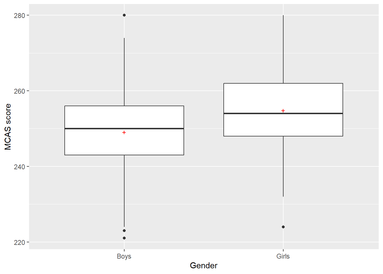
Box-and-whisker plots
Sometimes we want to use a plot to convey a higher-level representation of a distribution. Box-and-whisker plots do this by graphically representing some quantiles of the variable and a few other statistics. A box-and-whisker plot consists of a box extending from the first quartile of a variable to the third quartile, with a line at the median and sometimes a mark at the mean. It also has lines, called whiskers, typically extending out 1.75 times the interquartile range or to the smallest and largest points in the dataset, whichever is closer to the median (showing the tails of the distribution). Finally, it contains marks for individual responses if those responses go past the whiskers. Figure 6 shows box-and-whisker plots for girls and boys.
Code
boy_girl_df %>%ggplot(mapping =aes(x = gender, y = scores)) +geom_boxplot() +stat_summary(fun.y = mean, geom ="point", shape =43, size =3, color ='red') +labs(x ='Gender', y ='MCAS score')
Figure 6: Adjacent box-and-whisker plots for girls and boys. The red `+’ symbol marks the mean value. The circles indicate unusually large observations falling more than 1.75 interquartile ranges beyond the edges of the boxes.
Bar plots
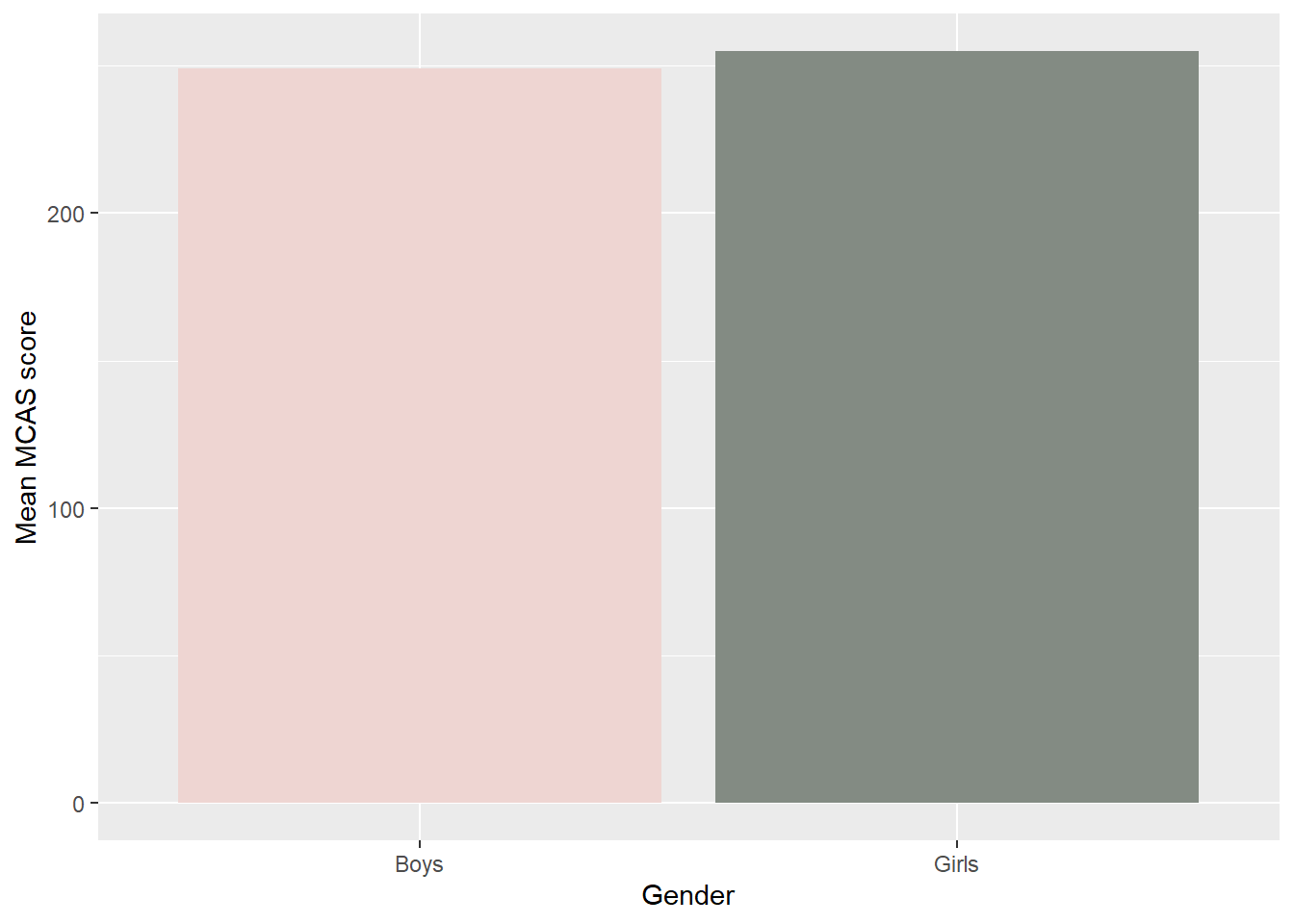
When we’re comparing groups, a bar plot is a handy display. A bar plot consists of bars, one per group, where the bar’s height is equal to some group-level statistic. The statistic is usually the mean or some other measure of central tendency, though you could do any other statistic that can be calculated from the group, such as the standard deviation (there are other similar plots that we won’t be discussing here). Figure 7 shows a bar plot showing the mean MCAS scores for girls and boys; note the awesome colors (mistyrose2 and honeydew4, both included in R; if you encounter a honeydew melon with a color similar to honeydew4, you may want to avoid it).
Code
boy_girl_df %>%group_by(gender) %>%summarize(mean =mean(scores)) %>%ggplot(aes(x = gender, y = mean)) +geom_col(fill =c('mistyrose2', 'honeydew4')) +labs(x ='Gender', y ='Mean MCAS score')
Figure 7: Barplots of mean MCAS scores for girls and boys.
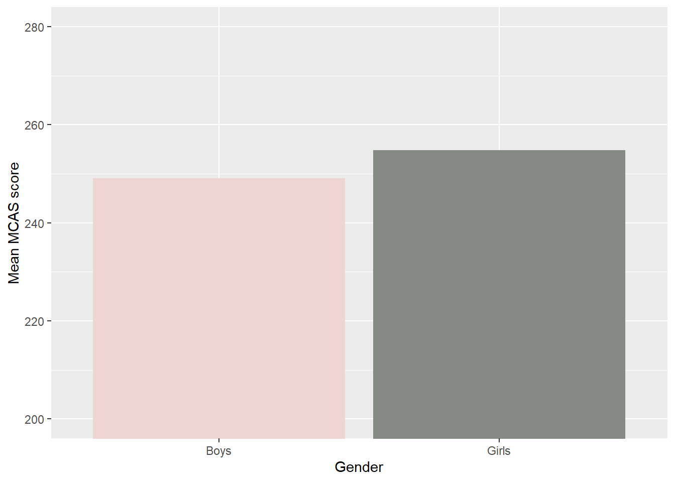
The same data, but now with the axis constrained to run from 200 to 280, the theoretical range of the MCAS.
Note that we can change the impression a bar plot gives by altering the y-axis range. The first plot extends from 0 up, and the difference between girls and boys looks tiny; the second plot extends from 200 up, and the difference looks much more consequential. Usually it’s a good idea to have the axis include 0, because small differences can be made to look large just by zooming in close enough. However, in this case we prefer the plot on the right. In this example, 0 is not a possible value on the MCAS; 200 is the lowest possible score, and hence the lowest possible mean value. Scores below this value are not meaningful at all due to how the scale is constructed. We also extended the y-axis up to 280, to show the full range of possible values that the mean could be.
Null-hypotheses and the t-distribution
Continuous variables offer a whole new range of potential null-hypotheses to test. How exciting for us! The first, and simplest, is a null-hypothesis that the mean value in the population is equal to a particular number (similar to a null-hypothesis for a categorical variable that the population proportion falling into a particular cell is equal to some number, e.g., that 50% of Massachusetts 10th graders are girls).
Null-hypotheses about population means
Suppose we know for a fact that in 2012, the average MCAS ELA score for girls was 253.5. We want to know if girls are doing better this year than in the year before.[^s061] A null-hypothesis we might entertain would be that \mu_{girls} = 253.5, i.e., that the population mean value for girls in 2013 is equal to the (known) population mean from 2012. We can express this mathematically as H_{0}:\mu_{girls} = 253.5, where H_0 (“H nought” or “H zero”) refers to the null-hypothesis that the mean score for girls in 2013 is equal to the mean score from 2012.
If the sample mean is close to the hypothesized population mean (we’ll be more precise about what “close” means soon), we will fail to reject the null-hypothesis and conclude that it is plausible that the mean from 2013 is identical to the mean from 2013. In contrast, if the sample mean is far from the hypothesized population mean, then we will conclude that it is implausible that girls this year have mean MCAS scores equal to 253.5; depending on whether the observed value is larger or smaller than 253.5, we will conclude that girls are doing better or worse this year.
Remember, we can say for certain that girls in this particular sample have mean scores above 253.5. We want to know if it’s plausible that girls in the population, of which our sample is a minuscule part, also do. But to test the null-hypothesis, we need to identify the probability distribution which describes how probable different sample means would be if the null-hypothesis is in fact true (the sampling distribution of the sample mean under the null-hypothesis). Then we’ll be able to compare the observed value to the distribution to see how improbable it is.
Before we do that, though, we need some definitions. First, we’ll call the null-hypothesized value of the population mean (253.5 in our case) \mu_{0}, or “myoo nought”. Next, we’ll call the observed sample mean \hat{\mu}, or “myoo hat”. Remember, the hat indicates that we’re viewing the sample mean not as interesting in its own right, but as an estimate of the population mean. It’s just the sample mean, \bar{y}. Additionally, we’ll call the observed sample standard deviation \hat{sigma}, or “sigma hat”. This is also interesting as an estimate of the population standard deviation and not in its own right. Finally, we’ll let n be the number of observations in the sample.
Standard errors
We’ll also need to introduce a new concept which we’ll return to repeatedly in later units. (I keep saying things like this not to threaten you, but to reassure you that you’ll have lots of chances to practice). The standard error of a test-statistic is the standard deviation of that statistic across repeated (independent) samples. This is an unusual concept, so let’s take a moment to explain. Imagine that we were able to draw multiple samples from a population, with each sample containing n observations. For each sample, we calculate a statistic, say the sample mean. We can think of these means as a sample of sample means. The mean mean of this sample of samples (whoa…) would be equal to the population mean (the average sample mean is equal to the population mean). We could also calculate the standard deviation of the sample means, which we refer to as the standard error of the mean.
The standard error, then, is a measure of how spread out a statistic is across multiple (independent) samples. A high standard error means that the value of the statistic tends to vary a great deal from sample to sample. If that’s the case, there’s no reason to expect a mean from a particular sample, such as our actual sample, to be close to the population mean. A low standard error means that the value of the statistic is relatively constant across samples, and therefore a mean from a given sample, including our sample, will generally be close to the population mean. We can write “the standard error of the mean” as se(\hat{\mu}).
When the statistic is the sample mean, the standard error is given by
se(\hat{\mu})=\frac{\sigma}{\sqrt{n}}
This is equal to the standard deviation of the variable (say MCAS scores) divided by the square root of the sample size. Let’s look at this formula in a little more detail. As the sample size gets larger, the denominator of the fraction also gets larger, and the standard error goes down. Practically speaking, as the sample size increases the mean gets less and less spread out, and tends to be closer and closer to the true population value. Similarly, when the standard deviation of the variable is low the standard error is also small. In this case, values of the observations are clustered closely together and sample means will tend to be close to the population mean.
It turns out that we can estimate the standard error of the mean from a single sample, which should seem pretty weird. How can we know how spread out the mean would be across repeated random samples from the population when we only observe a single sample, huh? Good question! In fact, if we write \hat{se}({\hat{\mu}}) for the estimated standard error of the mean, then
The formula is almost identical to before; the only difference is that we use the sample standard deviation rather than the (unknown) population standard deviation.
How can we estimate how variable the sample mean is across multiple samples when we only have access to a single sample? We’re able to do so with the mean because the standard error is a function of n, which we know, and of the population standard deviation (the standard deviation of individual outcomes, not of sample means), which we can estimate. Combining those two things allow us to estimate the standard error of the sample mean. In later units we’ll see the same thing again: we can estimate the variability of a statistic from a single sample, because the variability is a function of things which can be observed or estimated directly from the sample. In contrast, we can’t use a single MCAS score to estimate the standard deviation of MCAS scores; a single value gives us no information about how spread out the variable is.
The t-distribution(s)
Now it’s time to test out null-hypothesis. We’ll do that by computing a test-statistic which will measure how different the sample is from what the null-hypothesis predicted. The test-statistic that we’ll be working with is
t = \frac{\hat{\mu}-\mu_0}{\hat{se}(\hat{\mu})}.
The best way to think of this is as the difference between the observed mean (\hat{\mu}) and the hypothesized mean (\mu_0) in (estimated) standard error units. The greater t is in magnitude, the farther the observed value is from the hypothesized value, and thus the more evidence we have against the null-hypothesis. Sometimes we write t as t_{obs} or t^{obs} for “the observed value of t”.
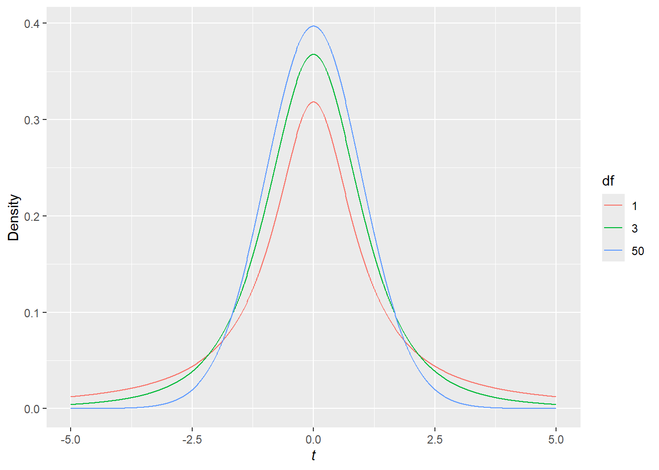
If the null-hypothesis, H_0:\mu_{girls}=253.5, is true, then the value t=\frac{\hat{\mu}-253.5}{\hat{se}(\hat{\mu})} follows what is known as a t-distribution with n-1 degrees of freedom.[^largesample] If we take repeated random samples from a null-population and calculate the t-statistic in each one, the distribution of those statistics will look like a t-distribution, which is a symmetric bell-shaped distribution with a single mode at 0. This distribution can be written as either t_{n-1} or t(n-1). Figure 8 shows t-distributions with 1, 3, and 50 degrees of freedom (as the degrees of freedom get large, the shape of the t-distribution stops changing very much), which correspond to samples of size 2, 4, and 51. As the degrees of freedom approach infinity, meaning that we can perfectly estimate the standard error of the mean, the t-distribution becomes the normal distribution, one of the best known and most useful distributions in statistics. We’ll hear more about the normal distribution in later units.
Code
x <-seq(from =-5, to =5, by = .01) ## creates a sequence of values from negative 5 to 5 by steps of .01t1 <-data.frame(t = x, density =dt(x, 1), df =1) ## functions for generating three t distributionst3 <-data.frame(t = x, density =dt(x, 3), df =3)t50 <-data.frame(t = x, density =dt(x, 50), df =50)my_dat <-rbind(t1, t3, t50)my_dat$df =factor(my_dat$df)my_dat %>%ggplot(mapping =aes(x = t, y = density, color = df)) +geom_line() +xlab(expression(italic(t))) +ylab('Density')
Figure 8: t-distributions with various degrees of freedom.
The first thing you’ve probably noticed is that all of the distributions have peaks centered on 0. This reflects the fact that samples with means which are close to the population mean (where \hat{\mu} - \mu is close to 0) are more probable than samples with means that are far from the population mean. The distributions are also symmetric around a t-value of 0. This means that sample means are equally likely to be k standard errors higher than the population mean as they are to be k standard errors lower. Notice also that the red distribution, a t_1 distribution, also known as a Cauchy distribution, a Lorentz distribution, or any of a number of other distributions has a short, sharp peak, and long, thick (i.e., heavy) tails to the right and left. In small samples we tend to estimate the standard error very imprecisely, which means that it’s not all that unusual for the observed mean to be many estimated standard errors away from the population mean; sometimes our estimate of the standard error is far too small. As the sample size increases, the t-distribution has narrower and narrower tails, meaning that it’s less and less likely to draw samples with means that are many estimated standard errors away from the population mean; our estimates of the standard error are more and more stable.
In the current example, \mu_0=253.5, \hat{\mu}=254.84, \hat{\sigma}=9.83, and n=200. So we can estimate the standard error of the mean as
Notice that I’m rounding as I go. Don’t do this. Only round your final result. Better yet, let your computer do all of that for you. There’s no need to waste time plugging numbers into a calculator and probably making a bunch of mistakes when your software will handle everything for you.
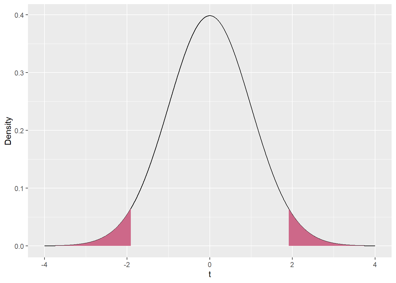
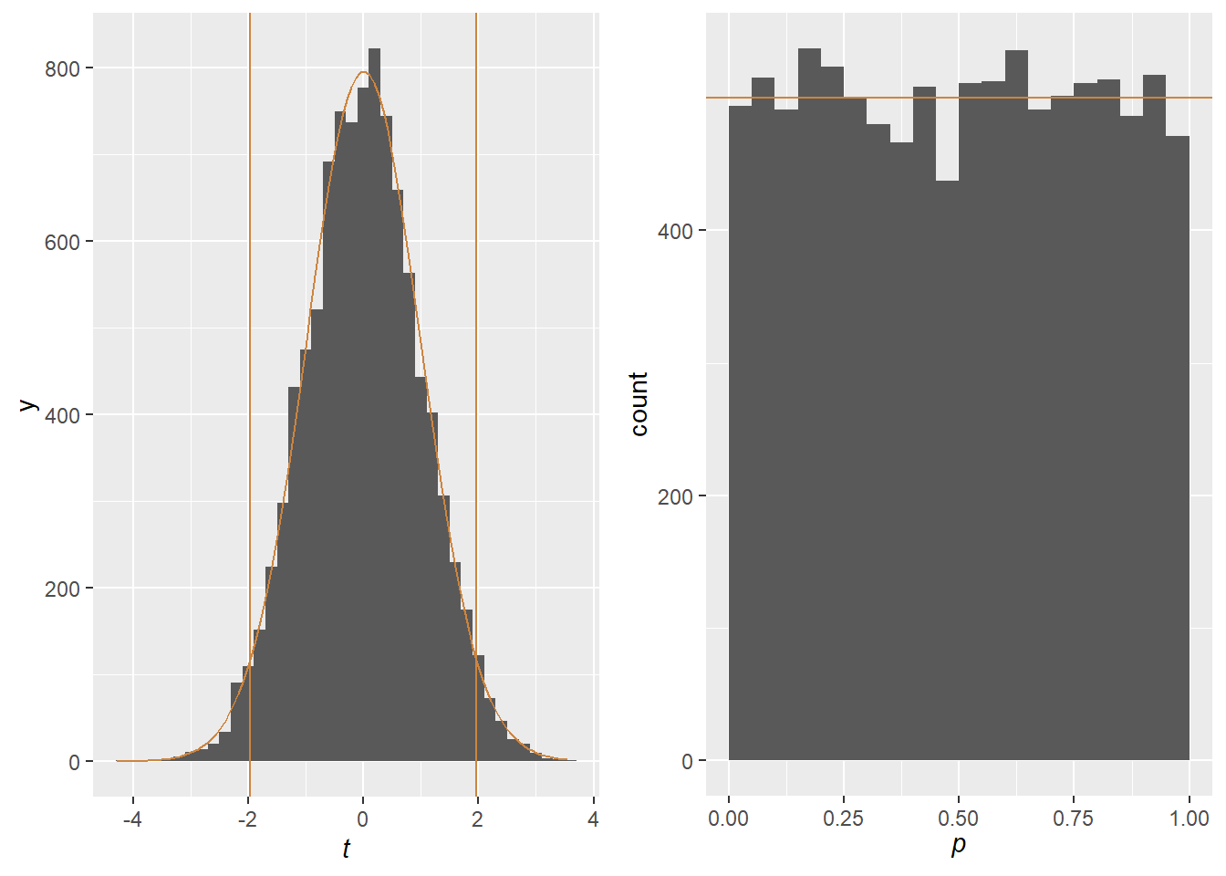
We need to compare this to a t-distribution with 199 degrees of freedom, i.e., a t_{199} distribution. Recall from Unit 1 that what we want to know is the probability of drawing a sample with a t-statistic as extreme as, or more extreme than, the observed 1.91. This will give us a p-value and tell us how unlikely our sample would be if the null-hypothesis were true. In turn, this will tell us if we should reject or fail to reject the null-hypothesis.
What we mean by “as extreme as or more extreme than” is a little harder to define here than it was for the \chi^2 test statistic. For the \chi^2 distribution, large positive numbers indicate inconsistency with the null hypothesis and small numbers indicate consistency. As a result, we can calculate the p-value as the area under the \chi^2 distribution from the value of the test-statistic out to infinity.[^limit] In contrast, for the t-distribution, large numbers, whether positive or negative, indicate inconsistency with the null-hypothesis. As a result, assuming t is positive, we calculate the p-value as the area under the curve between the observed t and positive infinity and the area between negative t and negative infinity (and similarly if t is negative). Given the fact that the t-distribution is symmetric, we can also write this as twice the area under the curve between t and positive infinity. Figure Figure 9 displays the area that counts towards the p-value in our case.
Code
# this is all for making the shaded regions on the plots, and I'm not going to comment it too carefullycord.x.l <-c(-4, seq(from =-4, to =-1.91, by = .001), -1.91)cord.y.l <-c(0, dt(seq(from =-4, to =-1.91, by = .001), 199), 0)cord.x.r <-c(1.91, seq(from =1.91, to =4, by = .001), 4)cord.y.r <-c(0, dt(seq(from =1.91, to =4,by = .001), 199), 0)my_t <-data.frame(x =seq(-4, 4, .001))my_t$t <-dt(my_t$x, df =199)ggplot(my_t, aes(x = x, y = t)) +geom_line() +geom_area(data = my_t[my_t$x >1.91, ], fill ='palevioletred3') +geom_area(data = my_t[my_t$x <-1.91, ], fill ='palevioletred3') +xlab(expression(t)) +ylab('Density')
Figure 9: A t_{199} shaded from negative infinity to -1.91 and from 1.91 to positive infinity, colored with “palevioletred3”
In our example, the area to the left of the curve is .029, as is the area to the right, meaning that the p-value is .058. This is substantial evidence against the null-hypothesis. It means that, if the null-hypothesis were true and the mean score for girls this year were equal to 253.5, only around 6% of samples would have a t-statistic this extreme or more. However, by convention, we only reject the null-hypothesis if the p-value is less than or equal to .05. So in this case we fail to reject the null-hypothesis. Keep in mind: failing to reject a null-hypothesis does not mean that we found that there’s no difference, just that we did not find that there is a difference. These are slightly, but importantly, different.
We might report this as follows: We tested the null hypothesis that the population mean MCAS ELA score for girls in 2013 was equal to 253.5, the known mean score in 2012. The mean of the sample taken in 2013 was slightly higher than the population mean in 2012 (\hat{\mu}_{girls}=254.84), but the difference was not statistically significant (t(199)=1.91,p=0.058).
Null-hypotheses about differences in means
In the previous example, we were testing a null-hypothesis that a population mean was equal to a specific value. That’s unusual, since it’s rare that we want to compare a variable to a specific number. One situation in which this sort of analysis might make sense is if we measured student ability at the beginning and the end of the year and created a variable measuring how much students changed over time by taking Y_{change} = Y_{end} - Y_{beginning}. We might be interesting in determining whether the population mean of this variable was different from 0, which would be testing a null-hypothesis of no mean change (i.e., H_0:\mu_{change} = 0).
A much more common situation is when we need to test whether two population means are equal to each other. For example, in the current situation we want to know if boys and girls have the same average scores in the population. The corresponding null-hypothesis is that \mu_{girls}=\mu_{boys}. Obviously this is not the case in our sample, where \hat{\mu}_{girls}=254.84 and \hat{\mu}_{boys}=249.07. However, we might wonder if it’s plausible that we simply happened to draw an unusually capable sample of girls and an unusually incapable sample of boys. Even if the population means are identical and, on average, girls and boys have the same MCAS scores, we wouldn’t expect the means to be exactly equal in our sample.
Testing the null-hypothesis that \mu_{girls}=\mu_{boys} is somewhat similar to testing the null-hypothesis that \mu_{girls}=\mu_{0} (or, equivalently, that \mu_{boys} = \mu_{0}). The major difference is that in the previous example \mu_{0} was known (we chose 253.5), but in the current example we must estimate both \mu_{girls} and \mu_{boys}.
The details of this test are a little trickier, so we’re going to omit some of them. Interested readers can find more information online.[^lazy] The basic ideas, though, should hopefully seem familiar to you.
Suppose that the null hypothesis is true and the population mean score is the same for girls as for boys. This is equivalent to H_0:\mu_{girls} - \mu_{boys} = 0, a null-hypothesis that the difference in population means between girls and boys is 0. We’ll call the standard error for the difference between the sample means se(\hat{\mu}_{girls}-\hat{\mu}_{boys}). This is the standard deviation of the difference in means, across multiple independent samples of the same size drawn from the same population. Remember, the motivating idea for a standard error is that we take multiple samples from the population, each with the same number of girls and boys as in our original sample. In each sample we estimate the mean score for girls and the mean score for boys, and take the difference between these numbers. The standard deviation of these differences is the standard error of the estimated difference, or se(\hat{\mu}_{girls}-\hat{\mu}_{boys}).
As before, we can’t know the standard error exactly, but we can estimate it from
the standard deviation of the scores for girls;
the standard deviation of the scores for boys;
the number of girls in the sample; and
the number of boys in the sample.
This is where the details get tricky and we mostly omit them, but the standard error increases with the standard deviations of girls’ and boys’ scores and decreases with sample size. When our samples are large and standard deviations are low for both girls and boys, the standard error tends to be small and sample differences tend to be close to the population difference. We’ll call the estimated standard error \hat{se}(\hat{\mu}_{girls}-\hat{\mu}_{boys}).
This is the sample difference in means (or the difference in sample means, those are the same thing) expressed in standard error units. That is, a t-statistic of 1 would indicate that the mean difference was 1 estimated standard errors above 0. The larger the test-statistic is, the more the sample diverges from the null-hypothesis that the population means are equal to each other. As you will have guessed, this quantity also follows a t-distribution, specifically t_{n-2}, where n is the size of the whole sample, in this case 400 (200 girls and 200 boys). In general, the degrees of freedom is equal to the number of observations in the sample, but we lose one for each population parameter we try to estimate.[^fracdf] Here we have 400 observations and we need to estimate both \mu_{girls} and \mu_{boys}, giving us 398 degrees of freedom. Remember, when the degrees of freedom are large, a t-distribution looks basically like a Normal distribution.
As a quick aside, note that we were testing a hypothesis that the population mean difference is equal to 0. But we can just as easily test a hypothesis that the population mean difference is equal to some other number, for example that it’s equal to 2. To do this we would define
We’ll explain this a little more in unit 5. Of course, it’s not really clear why we would want to test a hypothesis that the mean difference is equal to 2, since that seems kind of random.
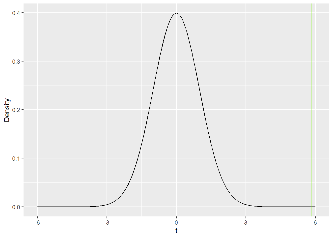
In our running example, the standard error of the difference in sample means is approximately 0.991, while \hat{\mu}_{girls}=254.84 and \hat{\mu}_{boys}=249.07, so we calculate that
t = \frac{254.84-249.07}{.991}=5.82
So the t-statistic for the difference in means is 5.82. The observed difference in means is 5.82 estimated standard errors greater than 0. Since there are 400 people in our sample, we have 398 degrees of freedom. Figure 10 shows a t-distribution with 398 degrees of freedom. I didn’t bother with shading, because the curve is so close to 0 past the observed t-statistic, there’s really nothing to shade. The vast majority of the area of the t-distribution lies between t=-5.82 and t=5.82. If the null-hypothesis actually is true, and \mu_{girls}=\mu_{boys} (girls and boys have the same mean scores in the population), then this is an exceptionally improbable t-statistic. In fact, the p-value is approximately .00000001, meaning that we’d expect to need to take 100,000,000 samples from a null-population to get a result this or more extreme. That’s a lot of samples, and it’s a little hard to believe that this particular sample is that one-in-a-hundred-million event. Consequently, we reject the null hypothesis and conclude that the population mean MCAS score for girls is different from the population mean MCAS score for boys. Given that the sample mean is higher for girls than for boys, we further conclude that the population mean MCAS score for girls is higher than the population mean MCAS score for boys.
Figure 10: t-distribution for the difference in mean scores for girls and boys t_{398}. The value of the test-statistic is 5.82 where the curve is so close to the x-axis that we can’t see any area beneath it. The `lawngreen’ line is at the sample t-statistic and is a really nice color. My own lawn doesn’t look that color.
We might report the results like this: in our sample, the mean MCAS score for girls was higher than for boys (\hat{\mu}_{girls}=254.84, \hat{\mu}_{boys}=249.07). The difference was statistically significant (t(398)=5.82,p<.001), so we infer that girls in Massachusetts have higher average MCAS ELA scores than do boys.
Establishing \alpha and power
Until now, we’ve been a little fast and loose in rejecting null-hypotheses. We need a way of deciding whether or not to reject. Specifically, before we undertake an analysis, we need to establish the amount of evidence we require against the null-hypothesis before we reject. How improbable does a statistic need to be before we decide that our results are not just due to a chance sample? This can be summarized with a single number, between 0 and 1, which we refer to as \alpha (pronounced ‘alfa’). \alpha is the p-value below which we reject a null-hypothesis, and above which we fail to reject. Remembering that the p-value can be thought of a summary of how much evidence we have that a null-hypothesis is false,[^precise] \alpha is the amount of evidence we need against a null-hypothesis before we reject it. There are other \alpha’s in statistics, but this is the only one we use in this class.
In theory, we can choose the level at which we want to set \alpha based on the context. In some cases, we’ll want to be certain that we only reject null-hypotheses that are really false, in which case we might set \alpha to be very low. If a drug is known to have serious negative side-effects, we might want to have a great deal of evidence that it actually cures the condition it’s intended to treat before approving it for use in the general population.
In other cases we might want to err on the side of rejecting null-hypotheses, even if the evidence isn’t as strong. We might not need a lot of evidence that a drug actually cures Ebola before prescribing it, especially if the drug is cheap and has no side-effects. In this case the potential benefits of the drug are great enough to tolerate some uncertainty as to whether the drug actually does anything. In a case like this, we can set \alpha higher because we’re less concerned about falsely concluding that it works.
The lower we set \alpha, the more evidence we need to reject a null-hypothesis. That means that we can be more confident in our rejections, but it also makes it harder to discover real associations. Our ability to reject false null-hypotheses is referred to as power.
If we don’t explicitly establish \alpha, which we should, it will be assumed to be whatever is conventional in our field. In social sciences, \alpha is generally assumed to be .05. This means that we should expect to incorrectly reject about one in 20 true null-hypotheses that we test, which seems like a good number. Unless we say otherwise, we will always use this as our value of \alpha And although we just finished describing how we can set \alpha, most journals will expect you to use the default journal, and you may need to convince them to let you use anything else. Other disciplines have different defaults. Theoretical physicists need incredibly high levels of evidence before declaring that they’ve found a new fundamental particle, and often set \alpha as low as .0000003 (the standard for discovering a new particle, equivalent to t = \pm4.86). Economists just want to publish papers where they find things, so they frequently use a value of .10 for \alpha.
Critical values
For any given distribution and \alpha, there is a value of the test-statistic which gives a p-value exactly equal to \alpha. This value os referred to as the [critical value]{glossary.qmd/#sec-critical-value} For most t-distributions, when \alpha=.05, the critical value is close to 2 (or -2, but we always talk about the critical value as a positive number). This is probably worth remembering, since we’ll use it later in this unit. For \chi^2_1 and \alpha=.05, the critical value is close to 5. Putting this in more familiar terms, if we establish \alpha = 0.05, then in order to reject a null-hypothesis with a test-statistic which follows a \chi^2_1 distribution, we need a sample \chi^2 value of 5 or greater.
Types of errors
In statistics, there are two kinds of errors that we can make, less-than-helpfully referred to as Type I and Type II. We commit a Type I error when we reject a null hypothesis that is actually true. For example, if it’s actually true that \mu_{girls}=\mu_{boys} and in the population girls and boys have the same average MCAS score, then we committed a Type I error in rejecting the null-hypothesis. If we set \alpha at some value, say .05, then we should commit Type I errors for about \alpha proportion of the true null-hypotheses we test (so for about 5% of null-hypotheses using \alpha = .05). The reason for this is that we reject any null-hypothesis only when the p-value is less than \alpha; if the null-hypothesis is true, this should happen with probability equal to \alpha! Cool! Remember, the fact that we rejected a null-hypothesis doesn’t mean that we know that it’s false, only that we have enough evidence against it that we’ve decided against it. Of course, if the null-hypothesis is actually false, it’s impossible to commit a Type I error; in that case it wouldn’t be an error!
On the other hand, if we fail to reject a null-hypothesis that is actually false, then we have committed a Type II error. If \mu_{girls}\ne\mu_{boys} but the p-value for our test-statistic is greater than \alpha, then we will have committed a Type II error. One minus the probability of committing a Type II error is the power of our analysis, and is related to \alpha, the sample size, and the magnitude of the true population association. Low values of \alpha reduce power and increase the rates of Type II errors, because we need more evidence to reject the null-hypothesis. Smaller samples make it harder to make precise inferences about the population, and so decrease power and increase the rates of Type II errors. Finally, the smaller the true association, the lower the power and the higher the rate of Type II errors, because it’s harder to find small effects than big ones. If the null-hypothesis is true, it’s impossible to commit a Type II error.
The language of “errors” is a little unhelpful. You might do everything right and still commit a Type I or Type II error. This is through no fault of your own, and simply a reflection of the fact that samples are random and sometimes show relationships that don’t exist in the population. Don’t beat yourself up about it! If you reject a null-hypothesis, you’ll never know if that was a Type I error or if the null-hypothesis is actually wrong, unless you can somehow observe the population to see what the true value of the parameter is. The same is true of Type II errors.
Confidence intervals
So far we’ve rejected the null-hypothesis that \mu_{girls}=\mu_{boys}, which means that we’re confident that girls and boys in the population have different mean MCAS scores, and that girls have higher scores than boys. However, that’s not very informative; we can’t say how large the difference is. In the sample, girls scored roughly 5.78 points higher than boys, but there’s no reason to assume that this is the exact difference in the population, even if we think that the difference is not 0. Of course, we’re not going to be able to say what the exact difference is, but we’d like to give a range of plausible values. We’ll refer to this hypothetical range of plausible population values as the confidence interval for the difference.
But how can we determine what a range of plausible values would be for the mean difference? One reasonable approach is the following: count as plausible any difference d for which we would fail to reject H_0:\mu_{girls}-\mu_{boys}=d. This is the set of all values for which we lack sufficient evidence to say that the true difference is not equal to that value.[^doubleneg] Much more simply, if we can’t say with confidence that the difference is not equal to d, then it’s plausible that the difference is equal to d! Note that this depends on \alpha, which we require to decide whether or not to reject a null-hypothesis. When we use some value \alpha_0 to construct our confidence intervals, we refer to 1-\alpha_0- or (1-\alpha_0)*100\%-confidence intervals. By far the most common confidence interval is the 95%-confidence interval, or the 95%-CI for short. This is the confidence interval associated with \alpha = .05.
Obtaining a confidence interval for the difference in population means turns out to be much, much easier than describing or defining one. But first we need to recall the concept of a critical value. The critical value is the value of the test-statistic (t in this case) which is associated with a p-value value of exactly \alpha (t_{crit} is always positive). When working with t-distributions, we refer to the critical value as t_{crit}. t_{crit} is a function of \alpha (smaller values of \alpha correspond to larger values of t_{crit}) and the sample size (larger samples correspond to smaller values of t_{crit}, although this doesn’t matter too much). If the observed test-statistic is larger than t_{crit} (or smaller than -t_{crit}), we reject the null-hypothesis. For an \alpha of .05 and a sample larger than 40 or so, t_{crit} is always very close to 2. For extremely large samples, t_{crit} is close to 1.96 (but saying t_{crit} = 2 is a reasonable simplification).
Now, if we let \hat{d} be the difference in sample means/the estimated population difference, let \hat{se} be the estimated standard error for the difference, and let t_{crit} be the critical value, then the confidence interval is
In other words, the confidence interval contains all values within t_{crit} estimated standard errors of the observed difference. You might notice that we would fail to reject a null-hypothesis that the true difference in means is equal to any of the values contained in the confidence interval, because all of these value are less than t_{crit} estimated standard errors from the sample difference.
Alternately, if you use the formula for the more general t-statistic, you might observe that if we test a hypothesis that \mu_{girls} - \mu_{boys} = \hat{d}+t_{crit}*\hat{se}, we would get
t=\frac{(\hat{\mu}_{girls}-\hat{\mu}_{boys}) - \hat{d}+t_{crit}*\hat{se}}{\hat{se}} = \frac{\hat{d} - \hat{d}+t_{crit}*\hat{se}}{\hat{se}} = \frac{t_{crit}*\hat{se}}{\hat{se}} = t_{crit} which is just barely large enough to reject the null-hypothesis (that’s what t_{crit} means). We would get something similar (-t_{crit} if we tested a hypothesis that\mu_{girls} - \mu_{boys} = \hat{d}-t_{crit}*\hat{se}) So if we tested for any value in the interval (\hat{d}-t_{crit}*\hat{se},\hat{d}+t_{crit}*\hat{se}), we would fail to reject our hypothesis and would conclude that the population mean difference was plausibly equal to the value being tested.
Of course, from our perspective it’s actually much easier than that, because our statistical software will automatically calculate and report the confidence interval. All we need to do is to keep in mind that the confidence interval represents a range of plausible values for a population parameter.
Here are some properties which are true of all confidence intervals (about differences in means, or any other population parameter):[^ciprops]
We fail to reject the null-hypothesis if and only if the confidence interval contains 0. Remember that the confidence interval contains all of the values of the population parameter for which we would fail to reject the null-hypothesis; if 0 is one of those values, then we fail to reject H_0. If we reject H_0, then 0 is not a plausible value.
Over repeated independent samples, X% of the time the X%-confidence interval will contain the true population parameter.
One way to think of a confidence interval is as all values of the population parameter which are which are consistent with the observed data. Remember that we decide how consistent it needs to be by setting \alpha; the closer \alpha is to 0, the wider the confidence interval because we require ever more evidence to reject H_0.
The confidence interval is symmetric and centered on the sample statistic which corresponds to the population parameter. Its width is 2\times t_{crit}\times \hat{se}, or usually close to 4\hat{se}.
Relatedly, the confidence interval always includes the sample estimate. It is never interesting to note that the sample estimate is in the confidence interval, because we create the confidence interval by starting at the statistic and moving out t_{crit}\times \hat{se} in either direction.
The confidence interval is unique to each sample; there is no such thing as a confidence interval in the population. The confidence interval is about the population, but it’s a property of the sample.
Turning back to our example, the 95%-confidence interval for the difference in mean scores between girls and boys in the population is
Notice that the confidence interval contains all of the information that a hypothesis test does; we fail to reject the null-hypothesis if and only if the confidence interval covers the null value (0). But it also gives us a sense of what population values are consistent with the observed data. This allows us to say more than simply that the population parameter is not equal to 0, it also gives us an idea of what the magnitude is. Narrow confidence intervals (corresponding to small standard errors) are more informative than wide ones (corresponding to large standard errors), because they give us a more precise estimate of the parameter of interest.
A (very) common misconception
It would be incorrect to say that there is a 95% probability that the population difference in means lies in the interval (3.83,7.72). In frequentist statistics, which is the variety we’re using, the population difference in means is a fixed quantity; we don’t know what the exact value of the difference is, but it’s one specific number. Similarly, after we’ve taken a sample, the confidence interval is a specific, fixed set of numbers; it’s purely determined by the sample, and once the sample has been taken it becomes a fixed quantity. It doesn’t make sense to say that there’s a probability that the interval contains the value; it either does or it does not. We don’t know if it does or not, but only one of those is true, so probability doesn’t enter into things.
What we can say is that, over repeated independent samples, 95% of the 95%-confidence intervals we construct will contain the target population parameter. It’s also correct to say that the confidence interval we will construct from a sample that we have not yet taken, has a 95% probability of containing (or covering) the parameter of interest. However, as soon as we’ve taken the sample, the confidence interval is fixed, and it either does or does not contain the value of the parameter of interest.
Correlations
So far we’ve talked about how to estimate mean differences on a numeric variable between two different groups. Another way to think about this is as the association between a continuous/numeric variable (e.g., MCAS scores) and a categorical variable (e.g., gender). This enables us to ask a lot of interesting, important questions! But there are other questions that we can’t answer, specifically questions about how two continuous/numeric variables are associated with each other. Answering this sort of question is kind of the goal of the rest of the course, so we’ll spend a lot of time with it. In this unit we’re going to introduce one way of quantifying the association between a pair of numeric variables, the correlation.
To motivate this analysis, we’re going to slightly modify our example. Now we’ll consider a new sample of 100 respondents (we don’t care about their gender anymore). For these students, we’ve observed their ELA and math MCAS scores. We display these students in a scatterplot in Figure 11. We’ll talk more about scatterplots later, but for now, each point represents a single student; the horizontal position of the point represents the student’s ELA score and the vertical position represents the student’s math score.
Code
library(mvtnorm) # for generating multivariate normal observationsobs <-round(rmvnorm(n =100, mean =c(250, 250), sigma =matrix(c(10, 7, 7, 10), nrow =2)))dat <-data.frame(ela = obs[, 1], math = obs[, 2])ggplot(dat, aes(x = ela, y = math)) +geom_point() +labs(x ='ELA score', y ='Math score')
Figure 11: A scatterplot of math MCAS scores against ELA MCAS scores for a sample of 100 students.
Note the clear evidence of an association in the scatterplot. Students with high ELA scores tend to have high math scores. Students with low ELA scores tend to have low math scores. There are no students with high ELA scores and low math scores or low ELA scores and high math scores. But now we’d like to be able to quantify the strength of this association. We’re going to do so using the correlation, which we write as \rho (pronounced ‘roh’).
We’ll refer to a student’s ELA score as ELA, and to a student’s math score as MATH. As we’ve said earlier in this unit, we’ll refer to the mean value of ELA as \mu_{ELA}; we’ll refer to its standard deviation as \sigma_{ELA}. In the population, we define
That is, for each observation, find how far its ELA score is from the mean, and multiply that by how far its math score is from the mean. Multiply these together and sum them all up, then divide by the product of the sample size, the standard deviation of ELA scores, and the standard deviation of math scores.
The formula for the sample is very similar; we simply replace all of the parameters with their sample estimates to obtain
Correlations summarize the strength of the linear association between a pair of variables. Notice that if people who have above ELA scores also tend to have above average math scores, then the product (ELA_i-\hat{\mu}_{ELA})(MATH_i-\hat{\mu}_{MATH}) will generally be positive (because usually either both terms will be positive/above average or both terms will be negative/below average; in either case the product will be positive), and the correlation will be positive; the stronger the association, the larger the correlation will be. If people who have above average ELA scores also tend to have below average math scores, then the product will generally be negative, as will \rho. If the two are completely unrelated, then the positive and negative terms will cancel out, and the correlation will be 0. The correlation is a handy statistic used to summarize an important quantity.
Let’s take a little while to describe the properties of correlations. Again, the correlation is a measure of the strength of the linear association between a pair of numeric variables. Larger correlations, whether positive or negative (i.e., closer to 1 or -1), indicate stronger linear associations. In this context, a positive correlation indicates that students who have high ELA scores also tend to have high math scores and that people who have low ELA scores also tend to have low math scores.[^relative] A negative correlation would indicate the opposite; students with high ELA scores tend to have lower math scores than students with lower ELA scores. The larger the correlation, the stronger the association; a value of 1 or -1 would correspond to a scatterplot where every point fell on a straight line (i.e., the linear association was perfect). A correlation of 0 is a special value. It indicates that there is no linear association between a pair of variables. Correlations are said to be scale-independent, meaning that they don’t change based on the scale on which a variable is measured (e.g., the correlation between height measured in centimeter and weight measured in grams is the same as the correlation between height measured in miles and weight measured in tons).
In our current example, the sample correlation between ELA scores and math scores is .722, which is typically considered a strong correlation. Students tend to score well on both tests or score poorly on both tests; few students do well on one test and poorly on the other.
Inference with correlations
As with contingency tables, population means, and population differences in means, one thing we want to do with correlations is to test null-hypotheses. In general, null-hypotheses with correlations are of the form H_0:\rho=0, i.e., that in the population the correlation between a pair of variables is 0, meaning that there is no linear association between the two variables in the population. In our current example, this would be a null-hypothesis that in the population, there is no linear association between students’ ELA scores and their math scores. We would be hypothesizing that students with high ELA tended to have the same math scores as students with low ELA scores. Once more, the null-hypothesis is rarely what we actually believe, it’s just a tool we use to help us test whether or not there’s actually an association.
There are multiple ways to test this null-hypothesis. We’ll introduce one of the simplest approaches. Remember that \hat{\rho} is the sample correlation (and an estimate of the population correlation), and let \hat{se}(\hat{\rho}) be the estimated standard error of the correlation (i.e., the standard deviation of the sample correlation across multiple samples).[^computese] Then our test-statistic is
t=\frac{\hat{\rho}}{\hat{se}(\hat{\rho})}.
This should look very familiar. Just as with the mean, the test-statistic is the estimate of the parameter of interest divided by the (estimated) standard error of the statistic. Here \hat{\rho} estimates \rho just like \hat{\mu} and \hat{\mu}_X-\hat{\mu}_Y estimated \mu and \mu_X-\mu_Y, respectively. Also as before, the test-statistic follows a t-distribution, in this case with n-2 degrees of freedom. The degrees of freedom are n-2 because we have n observations, but lost two degrees of freedom from estimating two means; we can only calculate the correlation after estimating \mu_X and \mu_Y. Of course, your software will keep track of this for you when you conduct a null-hypothesis test of a correlation.
We also have a formula for the estimated standard error of the correlation. This is given by
Here are a few things to notice. First, just as with the mean, larger sample sizes give smaller standard errors. Additionally, large sample correlations (positive or negative) are associated with smaller standard errors; if the population correlation is extreme, the sample correlation will tend to be very close to the true value. If the population correlation is close to 0, sample correlations will tend to be more variable across repeated random samples.[^breaksdown]
In our example, the sample correlation is .722, while the sample size is 100. So we can calculate
For a t_{98}-distribution, the area under the curve to the right of 10.34 is approximately 0 (actually 5.47\times10^{-17}, or .0000000000000000547), and the area to the left of -10.34 is the same (because t-distributions are symmetric around 0). Thus, the p-value is (substantially) less than .001, leading us to reject the null-hypothesis that \rho=0 and infer that there is a linear association between ELA and math scores in the population. Because the association is positive in the sample, we infer that the population correlation is also positive.
Of course, just knowing that the association is positive doesn’t tell us much about what it actually is. This is the limitation of significance testing which shows up again and again: it typically only tells us that a population parameter is greater than (or less than) 0, but doesn’t tell us much about what the association actually is. We’d like to form a confidence interval for the parameter, which will give us a range of values of \rho which are consistent with the sample data. As with the mean, we can form a confidence interval by taking
Assuming we have once again set \alpha at .05, and given that df = 98, t_{crit}=1.98 (as we noted before, t_{crit} is usually close to 2, as long as the degrees of freedom are even slightly large). Therefore[^cimethods]
Just as with confidence intervals for means, this is a range of values for the population correlation which are consistent with the sample data. We would not reject a hypothesis H_0:\rho=\rho_0 for any value of \rho_0 which is in the interval, and we would for any value outside the interval.
Notice that the 95%-confidence interval is rather wide. It includes population correlations which are fairly moderate, but also correlations which are incredibly strong. Although we have convincing evidence that the correlation is greater than 0, we can’t say much about what it actually is. This is partly because our sample is fairly small.
Communicating our results
We’re focusing on the t-tests here because we’ll talk more about correlations later.
We were interested in two separate research questions. First, is the mean MCAS ELA score for 10th grade girls in Massachusetts in 2013 different from the mean score in 2012, which is known to be 253.5? Second, did girls and boys in Massachusetts have different mean MCAS ELA scores in 2013?
To answer the first question, we used a single sample t-test on a sample of 200 girls from Massachusetts to test a null hypothesis that girls’ mean scores in 2013 were equal to 253.5 (H_0:\mu_{girls}=253.5). Although the sample mean for girls in 2013 was slightly higher than the mean in 2012 (\hat{\mu}_{girls}=254.84, SD=9.83), the p-value was greater than our pre-established \alpha of .05, and we failed to reject the null-hypothesis (t(199)=1.93,p=0.055,95\%-CI=(-0.03,2.71)).
To answer the second question, we used a two-sample t-test on a sample of the same 200 girls and an independent sample of 200 boys to test the null-hypothesis that girls and boys had the same mean score in 2013 (i.e., H_0:\mu_{girls} - \mu_{boys} = 0). In the sample, girls had higher mean scores than boys (\hat{\mu}_{girls}=254.84, SD=9.83, \hat{\mu}_{boys}=249.07, SD=9.98), and this difference was statistically significant at the pre-established level (t(398)=5.83, p<.001, 95\%-CI=(3.83,7.72). We concluded that girls in Massachusetts had higher mean scores than boys in 2013, and that the evidence suggests that the difference was between 3.83 and 7.72 points on the MCAS. Given that the difference between any two proficiency categories on the MCAS is 20 points, the mean difference in scores between girls and boys is moderate to large.
Although we actually made up the data, so please don’t take us too seriously.
Appendix
Assumptions motivating a t-test.
In conducting a t-test of H_0:\mu=\mu_0, we make two assumptions, which we list below.
The observations in the sample are independent of each other.
The values of the outcome follow a normal distribution.
To be technically correct (the best kind of correct), we also assume that both variables have means and standard deviations, but that’s basically always true in social science research.
The first assumption is the most important by far, and cannot be tested directly. We need to know that the observations are not linked in any way. For example, if we obtain our sample by randomly selecting a single school in Massachusetts and then recording the MCAS ELA scores of the students in that school, our inferences would not be justified. In particular, we would tend to estimate unrealistically narrow confidence intervals and unrealistically small standard errors. Students in a single school tend to be more similar to each other than they are to students in other schools. If we just happened to select a high-scoring school, our estimates would be too high, and our standard errors would not correctly reflect our uncertainty; they would be narrower than they ought to be.
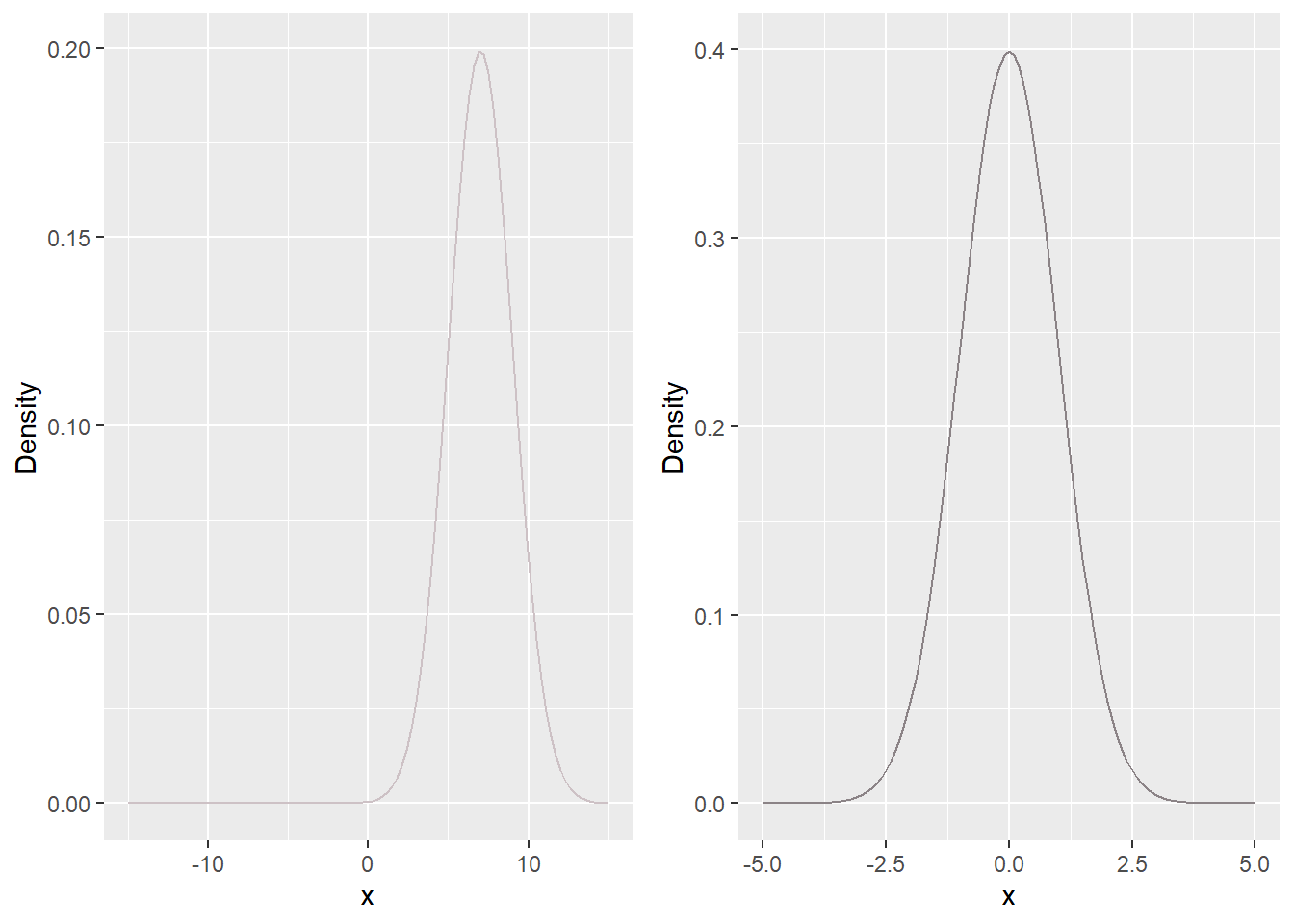
The second assumption is easier to test, but is also less important. The math behind the t-test only works out perfectly if the values in the population follow a normal distribution. However, it works out approximately if the sample is moderately large (say 40 respondents or so) and the distribution from which the values are drawn does not have excessively heavy tails (i.e., there aren’t too many huge large positive or negative values in the population). This is fortunate because no variable we will ever analyze is actually normally distributed, and we can prove that mathematically. See Figure 12 for examples of normal distributions. Bell-shaped distributions are quite common in applied research, even though they’re not actually normal distributions.
Figure 12: Two normal distributions. The distribution on the left has a mean of 7 and a standard deviation of 2 (Normal distributions are completely defined by their means and standard deviations). The distribution on the right has a mean of 0 and a standard deviation of 1, and is referred to as a standard normal. It is identical to the limit of a t_{df} distribution as df goes to infinity. But why would df go to infinity? That’s such a long way to go! The line on the left is drawn in lavenderblush3' and the line on the right inlavenderblush4’; before I started creating plots in r, I probably would not have expected that one would need quite that many shades of lavenderblush. I’m also not really able to see how the color of the second line is either lavender or blush.
To conduct a t-test of a null-hypothesis of equality of means, H_0:\mu_1=\mu_2, we need to make the same assumptions. The specific test that we use also depends on whether the distribution of the variable of interest has the same variance in both groups (e.g., that the MCAS scores of girls and boys have the same standard deviation in the population). If we choose to make this assumption, we conduct a t-test with equal variances (or a pooled t-test, referring to the pooling of standard deviations across groups); if not, we conduct a t-test with unequal variances (or an unpooled t-test). The decision that we make impacts how we estimate the standard error. Standard errors calculated under the assumption of equal variances tend to be (not always) smaller than standard errors calculated without that assumption, making it easier to reject null-hypotheses. On the one hand, we usually want to reject null-hypotheses, so it makes sense to assume equal variances whenever the assumption is reasonable; using this test increases our power. On the other hand, if we use a test with unequal variances it will work even if the variances are actually equal. The converse is not true; assuming equal variances when the true variances are not equal can mess up your analysis. The default t-test for R is a test with unequal variances, which is a more conservative test. Stata defaults to a test with equal variances, which isn’t an assumption you should make by default.
A simulation
We can demonstrate that sample means do actually follow a t-distribution across repeated random samples when the null-hypothesis is true. To accomplish this through simulation, we could do the following.
Take a random sample;
Calculate the t-statistic (sample mean divided by estimated standard error);
Repeat a lot of times;
Plot the distribution of t-statistics and compare it to the appropriate t-distribution.
Let’s do it! For this example we’ll be simulating drawing 10,000 samples each of size 100 from a population where the true mean is 0 and the true standard deviation is 1. In each sample, we’ll test H_0:\mu = 0, which we know is true because we built a population in which it would be true.
Figure 13 shows the distribution of the observed t-statistics and p-values, as well as their theoretical distributions. Notice how close the theory comes to the reality. If we had taken more samples, the observed statistics and p-values would eventually have converged to their theoretical distributions.
Figure 13: A histogram of the observed t-statistics across 10,000 samples when sampling from a null-population, and the distribution of p-values calculated from the samples. In both cases, the theoretical distribution is overlaid in the delightful color “peru”. The vertical lines are are t-statistics corresponding to p-values of .05; 95% of the distribution is contained within them.
What about when the null-hypothesis is not true? We can conduct a simulation again, this time assuming that the true mean is equal to 0.25, i.e. 0.25 standard deviations away from 0.
In this case, a very very different picture emerges. The sample means no longer follow the t-distribution; that’s only for samples taken from a null-population, which is not what we’re dealing with. Rather, the mean t-statistic is around 2.5. The distribution is still symmetric and has a similar spread to before, but it’s centered at a very different value. Similarly, the p-values don’t follow a uniform distribution as they would if the null-hypothesis were true. Rather, they are far more likely to be close to 0 than they are to be far from 0. That’s a good thing! The null-hypothesis is false, as we want to see that in elevated rates of rejecting null-hypotheses, which is exactly what we observe.
All of these things can be shown using mathematical statistics, which is where the techniques we use originated. However, doing proofs can be extremely challenging. In contrast simulations, though not exactly simple, are much more straightforward to carry out. If you’re interested in learning more about the analyses and tests that you use, it’s worth learning how to conduct simulations, probably using R, Python, or another coding language (Stata can do simulations, but not as easily). Code for these simulations is in the script file for unit 2 and is available on request.
Figure 14: A histogram of the observed t-statistics across 10,000 samples when sampling from a non-null-population, and the distribution of p-values calculated from the samples. The color is now `rosybrown3’, though I’m sure you didn’t need me to tell you that!
Bootstrapping
Another approach to hypothesis tests and confidence intervals is referred to as the bootstrap (named after the fictional Baron Munchausen who pulled himself out of a swamp by his bootstraps).[^baron] The bootstrap is an improvement on another broadly applicable approach, the jackknife (so named because, like a jackknife, it’s useful in any situation.)[^jackknife]
There are actually many different bootstraps (different ways to resample our data), but one of the best-known works as follows. Start with the observed sample. The sample is the best representation we have of the population about which we want to make inferences. So we can estimate the standard error of the mean by taking samples of size n (the size of the original sample) from the original sample, calculating the mean in each one, and using the standard deviation of the test-statistic across these resamples as an estimate of the standard error. This is analogous to taking repeated samples from the population, except using the actual sample to stand in for the population. Of course, in order to get multiple different samples of size n from an original sample of size n, we need to sample with replacement, which means that if we happen to sample a given participant, we put them back into the pool with the potential to be resampled in the same sample. Otherwise we would end up with the same sample every time. In theory, this means that we could end up with a new sample consisting of a single observation repeated n times, which would be wicked boring but also incredibly improbable in even a moderately large sample.
If the assumptions of the t-test are true, bootstrapping will tend to give very similar results to the t-test. In our running example, both the t-test and a bootstrap agreed that the standard error for the mean score for girls was 0.695. On the other hand, if the population values do not follow a normal distribution, bootstrapping can represent an improvement over a t-test. Different bootstraps also allow us to handle sampling distributions which are not symmetric, which can occur when population values are badly skewed and the sample is small. Bootstraps are especially popular in small samples, where the assumption of normality becomes more important. They’re also used in new methods where the formulas haven’t been worked out yet.
Standard deviations, sample size, and standard errors
Recall that the formula for the standard error of the mean is
se(\hat{\mu})=\frac{\sigma}{\sqrt{n}}.
Conceptually, there are two parts of the standard error. The first part is the sample size. As our samples get larger and larger, our standard errors get smaller and smaller, and therefore our estimates of the mean become more and more precise. The second part is the standard deviation of the outcome, \sigma. It’s harder to estimate the mean of a variable which is highly dispersed than of a variable which is more tightly clustered. This is because if a variable is widely dispersed, individual observations can have a large influence on the sample mean, making it an imprecise estimate of the population mean. The same is true for estimating differences between two means, although the formula is slightly different. Figure 15 illustrates this idea. All three groups have the same mean difference between girls and boys, 0.5, and the same sample size, n=45. In group 1, the standard deviation of the outcome is large, and it’s difficult to see if the difference between girls and boys is real in the population, or whether it’s simply sampling variation. In group 2, the standard deviation is slightly smaller, and the difference is more convincing. In group 3, the standard deviation is very small, and it’s obvious that the population means are different.
Code
N <-45set.seed(50152009)g1 <-data.frame(out =rnorm(N, 5, 2), gender ='female', group ='Group 1')b1 <-data.frame(out =rnorm(N, 5.5, 2), gender ='male', group ='Group 1')g2 <-data.frame(out =rnorm(N, 5, 1), gender ='female', group ='Group 2')b2 <-data.frame(out =rnorm(N, 5.5, 1), gender ='male', group ='Group 2')g3 <-data.frame(out =rnorm(N, 5, .5), gender ='female', group ='Group 3')b3 <-data.frame(out =rnorm(N, 5.5, .5), gender ='male', group ='Group 3')dat <-rbind(g1, b1, g2, b2, g3, b3)ggplot(dat, mapping =aes(x =interaction(gender, group), y = out, color = gender)) +geom_point() +scale_x_discrete(labels =c('Group 1', '', 'Group 2', '', 'Group 3', ''))
Figure 15: Three groups of girls and boys, with progressively smaller standard deviations.
The \chi^2 test revisited
We could also test a null-hypothesis that proficiency and gender are unrelated in the population, as in the previous unit. Recalling that proficiency on the MCAS is defined as scoring 240 or above, we could make a contingency table of gender against proficiency, displayed in Table 1. We once again reject the null-hypothesis (\chi^2(1,N=400)=9.21,p=.002), but do so with much less confidence that we did the null-hypothesis that the mean score was the same for girls and boys (the p-value in that case was close to .00000001). When we throw out information about the actual scores received by the students and only measure whether they were proficient or not, it becomes much more difficult to determine whether a sample association is real in the population. It also slightly changes the research question from “do girls and boys have different mean scores” to “are girls and boys labeled proficient at the same rate”?
Table 1: Contingency table of gender and proficient status
Proficient or advanced
Lower than proficient
Total
Boys
171
29
200
Girls
190
10
200
Total
\pi_{prof}
\pi_{nonprof}
Common misconceptions
Our sample only has 400 people, but Massachusetts has tens of thousands of 10th graders. We can’t make inferences from such a small sample. This is incorrect. Small samples tend to have larger standard errors and wider confidence intervals than large samples. This means that’s it’s harder to say anything with a small sample. However, the interpretation of the results of a small sample are identical to the interpretation of the results of a larger sample. Even though our sample only had 200 girls and 200 boys, we can say with a great deal of confidence that girls in the state score higher than boys (or we could if our data weren’t completely fake).
This is, however, dodging the issue of how the sampling was done. Our methods assume that every possible sample of girls and boys is equally likely; essentially, we assume that we have access to a list of every 10th grader in Massachusetts, and we randomly chose 200 girls and 200 boys. If we actually just went to a local high school and grabbed all of the girls and boys, then we shouldn’t use those results to make inferences about the state as a whole.[^grabbing] But this isn’t because of the small numbers, it’s because our sample wasn’t taken at random from the state as a whole. Taking a much larger sample from a single school district, say all students in Boston, wouldn’t do much to fix the problem.
We’ve shown that girls are better at ELA than boys. This is incorrect for two reasons. First, as we noted before, ELA scores might not be perfect measures of ELA ability. In particular, they may also be measuring confidence and motivation, and it may be that girls’ higher performances are driven by these other variables. Second, and more importantly, we can only generalize to 10th grade girls and boys in Massachusetts in 2013. In fact, other research demonstrates that girls do better at reading and writing than boys in a number of settings, tasks, and populations, but our findings should not be generalized beyond the population from which the sample was taken, unless we’re willing to make additional strong assumptions.
A related misconception is that we can generalize to subpopulations of students in Massachusetts. Our results do not demonstrate, for example, that 10th grade girls in the Malden school district have higher average scores than 10th grade boys in the same school district, only that 10th grade girls in Massachusetts as a whole have higher scores than 10th grade boys in Massachusetts as a whole. Individual districts may have different associations.
My variable of interest isn’t normally distributed (or isn’t symmetric, or it’s bimodal), so I can’t use a t-test. Although a t-test works perfectly if the variable of interest is normally distributed, it generally works quite well with any distribution as long as the sample is even moderately large (say n>40). You really only need to worry if the variable has extreme observations (think of a sample of household wealth of Medina, Washington residents which included Bill Gates), although other approaches can sometimes give more accurate results. However, if you’re conducting a two-sample t-test where the two populations have different variances, then assuming equal variances can lead to biased inferences.
My data are entered as numbers, so I should treat them as numeric. Sometimes this is (or really should be) obviously wrong. For example, if student races are coded as numbers (say a 1 for African-Americans, a 2 for Asian-Americans, etc…) it doesn’t make sense to calculate a mean race. Despite this, researchers will occasionally mistakenly treat race as numeric, simply because it’s coded that way in the dataset. Less obviously, and more controversially, sometimes we have data which are clearly ordinal (we can order the categories), but not clearly numeric (we can’t do arithmetic on them). For example, a survey item might be coded with a 1 for strongly disagree, a 2 for disagree, a 3 for neither agree nor disagree, a 4 for agree, and a 5 for strongly agree. Some researchers will treat these as numeric and will, for example, conduct t-tests to determine whether girls or boys agree more with a given statement. On the other hand, it’s not clear that the average of neither agree nor disagree (3) and strongly agree (5) is agree (4), so this approach doesn’t always make sense. We have other techniques which allow us to do statistical inference without assuming that we can do arithmetic on these sorts of variables, but we won’t cover them in this class. But sometimes people will assume that these variables are numeric, just because it makes so many analyses so much easier, and is often at least reasonable.
I’m doing inference, so I should do a \chi^2 test. We used the \chi^2 distribution in the previous unit because, under the null-hypothesis of no population association between the variables in the contingency table, the sample \chi^2 value would follow a \chi^2 distribution. In contrast, sample t-statistics follow a t distribution. When doing inference, we use the distribution which is implied by the null-hypothesis. Your software will figure this out for you, but keep in mind that the test you you conduct is driven by your analysis.
[^discrete] : Ultimately all data we work with are discrete because they can be represented by a finite set of bits on your computer; there are a finite though large set of numbers that can actually be stored on a computer. [^madeup]: Not really! I made up all of these data, so don’t take them too literally! If this really bothers you, let Joe know by writing him at jcm977@mail.harvard.edu. [^median]: Other definitions are possible when there are an even number of points. [^hats]: When we think of the sample mean as an estimate of the population mean, we use \hat{\mu}; when we think of it as a description of the sample, we use \bar{y}; we’ll talk about this more later in this unit when we discuss significance tests. [^parameters]: We refer to population values as parameters and sample values as statistics. [^gates]: This number is almost certainly going to be wrong by the time you read this. The Gates’ household net worth increased more than 10 billion dollars in the few years between when I first wrote this and when I revised it. [^medina]: This is especially true since the population of Medina is so small. [^deep]: Dude. That’s so deep. [^infinite]: For a truly continuously distributed variable, we need an uncountably infinite number of values before there’s any probability that two of them will be the same and we’ll have a mode. That’s pretty crazy, right? Like, if your sample is infinite, but only countably infinite, you have no chance of sampling two observations with the same value. Sorry! Collecting a sample with even countably infinitely many members would be quite time-consuming, expensive, and impossible. [^howfar]: How far is it from agree to strongly agree? [^infinite2]: This is harder to express for a population with infinitely many members, but the basic idea is the same. [^sdbias]: Here’s an interesting conversation piece for your next party. Everyone knows that the sample variance is an unbiased estimator of the population variance. Duh. But the sample standard deviation is a biased estimator of the population standard deviation. Who knew? Statisticians everywhere. [^s061]: To really make sense of this question, we would need to delve into the nuances of how achievement tests are scaled. We’re not going to. If this question is interesting to you, consider taking S-061 or reading up on psychometrics and educational measurement. [^largesample]: This isn’t exactly true unless we make additional, unrealistic assumptions. However, in even moderately large samples (more than 40 or so) it’s usually very close to true. We’ll talk about these assumptions more in a later unit. [^limit]: Blah, blah, blah limit as x goes to infinity blah, blah, blah. [^lazy]: If this omission is bothering you, write to me at jcm977@mail.harvard.edu to let me know! Maybe I’ll rectify it! That laziness, tho…. [^precise]: Or more precisely, the p-value is the probability of taking a random sample with a test-statistic as large as or larger than the one we observed if the null-hypothesis is true. [^fracdf]: This is not always true and depends on certain decisions that we make as analysts. We might even end up with a t-distribution with fractional degrees of freedom. But it’s close enough for us, especially for illustrating how the test works. [^doubleneg]: StatisticsTM: Home of the Double Negative! [^ciprops]: That’s not really true, but it’s true of all of the confidence intervals we’ll deal with in this class. [^relative]: “High” and “low” mean high and low relative to other people in the sample, not in any absolute sense. Also, the fact that people with high ELA scores tend to have high math scores doesn’t mean that this is true for every individual. There are some students with high ELA scores who score low on the math test, and other students with high math scores who had low scores on the ELA test. Statistics is about summarizing trends, while still acknowledging that those trends are imperfect. [^computese]: We still need a way to calculate\hat{se}(\hat{\rho}); that’s coming later. [^breaksdown]: On the other hand, the distribution of the sample correlation breaks down at values of \hat{\rho} close to -1 or 1; the t_{n-2} distribution no longer does a good job of representing the actual distribution. Bootstrapping gives us one way to make better inferences, but we don’t cover that approach in this class. [^cimethods]: This is a fairly simplistic presentation of confidence intervals for correlation coefficients. In reality, there are other ways of calculating these intervals, they’re just much harder to explain. [^baron]: In the original story the Baron pulled himself out by his hair, not his bootstraps. Either way, it sounds like a wicked strange thing to do, and not entirely possible, in a physical sense. [^jackknife]: StatisticsTM: You Can’t Make This Stuff Up. Also, the jackknife is rarely a good technique to use. [^grabbing]: Applied research tip: going into a high school and grabbing all of the girls and boys is a good way to get yourself arrested. The things you learn….