library(ggplot2) # for simple plotslibrary(plotly) # for the plotslibrary(dplyr) # for pipes and data managementlibrary(kableExtra) # for pretty tableslibrary(gridExtra) # for arranging plots nicelync <-read.csv('nc.csv') %>%# read in the dataset for this analysisna.omit() # and drop any observations with missing dataN <-100set.seed(5092014)nc <- nc[sample(nrow(nc), N), ] # sample down to 100 observations
These course notes should be used to supplement what you learn in class. They are not intended to replace course lectures and discussions. You are only responsible for material covered in class; you are not responsible for any material covered in the course notes but not in class.
Overview
The setting
The linear model
Stochastic models
Fitting the model
Summarizing model explanatory power: R^2
The population model v.s. the fitted model
Residual standard deviations: \hat{\sigma}_\varepsilon
Summary
The setting
In this unit we’re going to expand our analytic toolkit by introducing the linear regression model. This model will allow us to quantify the association between two numeric variables (and later between a categorical variable and a numeric variable). It will also be the basis of the rest of the course.1 It’s also the root of much applied statistical analysis, particularly in social science. Contingency tables, t-tests, and correlations can all be understood as extensions of the linear regression model. What a model, right? In this unit we’ll focus on simple linear regression which involves a single predictor and a single outcome. In later units we’ll tackle multipl linear regression, which introduces the important concept of statistical control.
We’ll be working with data drawn from schools across the state of North Carolina. Students in 15 different middle- and high-schools were given a survey with multiple scales measuring several different glossary.qmd/#construct. Two of these were the personal interest that students felt their teacher took in them, which we’ll refer to as INTEREST, and the extent to which students were engaged in their class, or ENGAGEMENT.2
Constructs were measured by asking students a series of questions, seven for personal interest and eight for class engagement. Each question, or item, has five response anchors. For example, one engagement item asks “How excited are you about going to this class?”, and has response anchors of “Not at all excited”, “A little bit excited”, “Somewhat excited”, “Quite excited”, and “Extremely excited”. Each response anchor was associated with a number (one through five), and each student’s score on the scale was defined as their average response across all of the items. A student would score five if she or he gave the highest response to every item; similarly, she or he would score one by giving the lowest response to every item. The unusual student who gave the highest response to half of the items and the lowest response to the other half would score three on the scale. The resulting score is referred to as a scale score. There are other ways to score survey scales, but this is the simplest and easiest.
Notice that we’re defining personal interest and engagement to be whatever our scales are measuring. Different researchers might have different definitions, and our scales might not be measuring the constructs we think they are. Before trusting results from survey scales, we should have a very good understanding of what the actual items are and of how they’re understood by students. We should also keep in mind that in the best of cases we can only measure student perceptions of their teachers’ interest in their personal lives; we can’t say whether this is an accurate reflection of how interested their teachers actually are. Right now we’re going to ignore these complications, because they’re not relevant to the math of linear regression, even though they’re absolutely crucial to our interpretations.
The full survey included 1,762 students with complete data for both scales. In this example, we’re working with a subset of 100 students that we sampled at random from the complete dataset. This is not something we would ever do in reality, but it makes the plots a little easier on the eyes.
Theory suggests that there should be a positive association between student perceptions of teacher’s personal interest and student engagement in class. Students who believe that their teachers care about them as people are likely to form positive relationships with their teachers, which should lead them to engage more in those classes. This hypothesis suggests a causal association between INTEREST and ENGAGEMENT, but we won’t be able to test whether or not this is true (we’ll talk more about causal inference in the next unit). Instead, we’ll look to see whether or not there is an association between the two variables, and try to quantify the association that we find. Just to be completely explicit about it, although we are use a causal theory to guide our research and suggest what we should look for, nothing in the data we observe will be able to tell us if the relationship is actually causal.
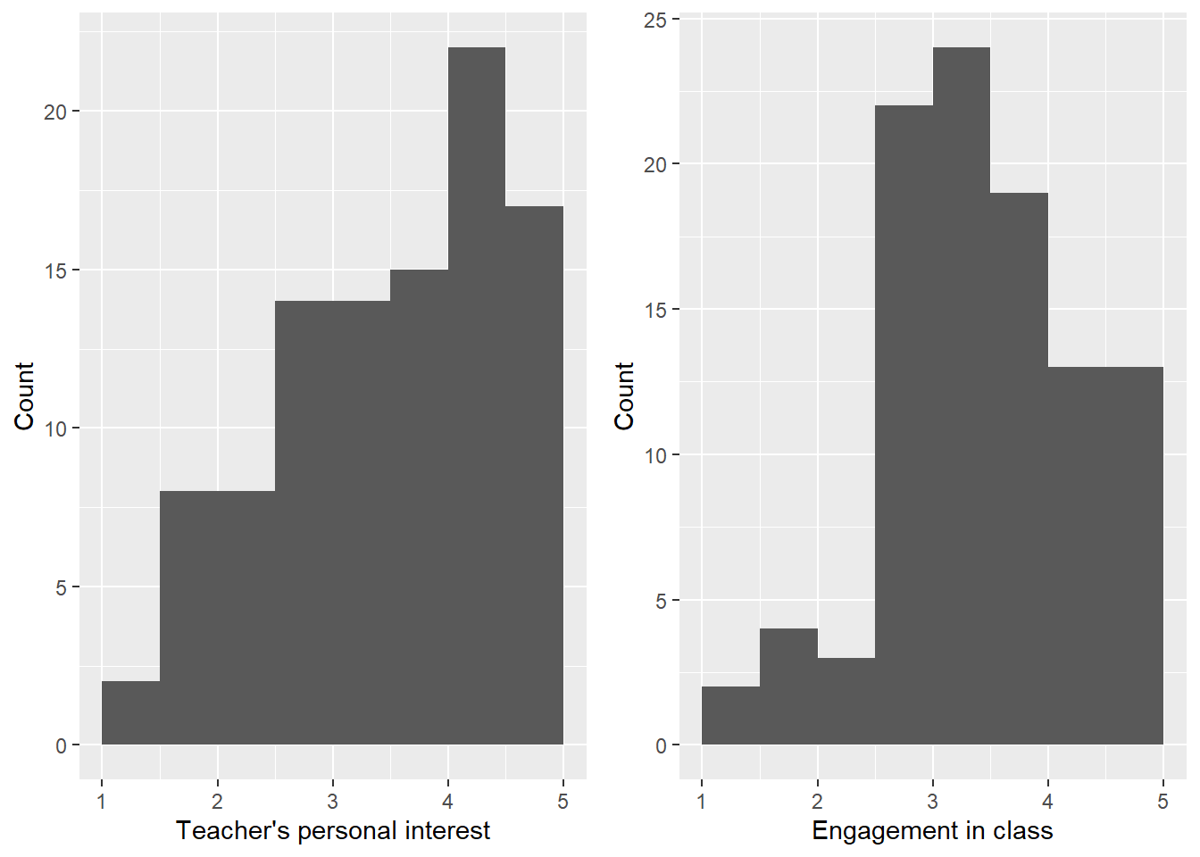
Before we start doing regression, we want to understand our data. We’ll start by examining histograms of personal interest and engagement. We display those in Figure 1. Responses to the interest scale are somewhat spread out, though there is a clear mode near 3, and possibly another one near 5. There is evidence of a ceiling effect on the interest scale; many students have the highest possible score. More substantively, many students rate their teacher’s personal interest in them as the highest possible value on the scale. The engagement scale has a clear mode near 4, and shows much less evidence of floor or ceiling effects. Both scales have slight negative skew. This is common in personality scales; frequently most respondents give high scores, but there’s a long tail of respondents giving lower scores.
Code
p1 <- nc %>%ggplot(mapping =aes(x = interest)) +geom_histogram(breaks =seq(1, 5, by = .5)) +labs(x ='Teacher\'s personal interest', y ='Count') +xlim(1, 5)p2 <- nc %>%ggplot(mapping =aes(x = engage)) +geom_histogram(breaks =seq(1, 5, by = .5)) +labs(x ='Engagement in class', y ='Count') +xlim(1, 5)grid.arrange(p1, p2, ncol =2)
Figure 1: Histograms of student scale scores for teacher’s personal interest and engagement.
Table 1 displays selected univariate descriptive statistics for the variables of interest. The mean scale score for INTEREST is 3.44, and the standard deviation is 0.96. The mean for ENGAGEMENT is very similar at 3.27. The standard deviation is fairly similar at 0.89.
Table 1: Univariate descriptive statistics
Variable
Mean
Standard deviation
INTEREST
3.44
0.96
ENGAGEMENT
3.27
0.89
Notice that these numbers are not especially meaningful by themselves. Without knowing the exact questions asked, it’s hard to say what level of engagement is reflected in a score of 3; even if we know the scale very well, it can be hard to make sense of the specific numbers that are attached to individual students. However, it is reasonable to say that a student with a 4 probably feels more engaged than a student with a 2, and if the mean is 3.27, then students with scores above this are more engaged than the average student.
The linear model
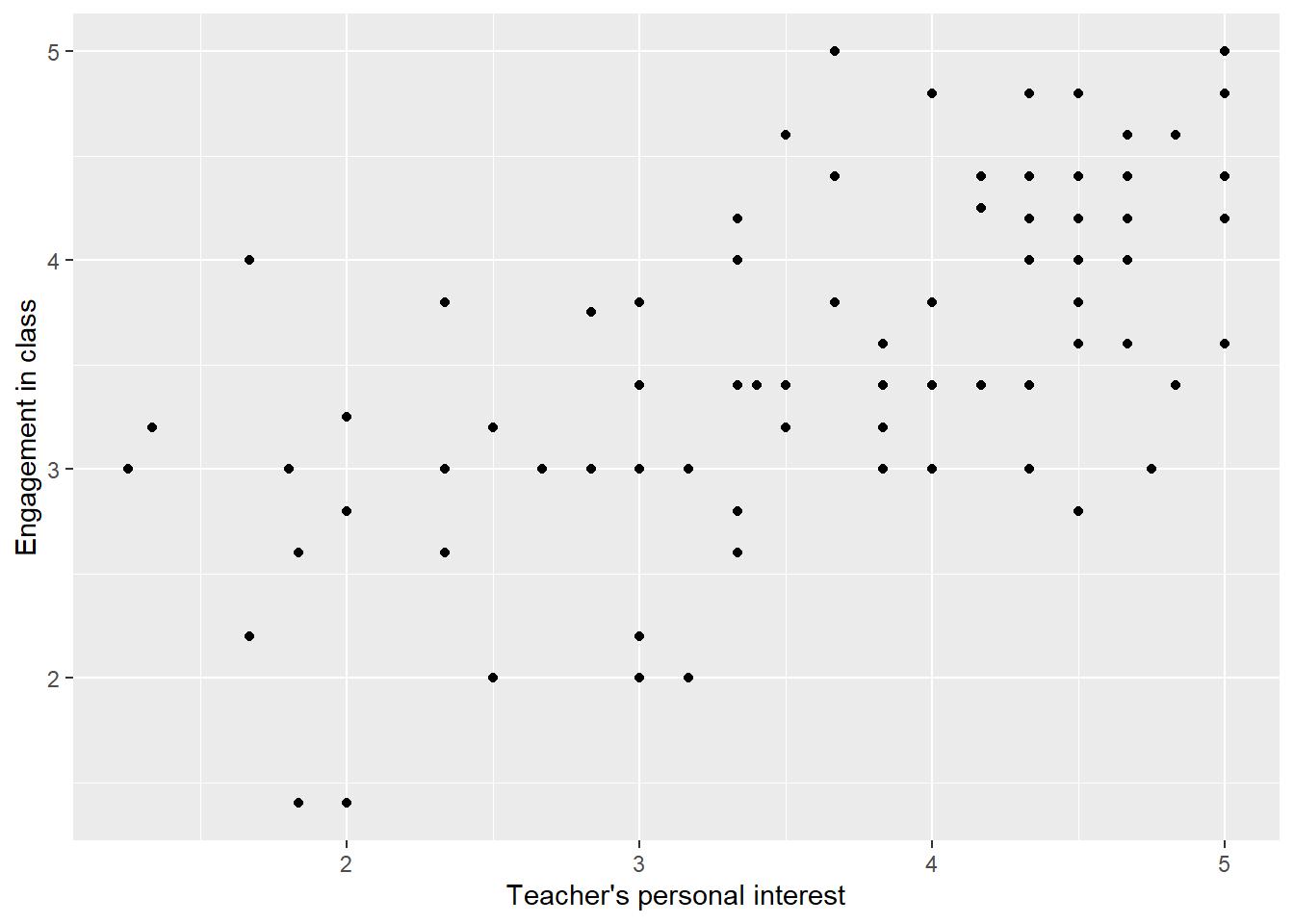
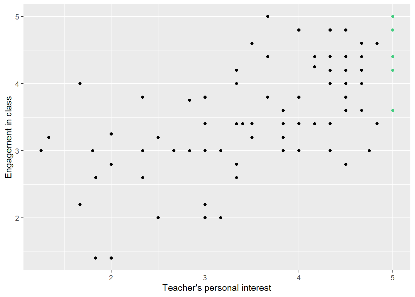
Figure 2 displays a scatterplot of student engagement against student perceptions of teacher personal interest. As before, each point represents a single student.3 The value on the x-axis represents the student’s scale score for teacher’s personal interest. The value on the y-axis represents the student’s scale score for student engagement in the class. For example, consider the point on the top right-hand side. It has an x value of 5 and a y value of 5. This student had a personal interest scale score of 5 and an engagement scale score of 5. Again, thinking substantively, this represents a student who thought that her or his teacher showed a great deal of personal interest, and who also felt extremely engaged in class.
Code
nc %>%ggplot(mapping =aes(x = interest, y = engage)) +geom_point() +labs(x ='Teacher\'s personal interest', y ='Engagement in class')
Figure 2: Scatterplot of student engagement against student perceptions of teacher personal interest.
One thing you’ve probably noticed is that there appears to be an association between INTEREST and ENGAGEMENT. Students who report that their teachers don’t take personal interest in them also tend to report that they themselves are not engaged in class. Similarly, students who report that their teachers take a great deal of personal interest in them also tend to report that they themselves are highly engaged in class. The association is not perfect. There’s one student with a scale score of five for personal interest and a score below 2.5 for engagement. At the same time, there’s one student with a personal interest scale score of close to 1 but an engagement score of almost 3. But on the whole, the two variables are positively associated. In statistics, this is the most we can hope for; we never expect an association to be perfect. People are too complex for perfect associations between pairs of variables; there’s always individual variability. However, even imperfect associations can be interesting to us as researchers.
The way we’ve thought about associations between pairs of numeric variables before is as a correlation. The correlation between these variables is .48, with a 95% confidence interval of (.32,.62). There is a strong positive association between the two variables, and the scatterplot suggests that the association is linear. The confidence interval indicates that the data are consistent with a range of population correlations, all of which are positive, though they range from fairly weak to quite strong.
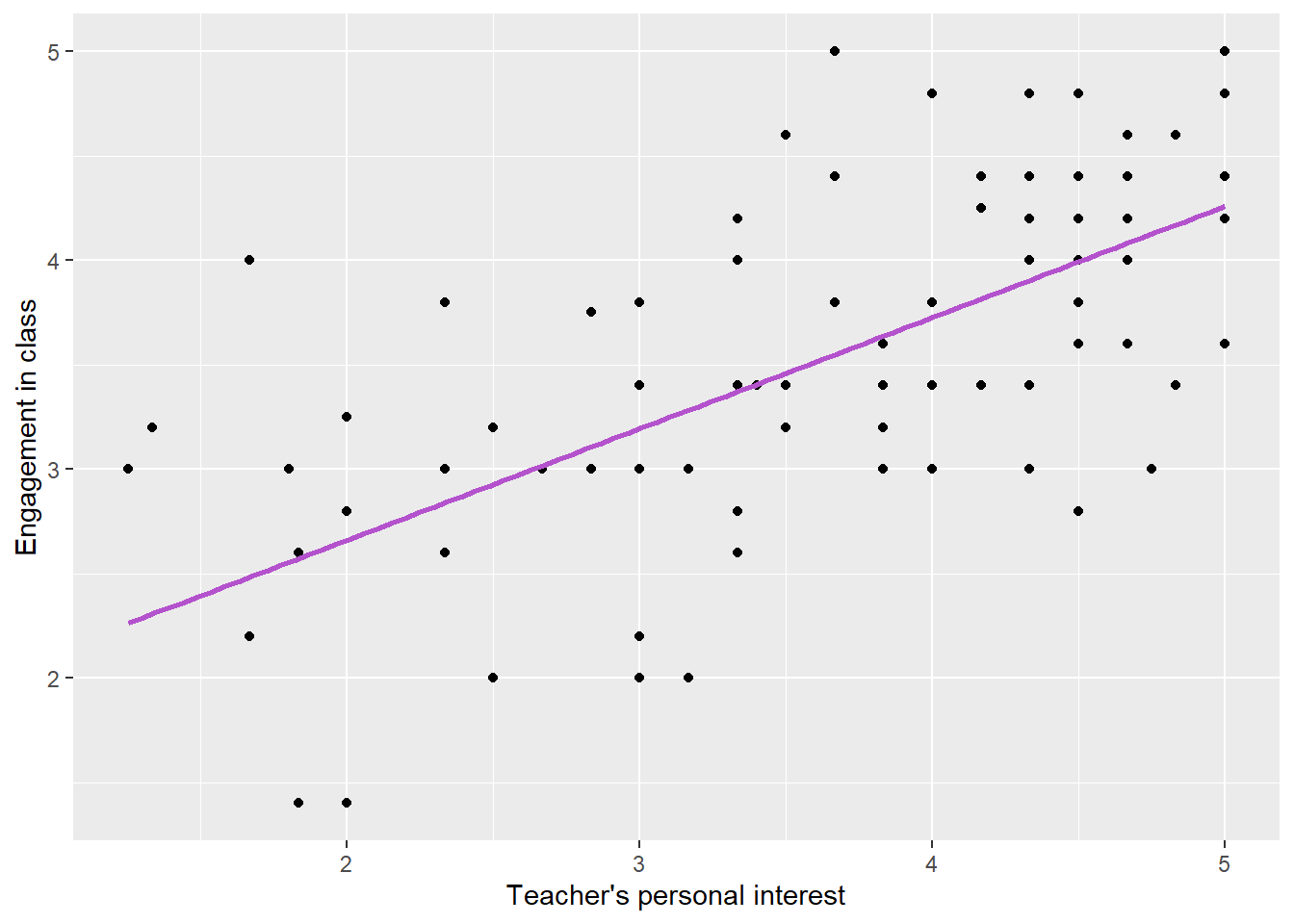
Now we’re going to introduce a new way of describing associations. Specifically, we’re going to talk about it in terms of a model. You may have noticed that it looks like we can describe the general association between INTEREST and ENGAGEMENT with a straight line. We can imagine drawing a line of best fit which captures the relationship between the two variables. Figure displays the same scatterplot as before, but this time with a line of best fit, also known as a regression line, overlaid on the scatterplot. The color of the line is “mediumorchid3”, which is one of the many awesome colors that R makes available to us. We would use “lightsteelblue4”, but you can’t handle “lightsteelblue4”….
Code
nc %>%ggplot(mapping =aes(x = interest, y = engage)) +geom_point() +geom_smooth(method ='lm', se =FALSE, col ='mediumorchid3') +labs(x ='Teacher\'s personal interest', y ='Engagement in class')
Figure 3: Scatterplot of student engagement against student perceptions of teacher personal interest with line of best fit plotted in “mediumorchid3”.
Later in this unit we’ll define the regression line a little more carefully and explain (somewhat roughly) how to calculate it. For now, however, we’ll say that it gives us the predicted value of ENGAGEMENT given a respondent’s values of INTEREST. That is, at any value of INTEREST, the line of best fit shows what our best guess of respondents’ levels of engagement would be. The guess is rarely, if ever, perfect. In fact, it will be wrong for almost everyone in the dataset. However, it represents our best possible guess.
As you might recall from algebra, we can specify any line with the equation
y = mx + b,
where m is the slope of the line and b is the intercept (we’ll talk about the slope and intercept more later on in this unit). The line is defined by every pair of values, x and y (usually written as (x, y)) which make the equation true. With the variable names we’re using in this example we would write
ENGAGEMENT_{i}=mINTEREST_{i} + b.
However, because we’re statisticians and want to prove that we’re special (because honestly, we don’t feel like we’re real mathematicians and we think they laugh about us behind our backs), we’ll instead write
ENGAGEMENT_{i}=\beta_{0}+\beta_{1}INTEREST_{i}.
The equation of this line represents our model for the association between engagement and personal interest. It expresses our belief that there is some line (not a curve) that we can use to predict values of ENGAGEMENT given values of INTEREST. We haven’t selected a specific line just yet, but we think that the shape of the association is linear.
ENGAGEMENT_{i} and INTEREST_{i} refer to the engagement and personal interest reported by student i, respectively. \beta_{0}, pronounced ‘bay-da not’ and written ‘beta nought’, is the intercept of the line while \beta_{1} (`beta one’) is the slope. Notice that we’ve introduced an asymmetry between engagement and personal interest which didn’t exist for correlations. We’ve written a student’s reported engagement in class as a function of her or his reported teacher’s personal interest. In statistics we refer to the variable on the left-hand side of the equation as the outcome, dependent variable, or response variable and the variable (or, in a later unit, variables) on the right-hand side as the predictor or independent variable. This may suggest that we believe that changes in the predictor cause changes in the outcome, but this is not necessarily the case. And as we’ve said before, even if we believe that changes in the predictor cause changes in the outcome, our analyses won’t show this. However, in doing regression analyses, we do need to decide which variable we want to treat as a predictor and which we want to treat as an outcome. This will also determine how we report our results, as we’ll see later.
It’s important to note that this line and the associated parameters describe the association in the population from which our sample has been drawn. The goal of regression analyses is typically to estimate the values of \beta_0 and \beta_1 from a finite sample; as with the other statistics we’ve looked at, we’ll use our sample to try to say something about the population from which it was taken.
Let’s take a minute to understand what how to make sense of these parameters. Our goal in doing data analyses is to make sense of the world, and a model is only useful if we can interpret it. We’ll start with the intercept, \beta_0. This parameter tells us the predicted value of ENGAGEMENT for respondents who report personal interest of 0. To see that, notice that if a respondent reports a personal interest of 0, then
ENGAGEMENT_i=\beta_0+\beta_1*0=\beta_0,
so we predict that ENGAGEMENT is equal to \beta_0 for students who report INTEREST of 0. For the current example, we estimate the intercept to be 1.72.4 Of course, this is hard to interpret directly because 0 is not a possible score for INTEREST; the scale only goes down to one. That’s fine, the line of best fit is just a mathematical abstraction and in order to be useful it needs an intercept, even if that intercept isn’t meaningful.
The intercept controls the height of the line of best fit, but it doesn’t tell us much about the association between the two variables, which is usually more interesting to us. That’s where the slope, \beta_1, comes in. You might recall from math classes that the slope is the difference in y caused by a one-unit difference in x. We have to be careful to avoid that sort of language in statistics, because it suggests that the association is causal. Readers might think that we were claiming that changing a student’s value of INTEREST will actually change their values of ENGAGEMENT. Instead, we say either that the slope is the difference in engagement associated with a one-unit difference in personal interest, or the predicted difference in engagement between two students who differ by one in personal interest.
To see why, consider two students, one of whom, student i, reports INTEREST to be some value INTEREST_0, and the other of whom, student j, reports INTEREST to be one higher, INTEREST_0+1. Then
So when two students differ by one unit (in this case, one scale-score point), we predict that they will differ by \beta_1 on engagement. This is how regression quantifies the association between a pair of variables. In our running example, the estimated slope of the line is 0.45.
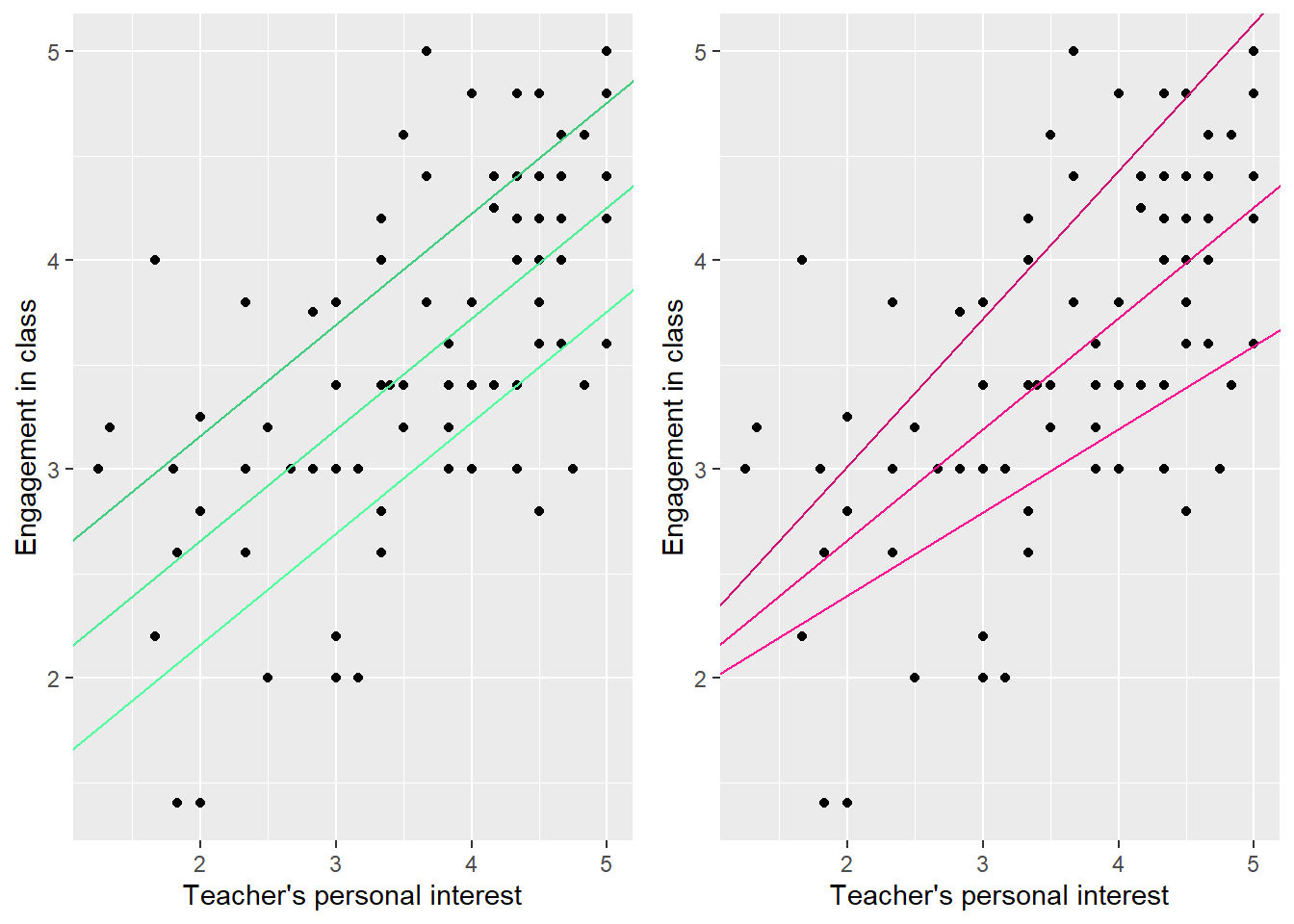
?@fig-varied_icepts_and_slopes shows how the line changes as we alter the intercepts and slopes. Notice how differences in the intercept shift the line up and down, but don’t change the association. Differences in the slope tilt the line up and down, meaning that the association becomes steeper or shallower as the slope changes.
Code
coefs <- nc %>%lm(engage ~ interest, .) %>%coef()p1 <- nc %>%ggplot(mapping =aes(x = interest, y = engage)) +geom_point() +geom_abline(intercept = coefs[1], slope = coefs[2], col ='seagreen2') +geom_abline(intercept = coefs[1] - .5, slope = coefs[2], col ='seagreen1') +geom_abline(intercept = coefs[1] + .5, slope = coefs[2], col ='seagreen3') +xlab('Teacher\'s personal interest') +ylab('Engagement in class')p2 <- nc %>%ggplot(mapping =aes(x = interest, y = engage)) +geom_point() +geom_abline(intercept = coefs[1], slope = coefs[2], col ='deeppink2') +geom_abline(intercept = coefs[1], slope = coefs[2] * .75, col ='deeppink1') +geom_abline(intercept = coefs[1], slope = coefs[2] *1.33, col ='deeppink3') +xlab('Teacher\'s personal interest') +ylab('Engagement in class')grid.arrange(p1, p2, ncol =2)
Figure 4: A demonstration of the effects of changing intercepts (left) and slopes (right). Colors are shades 2, 3, and 4 of “seagreen” and “deeppink”.
We need to be more precise about what we mean by the line of best fit, or the predicted value of engagement. If we can’t define the line of best fit, we won’t be able to find it. Recall that we can write the mean value of ENGAGEMENT as \mu_{ENGAGEMENT}, or \mu_{Y} for short. Now we want to introduce the concept of a conditional mean. The conditional mean of ENGAGEMENT at some value of INTEREST, say INTEREST_{0}, is the mean value of ENGAGEMENT for all students who report a value of teacher’s personal interest equal to INTEREST_{0}. If we refer to ENGAGEMENT as Y and INTEREST as X, then we can describe the conditional mean of Y at some value X_{0} as \mu_{Y|X}.5 Since we’re talking about \mu rather than \hat{\mu}, you know we’re discussing population means rather than sample means.
This is tricky concept, so let’s take a minute to illustrate. Remember that the sample mean of engagement, \hat{\mu}_{ENGAGEMENT} is equal to 3.27. Let’s assume that this is also the population mean, \mu_{ENGAGEMENT}. But now let’s look only at students who reported the highest value of teacher’s personal interest, INTEREST = 5. As we observed before, students who reported high values of teacher’s personal interest also tended to report high levels of personal engagement. If we only look at the students with the highest values of teacher’s personal interest, their mean value of engagement is much higher than the sample as a whole, 4.08 to be exact. This is the mean value of engagement conditional on teacher’s personal interest being equal to five (i.e., for students who report teacher’s personal interest of 5). Once again assuming that this is actually the population value, we can write it as \mu_{Y|X=5}.
The line of best fit in the population is defined to be the line which connects the conditional means of ENGAGEMENT at different values of INTEREST. Recall that the equation for the regression line is
ENGAGEMENT_i = \beta_0 + \beta_1INTEREST_i.
We described ENGAGEMENT_i as the predicted value of engagement for a student who reported a certain value of personal interest. Remembering that we’re referring to ENGAGEMENT as Y and INTEREST as X, another way to think of ENGAGEMENT_i is as \mu_{Y|X_i}. That is, the predicted value of engagement given a value of personal interest is the population conditional mean value of engagement at that value of personal interest. Basically, if all we know about person i is how much personal interest they think their teacher has in them, our best guess as to their level of engagement is the population mean of engagement for students with similar perceived levels of personal interest; in statistics our predictions are (almost) always conditional means.
If we don’t mind ugly formatting, we can reinforce this idea by writing the regression equation as
where \hat{ENGAGEMENT} is the predicted value of ENGAGEMENT for a student with a given level of INTEREST.
Notice that we’re making a very strong assumption here, namely that these mean values can be connected with a straight line. This assumption that is why we refer to our model as a linear model. The model that we’ve identified so far describes the association between INTEREST and ENGAGE, and we refer to it as the structural part of the model.
Stochastic models
Our model says that the predicted (or mean) value of ENGAGEMENT_i is equal to \beta_0 + \beta_1INTEREST_i. However, we don’t expect that this will be true for every single student. Observe in Figure 5, that there are multiple students with the same value of INTEREST all of whom have different values of ENGAGEMENT. For example, six students reported teachers’ personal interest of 5, but each of these students reported a different value of engagement, except for the two students who reported a 5. So far our model doesn’t allow for different students with the same value of personal interest to report different levels of engagement, but clearly this is unrealistic.
Code
nc %>%ggplot(aes(x = interest, y = engage)) +geom_point() +labs(x ='Teacher\'s personal interest', y ='Engagement in class') +geom_point(data = nc %>%filter(interest ==5), col ='seagreen3')
Figure 5: Scatterplot of student engagement against student perceptions of teacher personal interest.
This is why we need to add a random, or stochastic, part to the model. Specifically, we assume that
where \varepsilon_i is referred to as a residual. Each student has a residual, which is the amount by which the student’s actual value of ENGAGEMENT differs from the value predicted given their value of INTEREST. A positive residual indicates that the student reported a higher level of engagement than we would have predicted; a negative residual indicates that the student reported a lower level. A residual of 0 indicates that the student reported a value of ENGAGEMENT which was equal to the predicted, or conditional mean, value. We can think of residuals as expressing either how much our model missed by or as how any given student differs from an average student with the same level of INTEREST.
If our model is correct the residual is perfectly random conditional on the predictor. We assume that a student’s value of INTEREST can’t give us any information about her or his residual, although INTEREST is a key component of the structural part of the model.
This doesn’t mean that the residual is perfectly unpredictable. It’s possible, for example, that girls tend to have higher residuals than boys. That is it’s possible that girls with a given level of INTEREST tend to have more positive residuals than boys with the same level. In that case, knowing a student’s gender would help us to predict her or his residual, even if we know her or his value of INTEREST (we’ll talk about this more in later units). But the residual can’t be predicted from the predictor in the model.
One consequence of this is that the values of the predictor are uncorrelated with the residuals; there’s no linear association between a respondent’s value of the predictor and her or his residual because there’s no association at all.6
Adding a residual term to the model reflects the fact that even if we know a student’s value of INTEREST, there remains some uncertainty regarding her or his value of ENGAGEMENT. Our predictions may be good, but they won’t be perfect. Despite this, we can still talk about what happens on average, or how the two variables are associated with each other, because of the structural part of the model.
Fitting the model
We’ve discussed the linear model and described what \beta_0 and \beta_1 mean, but we haven’t explained how to calculate them.7 That’s what we’ll do in this section. It will be helpful to think of the regression line as the line of best fit, i.e., the line which comes closest to the values of ENGAGEMENT at any given value of INTEREST.
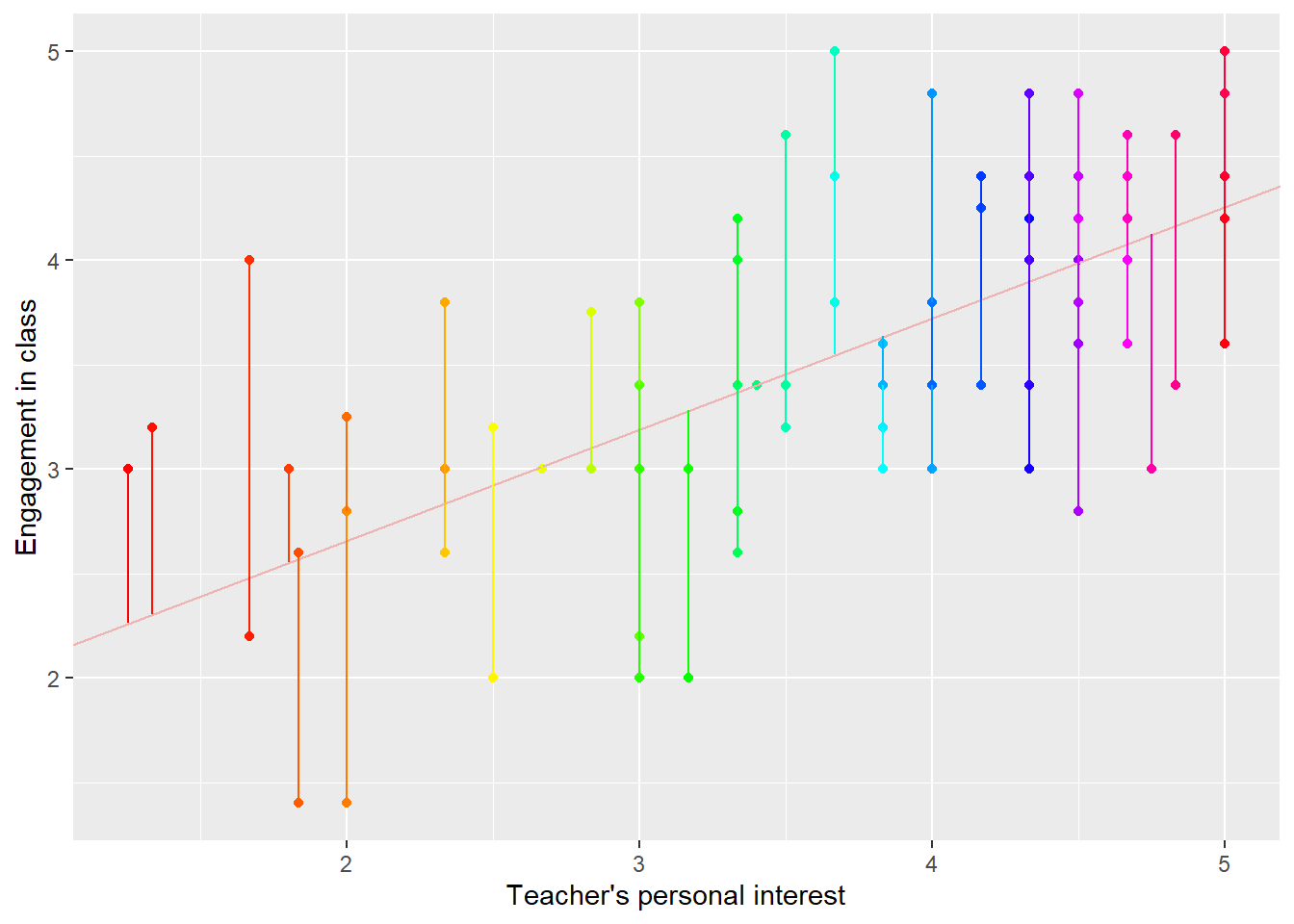
We’ll start by considering the residual. Remember that, for any individual i, given a predicted value of ENGAGEMENT_i, the residual is equal to the observed value minus the predicted value. This is illustrated in Figure 6; the lines from the true value to the predicted value indicate the residuals.
Code
nc <- nc %>%arrange(interest)mod <- nc %>%lm(engage ~ interest, .)nc$resids <-residuals(mod)nc$preds <-predict(mod)nc %>%ggplot(mapping =aes(x = interest, y = engage)) +geom_point(col =rainbow(nrow(nc))) +geom_abline(intercept = coefs[1], slope = coefs[2], col ='rosybrown2') +geom_segment(mapping =aes(x = interest, y = engage, xend = interest, yend = preds), col =rainbow(nrow(nc))) +labs(x ='Teacher\'s personal interest', y ='Engagement in class')
Figure 6: Scatterplot of residuals from the regression of student engagement on student reports of their teachers’ personal interest. Delightful colors are from R’s rainbow() function.
Remembering that residuals indicate misses, or badness of fit, the best fitting line should be the line which makes the residuals as small as possible. In statistics, this means making the variance of the residuals as small as possible (remember that the variance is the square of the standard deviation). This is worth reiterating: the line of best fit, or regression line, is the line which minimizes the variance of the residuals. This might sound a little surprising, because we’ve just said that the regression line is the line which connects the conditional means of the outcome. The fact is that these two lines are one and the same thing! The line which runs through the population mean values is the line which minimizes the variance of the residuals.
This criterion for fitting models is referred to as ordinary least squares, or OLS. It’s the most popular way to define a line of best fit, especially in applied data analysis, though it requires us to make multiple strong assumptions, which we’ll review in a later unit.
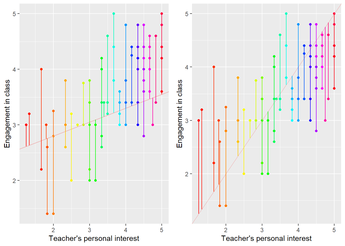
Figure 7 shows a pair of possible regression lines which do not minimize the variance of the residuals. Notice that the lines don’t appear to fit the data as well as the correct regression line in @fig:residual_plot. They don’t appear to capture the true association between INTEREST and ENGAGEMENT; the line on the left is too shallow and the line on the right is too steep. But another way to see the problem is that the residuals are larger and more variable in Figure 7 than in Figure 6.
Code
xy1 <-c(2.3,.25)nc$preds1 <- xy1[1] + xy1[2]*nc$interestxy2 <-c(0,1)nc$preds2 <- xy2[1] + xy2[2]*nc$interestp1 <- nc %>%ggplot(mapping =aes(x = interest, y = engage)) +geom_point(col =rainbow(nrow(nc))) +geom_abline(intercept = xy1[1], slope = xy1[2], col ='rosybrown2') +geom_segment(mapping =aes(x = interest, y = engage, xend = interest, yend = preds1), col =rainbow(nrow(nc))) +labs(x ='Teacher\'s personal interest', y ='Engagement in class')p2 <- nc %>%ggplot(mapping =aes(x = interest, y = engage)) +geom_point(col =rainbow(nrow(nc))) +geom_abline(intercept = xy2[1], slope = xy2[2], col ='rosybrown2') +geom_segment(mapping =aes(x = interest, y = engage, xend = interest, yend = preds2), col =rainbow(nrow(nc))) +labs(x ='Teacher\'s personal interest', y ='Engagement in class')grid.arrange(p1, p2, ncol =2)
Figure 7: Scatterplot of residuals from two incorrect regression lines of student engagement on student reports of their teachers’ personal interest. Delightful colors are (still) from R’s rainbow() function. Remember that just because you can use a lot of graphical options doesn’t mean that you should.
Sometimes we say that the regression line is the line which minimizes the sum of squared residuals/residual sum of squares or SSR. The sum of squared residuals is calculated by squaring each residual and adding them together. This definition of the regression line is also correct; the two conditions are the same. To see this, remember that the formula calculating variance is
But the mean residual must be equal to 0; a residual greater or less than 0 would indicate that we were consistently under- or over-predicting the outcome, which would mean that we could find a better line of best fit which would come closer to the outcome. So, when working with residual, we can rewrite the equation for the variance of the residuals as
Now notice that the numerator is the sum of squared residuals; whatever regression line minimizes the variance of the residuals will also minimize the residual sum of squares. Although it’s traditional to talk about regression lines in terms of minimizing the SSR, we prefer to discuss it as minimizing \sigma^2_\varepsilon (the variance of the residuals) because variance, unlike SSR, is a useful concept in its own right.
We omit the details of how to actually calculate the line of best fit (although we put it in the appendix in case you’re interested); it’s easy for a computer, only involving some simple algebra, but somewhat challenging and extremely tedious to do by hand.
Note that there is single regression line which minimizes the variance of the residuals, and therefore a single line of best fit.
Summarizing model explanatory power: R^2
It would be handy to have a way to summarize how well our model predicts the outcome, in this case students’ self-reported engagement. The statistic that we use for this purpose is R^2, or “R-squared”.
We’ll present three different ways to think about R^2. The first is in terms of variance. We can think of the variance of the outcome, \sigma^2_{ENGAGEMENT}, as the total amount of uncertainty we have about the students’ self-reported engagement. In our present example, this value is equal to 0.79, which is also defined as the square of the standard deviation. We can think of the variance of the residuals, \sigma^2_\varepsilon, as the amount of uncertainty we have about the outcome, after we account for the value of the predictor (remember, one goal of modeling is to use the predictor to reduce our uncertainty about the outcome). The variance of the residuals is always less than or equal to the variance of the outcome; after accounting for the predictor, our predictions always improve on average, or at least they never get worse. We could calculate this by taking all of the residuals in the dataset and finding their variance.
Then consider the quantity \sigma^2_{MODEL}=\sigma^2_{ENGAGEMENT}-\sigma^2_\varepsilon.8 This is basically a summary of how variable our predictions are. Remembering that \sigma^2_{ENGAGEMENT} is the total uncertainty we had about the outcome before we accounted for the predictor, and \sigma^2_\varepsilon is the uncertainty about the outcome remaining after we accounted for the predictor, we can also think of \sigma^2_{MODEL} as the uncertainty about the outcome which is explained by the model, or, alternately, which is associated with the predictor.
The problem with trying to interpret \sigma^2_{MODEL} is that it’s scale dependent; unless we know the scale on which the outcome is measured and the original variance, \sigma^2_{ENGAGEMENT}, we’ll have a hard time making sense of whether \sigma^2_{MODEL} is large or small. Instead, consider the ratio,
The numerator is the total uncertainty about the outcome which is explained by the model, while the denominator is the total uncertainty that we had to explain. Then R^2 is the proportion of uncertainty (or variability or variation) about the outcome which is explained or accounted for by the model, or associated with the predictor. R^2 is bounded below by 0 and above by 1; we can’t explain less than none or more than all of the uncertainty. Higher values indicate that the model has explained more of the uncertainty.
A similar way of calculating and describing R^2 uses sums of squares. Remember that the sum of squares residual, or SSR, can be calculated as SSR=\sum\varepsilon_i^2 Similar to the variance of the residual, the SSR can be thought of as summarizing the total uncertainty about the outcome after accounting for the predictor. We can also define the sum of squares total/total sum of squares or SST as
SST=\sum(Y_i-\mu_i)^2
This is the numerator of the variance of the outcome, and can be thought of as the total uncertainty about the outcome before accounting for the predictor. The difference between these two, the sum of squares model/model sum of squares or SSM, can be thought of as the amount by which we’ve reduced the uncertainty about the outcome by accounting for the predictor. We can define the model sum of squares as SSM = SST - SSR Once again, the SST is always at least as large as the SSR, so the SSM is always positive. Then we define R^2 as R^2 = \frac{SST - SSR}{SST} = \frac{SSM}{SST}, and can think of it as the proportion of the uncertainty about the outcome which is accounted for by the predictor. You’ve probably noticed that this approach is perfectly parallel to the one before using \sigma^2_{\varepsilon}, \sigma^2_{ENGAGEMENT}, and \sigma^2_{MODEL}. Once again we prefer the approach using the variances because it’s intuitive and because variances are important in their own right. On the other hand, SSR, SSM, and SST are used extensively in statistics when discussing R^2, so we present this approach as well.
There’s one more way to arrive at R^2. Notice that a value summarizing how well our model predicts the outcome also summarizes the strength of the association between the predictor and the outcome; the greater the value of R^2 the stronger the association between the predictor and the outcome. Another measure we have of the strength of the association between two variables is the correlation between the two. If we let the correlation between INTEREST and ENGAGEMENT be \rho, then
\rho^2=R^2
If we take the correlation between the predictor and the outcome and square it, the result will be the R^2 value from a regression of the outcome on the predictor. On the other hand, correlation is non-directional; the correlation between INTEREST and ENGAGEMENT is exactly the same as the correlation between ENGAGEMENT and INTEREST. This means that the value of R^2 from a regression of INTEREST on ENGAGEMENT is exactly the same as the value of R^2 from a regression of ENGAGEMENT on INTEREST. Put more substantively, the proportion of the variability of ENGAGEMENT which is associated with INTEREST is identical to the proportion of the variability of INTEREST which is associated with ENGAGEMENT. Cool!
It turns out that the sample R^2 is a biased estimate of the population R^2. This is because the sample line of best fit will always be closer to the observed values than the population line of best fit (because the sample line of best fit is the best fitting line possible for these particular values, and will always be a little closer than the population line). Therefore, we sometimes report the adjustedR^2. The adjusted R^2 is adjusted for over-fitting, is always less than the sample R^2 (and is sometimes negative when the unadjusted R^2 is very close to 0), and sometimes decreases as we add predictors.9 With large samples and simple models, the R^2 and the adjusted R^2 will tend to be extremely close.
In our running example, R^2 = .23, indicating that roughly one-quarter of the variability of student engagement is associated with student perceptions of teacher personal interest. This is considered a moderately strong association in the social sciences, though larger than many that we will encounter.
The population model v.s. the fitted model
Remember that the goal of regression is usually to estimate the intercept and slope of the regression model in the population, \beta_0 and \beta_1. So far we haven’t differentiated between the true values, which are the model parameters, and the values that we estimate from the sample. We’ll do so now.
When we’re talking about the population model, we’ll refer to \beta_0 and \beta_1. When we’re talking about the fitted model, we’ll refer to \hat{\beta}_0 and \hat{\beta}_1. The hats indicate that these are estimated values, not the true population parameters, which we can never know. We always assume that the estimated values are at least slightly different than the true population values. In the next unit, we’ll learn how to quantify that uncertainty and to test null-hypotheses about the population parameters.
Two distinguishing features of the population model are that it is written using population parameters, \beta_0 and \beta_1, and that it includes the residual, \varepsilon. In contrast, the sample model is usually written as
although sometimes we replace \hat{\beta}_0 and \hat{\beta}_1 with their actual estimated values (that is, we write the actual numbers). \hat{ENGAGEMENT}_i is the predicted value of ENGAGEMENT for person i (it doesn’t really matter who person i is, we just want to indicate that we’re referring to individual units). Notice that this sample model has no residual term since the residual is unpredictable by definition. These aren’t the only possible ways to write the population and sample models, but they’re representative. A course document, understanding_models.pdf goes into a little more detail about how to think about and write these models, including explaining the subscripts in a little more detail.
As we’ll discuss in more detail the next unit, the reason we care about the sample line of best fit is that it’s our best guess at the population line of best fit. In and of itself it’s rarely interesting at all, but as an estimate of the population line of best fit it’s very useful.
Residual standard deviations: \hat{\sigma}_\varepsilon
We can calculate the variance of the residuals (technically the errors) around the sample line of best fit, but this is only an estimate of the population variance, \sigma^2_\varepsilon. It’s imprecise because, first, we only observe n residuals of a theoretically infinite population and, second, the regression line is not the true line of best fit. This means that the sample residuals will tend to be smaller than the population residuals; they’re slightly closer to the sample line of best fit than they are to the population line of best fit. We estimate the variance of the residuals as
The denominator is n-2 because the sample residuals are systematically smaller than the population residuals (remember, the residuals are closer to the sample line of best fit than they are to the population line of best fit). We correct for this by making the denominator somewhat smaller than the number of points. We discuss this issue in a little more depth in the context of degrees of freedom in Unit 5. In multiple regression models, we replace n - 2 with n - p - 1, where p is the number of predictors in the model.
We’re usually more interested in the standard deviation of the residuals, \hat{\sigma}_\varepsilon, which is equal to the square root of the variance. That is,
This value is also referred to as the Root Mean Squared Error, or RMSE. This is because we find it by taking the square root of the mean of the squared errors. The name is wonderfully descriptive, if a little wordy. This is the output you’ll see in Stata; R refers to it as the residual standard error. Confusingly, another term for this quantity is the standard error of the estimate. We’ll call it the standard deviation of the residuals, because that’s what it is and we reserve the term standard error for something very different. We’ll discuss standard errors in the next unit.
Notice that we’ve used these already in calculating R^2. In this example, the Root Mean Squared Error is 0.78. Remember, by itself this number is meaningless; we need to know the variance of the outcome to give it context.
Summary
We’ve spent a lot of time in this unit trying to build intuition around some of the important concepts in linear regression. However, we don’t want to lose sight of the overall goal of conducting a regression analysis. Our goal is almost always to estimate \beta_1, the slope of the regression line, since this is the parameter which tells us the association between the predictor and the outcome. Keeping that in mind, let’s review how to interpret \beta_1. \beta_1 can be thought of as either the average difference in the outcome associated with a one-unit difference in the predictor or, equivalently, as the predicted difference in the outcome between two students who differ by one on the predictor. Basically, we think that one average, in the population, units which differ by 1 in terms of X differ by \beta_1 in the outcome.
There are subtly two important parts of that statement. First, we’re talking about differences on average. Not every two people who differ by 1 on perceived personal interest will differ by exactly \beta_1 on engagement; we’re dealing with stochastic relationships, and there’s a great deal of individual variability around the mean. Second, we’re describing the population. \beta_1 is a population parameter, and may not be identical to the sample estimates.
Here’s how we might summarize our analysis:
We were interested in determining the association between students’ reports of the personal interest their teachers took in them and their reported engagement in those teachers’ classes. We fit a regression of engagement on personal interest. The fitted regression equation was ENGAGEMENT_i = 1.72 + 0.45INTEREST_i. This indicates that a one scale-point difference in students’ reports of their teachers personal interest in their students predicts a one-half scale point difference in students’ reported engagement in those teachers’ classes; students who think their teachers care about them tend to be more engaged in those classes. The R^2 for the model was .23, indicating that 23% of the variability in students’ reported engagement was associated with the reports of their teachers’ personal interest in them. The remaining 77% of the variability in reported engagement was not associated with perceptions of teachers’ personal interest.
Appendix
Communicating our results
When we communicate our results to lay audiences, we have to be careful that we are not only clear, but that we also take steps to ensure that we’re not misinterpreted. In our experience, language that involves words like “change’‘, “increase’‘, or “decrease’’ can often sound like we’re making causal claims, even if we don’t intend to. For example, if we claimed that a one scale-point increase in students’ reports of their teachers’ interest in them resulted in a half scale-point increase in their reported engagement, many readers would think that this was a causal claim. They might think that changing students’ values on the predictor would actually change their values on the outcome. That’s why we try to restrict ourselves to talking about”differences’’ being associated with”differences’’. It’s not only for our own benefit or for other statistically sophisticated academics, it’s also for reporters and policy makers who might not be alert to potential pitfalls associated with making causal inferences from correlational data.
In addition to being careful with our language, we should be proactive about pointing out when our analyses do not support causal claims. We might even consider giving alternative explanations for the results. We might add a clarification to our summary paragraph, stating “Although our results are consistent with a hypothesis that perceiving personal interest from their teachers led students to be more engaged in their classes, this is not the only possible explanation for our results. It is also possible that students who are more engaged in class cause their teachers to show more personal interest in them. Alternately, it could be that both variables are associated with some third variable, such as student academic ability.”
Even if you choose not to include these caveats in your write-ups, they can be helpful to keep in mind as you conduct your analyses. Brainstorming alternative explanations for your results can help you understand what you have and have not found, and can help you think of additional analyses to conduct.
The optimization criterion
In regression we define the line of best fit as the line which minimizes the variance of the residuals, or the sum of the squared residuals (this is sometimes referred to as our optimization criterion, since it’s the thing we’re trying to optimize). Why this is our target may not be perfectly clear. For example, we might instead choose to minimize the sum of the absolute values of the residuals. One of the most compelling reasons for minimizing the sum of the squared residuals is that it’s very easy (for a computer, but also for a human) to find the line which does this. Minimizing the sum of the absolute values of the residuals is a much trickier problem. There are many other good reasons to try to minimize the sum of squared residuals, but keep in mind that this criterion is a choice that we make as statisticians; there’s nothing magic about it.
Correlations and regressions
It turns out that a correlation coefficient is closely linked to the slope of a regression. Suppose we have two variables. We standardize them by subtracting the variable’s mean from each observation, and then dividing by the standard deviation (remember, we earlier described this turning observations into z-scores). We write this as
x_{i}^{std}=\frac{x_i-\bar{x}}{s_x}.
Then the slope of the regression of y^{std} on x^{std}, \beta_1 is equal to the correlation between x and y, r_{x,y}. What’s more, this is also equal to the slope of the regression of x^{std} on y^{std}. In fact, the equations of the regressions will be
\hat{y}_i^{std} = r_{x,y}x_i^{std},
and
\hat{x}_i^{std} = r_{x,y}y_i^{std}.
The correlation is the slope of a regression between two variables when both are on a standardized scale. When we do this standardization, the intercept is guaranteed to be 0, because at the mean value of the predictor, we always predict that the outcome will be equal to its mean; this is a consequence of using a linear model for the outcome.
Regression math
Just in case you’re interested, we’ll cover how we actually fit a regression model. None of this material is even remotely required. BUT IT SURE IS AWESOME!!! We’ll use an extremely simple example.
Suppose we have four students who report INTEREST of 2, 3, 3, and 4, and report ENGAGEMENT of 2, 2, 4, and 3. We first need to form a 4 \times 2model matrix, which you can think of as a rectangle with 4 rows and 2 columns; the first column is all 1’s, and represents the intercept (every observation has the same intercept, so we can think of it as a variable on which every unit has a value of 1); the second has the values of the predictor, INTEREST. We can write this as
When they’re the right sizes, matrices can be multiplied together; square matrices (matrices with the same number of rows and columns) can (usually) be inverted, which is sort of like dividing 1 by the matrix. When we have an invertible square matrix, Z, we represent its inversion by Z^{-1}. When we pre-multiply a matrix by its transpose (X^TX) (with matrices, AB is not the same as BA, so we need to be very clear about which one comes first), this is something like squaring the matrix, and always results in a square matrix.
Now the equation for the regression coefficients can be written as
Math: it’s awesome (but seriously, you wouldn’t want to do these computations by hand. Be glad that your computer is willing to do them for you, and, like, give it a cookie or something).
Displaying a regression in a table
There are many different ways to display regression results, however there are some standards. Tables should typically include the coefficients from the fitted regression model (sometimes we omit coefficients that aren’t especially interesting when presenting complex models), as well as some statistic indicating the quality of the predictions. The model R^2 is a good choice to represent overall quality of fit, though some people prefer the residual standard deviation, \hat{\sigma}_\varepsilon. Coefficients should be accompanied by estimates of uncertainty, either standard errors or confidence intervals; we’ll talk more about those two things in the next unit. You should also include the sample size somewhere. Table @tbl:regression_table shows an example of such a table. I used the texreg package in R to make it, though the stargazer package is also nice, and Stata has packages which provide similar functionality.
Table 2: ======================= Model 1
———————– (Intercept) 1.60 (0.24)
interest 0.53 (0.06)
———————– R^2 0.42
Adj. R^2 0.42
Num. obs. 100
======================= *** p < 0.001; ** p < 0.01; * p < 0.05
Code
library(texreg)screenreg(mod)
Common misconceptions
Here are some common misconceptions that you might have coming into the class.
A model has a high R^2 value, so the variables must have a causal association. Nuh-uh! This is not correct. R^2 is another way of expressing the correlation between a pair of variables, although it also has a specific interpretation as the proportion of variability in one variable which is associated with, or explained by, the other variable. Since correlation doesn’t imply causation, neither does R^2. Boom! As a practical example, the R^2 from a regression of reading ability on height is probably very high for elementary schoolers. This doesn’t indicate that being tall makes kids read better (or that reading well makes kids taller); children in higher grades are both taller and better readers. Don’t confuse correlation with causation! One way to show that this is a misconception is to note that the R^2 from a regression of X on Y is the same as the R^2 from a regression of Y on X; we can’t use this evidence to show both that X causes Yand that Y causes X! It wouldn’t be decent!
It’s impossible to demonstrate a causal relationship using statistics. In this class we spend a lot of time talking about when it’s inappropriate to talk about causality. This is because, in our experience, students (and journalists, policy makers, social scientists, and even ourselves) tend to be far too quick to see causal relationships in their data. However, given the right design and analytic approaches, it is possible to demonstrate that a relationship is causal. For now, however, we suggest that you treat all evidence as correlational unless it comes from a randomized, controlled experiment. Again, there are other designs which allow us to establish causality, we’re just not going to cover them in this class.
We can only use regression if the outcome is caused by the predictor. It’s tempting to think that, since we call ENGAGEMENT the outcome, we must be claiming that it’s caused by INTEREST. However, the math behind regression works perfectly well even if the only association is correlational. We typically select the outcome based on the research question we want to answer; we’ll talk more about this in Unit 9. We might also select a model that represents how we think about the variables, even though all that our methods can do is infer association. For this analysis, things would have worked just as well if we had used INTEREST as the outcome and ENGAGEMENT as the predictor. We would have gotten different coefficients, which we would have interpreted in different ways, but it still would have been an appropriate analysis.
Students were asked to report on the teacher and the class in which the survey was administered.↩︎
Or possibly more than one; if multiple students have the exact same values for both INTEREST and ENGAGEMENT then their points will be stacked on each other. In this plot we made points partially transparent; the more students that have the exact same values of both variables, the darker those points will appear.↩︎
We do this because the formatting looks really awful when we write out INTEREST and ENGAGEMENT. \mu_{ENGAGEMENT|INTEREST}. Yuck.↩︎
In fact, we can guarantee that the residuals from the line of best fit are uncorrelated with the predictor. A later unit will demonstrate how to check other assumptions we make.↩︎
Of course, we’ve sort of done this already in defining the regression line as the line which connects the conditional mean values of ENGAGEMENT. On the other hand, given an actual dataset, it’s not clear how we would find that line.↩︎
Note that this is sort of an abuse of notation; \sigma^2_{MODEL} isn’t really a thing.↩︎