library(mvtnorm) # for generating values from a multivariate normal distributionlibrary(dplyr) # for the pipe (%>%)library(ggplot2) # for plotslibrary(gridExtra) # for combining plotslibrary(emojifont) # for cat emojisset.seed(5152009)N <-72# generating toy dataouts <-rmvnorm(N, c(3, 100), sigma =matrix(c(1, 0, 0, 20), nrow =2) %*%matrix(c(1, .22, .22, 1), ncol =2) %*%t(matrix(c(1, 0, 0, 20), nrow =2)))math <- outs[, 2]sob <- outs[, 1]math <-round(math)sob <-round(sob,1)sob[sob >5] <-5sob[sob <1] <-1
These course notes should be used to supplement what you learn in class. They are not intended to replace course lectures and discussions. You are only responsible for material covered in class; you are not responsible for any material covered in the course notes but not in class.
Overview
Correlation
Misuses (?) of correlations
Correlation v.s. causation
The Neyman-Rubin causal framework
Appendix
Causation in depth
Correlation
Regression gives us a powerful tool for describing the association between a pair of variables. However, it has the limitation that it’s scale-dependent; slopes can be hard to interpret unless we have a good understanding of what the predictor and outcome mean. But when we do regression with psychological scale scores, we frequently lack a good sense of what a one-unit unit difference on the scale actually means. Regression also requires that we select one variable as the outcome, and the other variable as a predictor. This often makes sense, but sometimes we just want to measure how closely connected two variable are, without assigning special roles to the variables.
In this unit, we’ll explore correlations a little further; correlations are useful, scale-independent statistics for quantifying the association between a pair of numeric variables.1 Correlations are also symmetric; the correlation between X and Y is the same as the correlation between Y and X. The rest of this unit will be revolve around understanding what a correlation is, and distinguishing correlation from causation. This unit includes an extensive section after the appendix explaining what causal inference entails. You don’t need to learn all of this for S-040, but it may be useful to you.
For our running example in this unit, we’re using a sample of students taken from a high school school in Arizona. Researchers administered a survey to the students, measuring them on a series of psychological variables. They calculated scale scores as described in Unit 3. One of the scales on the survey measured students’ sense of belonging at school, i.e., the extent to which they felt like valued members of their school community. Students’ responses were linked to their scores on an Arizona state math test. Based on previous research in different settings, researchers predicted that students who felt greater sense of belonging would also tend to have higher scores on the math test, for a variety of reasons. Our sample has 72 participants. We’ll refer to the math scores variable as MATH, and the sense of belonging variable as BELONG. These data are simulated, but they’re based on research in a real school, which is cool.
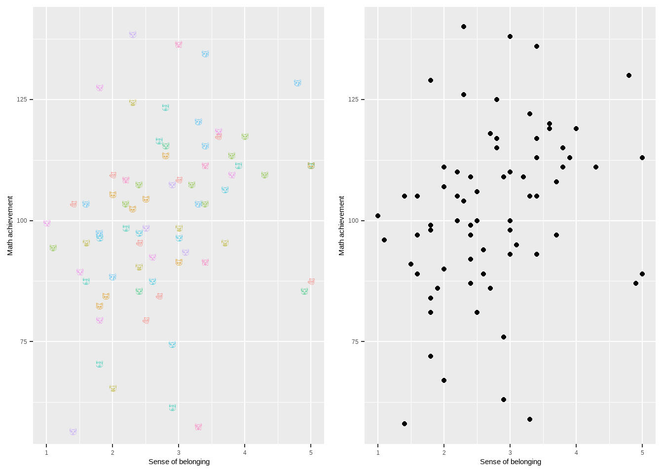
We display a scatterplot of the two variables in Figure 1; we’ve seen this in Unit 3, but we’ll review here. The two plots are identical except for the plotting character used. Each cat face/circle represents a single student in the sample. The x-coordinate of the plotting character indicates that student’s sense of belonging, while the y-coordinate represents the same student’s math score. Dots which are on the far right represent students who reported very high sense of belonging. Dots which are very high represent students who score very high on the state test. We say that we have ‘scattered’ or ‘plotted’ math score ‘on’ or ‘against’ or ‘versus’ sense of belonging. The choice of which variable goes on the x-axis and which on the y-axis is arbitrary for calculating a correlation. However, we think of sense of belonging as a predictor and grades as an outcome (possibly incorrectly), and we traditionally put predictors on the x-axis and outcomes on the y-axis.
Code
cats <-emoji(sample(search_emoji('cat')[!search_emoji('cat') %in%c('octocat', 'heavy_multiplication_x')], length(math), replace =TRUE))my_dat <-data.frame(sob = sob, math = math, label = cats)cats <- my_dat %>%ggplot(aes(x = sob, y = math, label = label, color = label)) +geom_text(family ='EmojiOne') +theme(legend.position="none") +labs(x ='Sense of belonging', y ='Math achievement')plot <- my_dat %>%ggplot(aes(x = sob, y = math)) +geom_point() +labs(x ='Sense of belonging', y ='Math achievement')grid.arrange(cats, plot, ncol =2)
Figure 1: On the left is a scatterplot of math score against sense of belonging. This is technically a catterplot, because we’re plotting cats. I so wish that I were responsible for this joke/concept, but I’m not. Colors and cat faces are random. There’s actually a package in R called CatterPlot which exists solely to make it easier to create scatterplots using cats. This figure, however, is just ggplot, using the emojifont package to plot cats. On the right is a more traditional scatterplot.
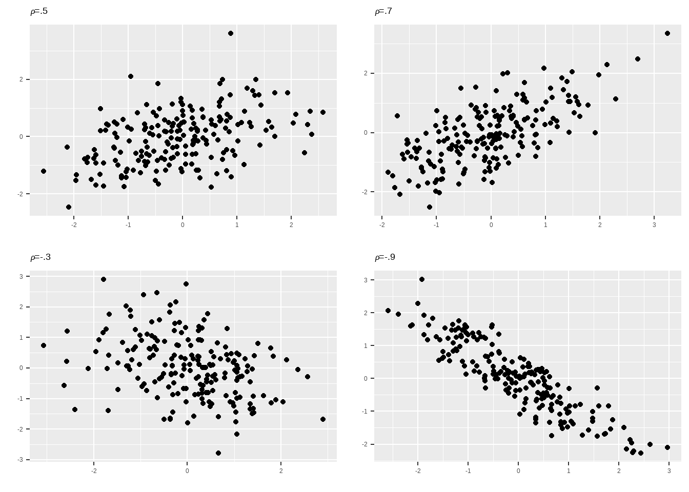
Recall that we denote the correlation (sometimes coefficient of correlation) as \rho (pronounced ‘roh’) when we’re referring to the population parameter, and as either \hat{\rho} or r when we’re referring to the sample statistic. To give you a sense of what different correlations look like, Figure Figure 2 shows scatterplots of samples drawn from hypothetical populations with correlation coefficients of .5, .7, -.3, and -.9.
Figure 2: Scatterplots drawn from populations with various correlation coefficients. We won’t use catterplots so much any more, even though they’re wicked funny.
One convention common in the social sciences is to refer to correlations of around \pm.3 as weak, correlations of around \pm.5 as moderate, and correlations of around \pm.7 as strong. In our experience, correlations of \pm.7 are unusual when working with data measured at the student level, and frequently indicate that the two variables are measuring almost the exact same thing (students’ math scores in 8th grade and their math scores in 9th grade might have a correlation above .7, because math ability in 7th grade is highly predictive of math ability in 8th grade).
In our running example, the correlation between sense of belonging and math scores is .29, indicating a weak linear association between student sense of belonging and math scores.
It turns out that correlations are closely linked to regression slopes. For starters, suppose we fit the model
Here MATH_i indicates the math score of student i, while BELONG_i indicates the sense of belonging score. We’ll refer to the correlation as \rho. We’ll refer to the standard deviations of MATH and BELONG as \sigma_{MATH} and \sigma_{BELONG}, respectively.2 Then it turns out that
The slope of the regression is equal to the correlation (the strength of the association) multiplied by the standard deviation of the outcome (the scale of the outcome) and divided by the standard deviation of the predictor (the scale of the predictor). As you can guess, if we were to take \rho\times\frac{\sigma_{BELONG}}{\sigma_{MATH}}, this would give us the slope of a regression of sense of belonging on math score. So one way to think of the correlation is as just a rescaled slope coefficient; it’s the regression slope coefficient, after we take out the scale of the outcome and the predictor.
We can check this in our data. We’ve already seen that \hat{\rho} = 0.29. Additionally, \hat{\sigma}_{MATH} = 17.4 and \hat{\sigma}_{BELONG} = 0.95. Finally, when we fit the regression, we have \hat{\beta}_1 = 5.3. We can check that, in fact,
5.3 = 0.29\times\frac{17.4}{0.95}
This is only approximately correct due to rounding. The slope of the regression of BELONG on MATH is 0.16, and once more we can check that
0.16 = 0.29\times\frac{0.95}{17.4}
A little algebra will demonstrate that if we multiply the slope from the regression of MATH on BELONG by the slope from the regression of BELONG on MATH, we’ll get \rho^2, which is equal to R^2 from either regression (remember, R^2 is the same no matter which variable we regress over the other).
Another thing you might notice is that if the two variables in the regression, call them Y and X, both have the same standard deviation (i.e., are measured on the same scale), then \frac{\sigma_X}{\sigma_Y} = 1, and so \beta_1 = \rho; the slope from the regression of Y on X will be equal to the correlation. The same, of course, would be true of a regression of X on Y.
One way to obtain two variables with the same standard deviation is to standardize them both. Standardization entails taking the values of a variable, subtracting the mean from each one, and then dividing by the standard deviation. By construction, the new variable will have a mean of 0 (because each value has been demeaned by subtracting the mean from each one) and standard deviation of 1. So if we standardize Y and X before regressing, the slope of the regression will be equal to the correlation. We talked about this in the appendix in unit 3, but we’ve given a little more detail here.
Misuses (?) of correlations
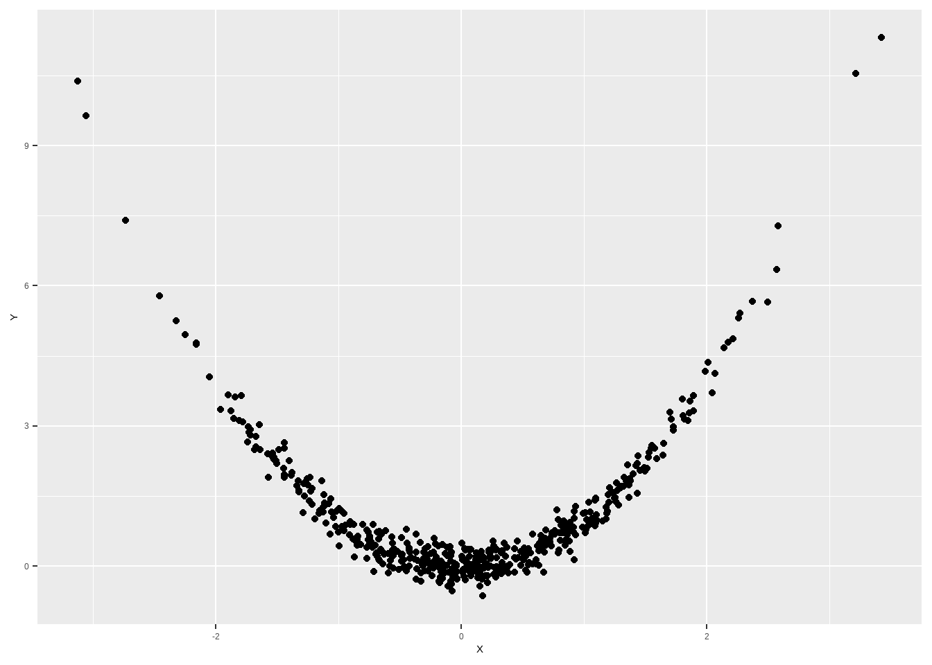
You might have noticed that we’ve stressed that correlations summarize the strength of the linear association between a pair of variables. That’s an important point to keep in mind. A common misconception is that the correlation is a measure of the strength of the overall association, but this is not the case. Consider, for example, Figure 3, which shows a scatterplot of Y on X (these variables can be whatever we want). It’s clear that the variables are very strongly associated; the scatterplot shows a very clear relationship between X and Y, such that if we know what the X value for a particular point is, we can very closely predict its Y value. However, the correlation for these two variables is only .063 and the sample is drawn from a population with a correlation of 0. This is because there is no linear association between these two variables; the association is completely non-linear. We can still calculate the correlation coefficient for this sample, but we need to keep in mind that the linear association is not a good summary of the association in this sample; put slightly differently, a linear model would be a bad choice for this particular association, since a line doesn’t capture how the two variables are related.
Figure 3: Scatterplot drawn from a population with a correlation of 0 but a strong non-linear association.
Correlation v.s. causation
You’ve all probably heard the phrase “correlation does not imply causation”, but it bears repeating.3 The fact that two variables are correlated, even strongly correlated, does not imply that one of them is causing the other. This is easy enough to remember in principle, but sometimes hard to remember in practice. One reason is that we frequently have a causal model in mind when we are deciding which relationships to estimate in the first place.
The researchers who decided to measure students’ sense of belonging and test scores were operating from a model suggesting either that feeling like one belongs in school causes students to perform better in school, or that performing well in school causes students to experience stronger senses of belonging in school. The sample results are consistent with both of those hypotheses. However, they cannot show which, if either, of those hypotheses are true. It could be that sense of belonging causes better performance, that better performance causes stronger sense of belonging, or that some third variable affects both sense of belonging and test scores; maybe students who enjoy studying tend to feel a greater sense of belonging at school and to score higher in math. The simple fact of the positive sample correlation cannot help us determine which, if any, of these scenarios is correct; in fact, all three are probably partially correct.
It’s worth repeating that variables may be correlated even if neither one is causing the other. For example, we might have no reason to expect that a student’s self-control causes or is caused by her sense of belonging. On the other hand, we might still expect these variables to be correlated because, for example, both variables are associated with socioeconomic status.4
The Neyman-Rubin causal framework
We’ve been talking a lot about causation but haven’t made it precise. In fact, different fields have very different definitions of what causation actually means. However, one dominant approach to causation is the Neyman-Rubin causal framework,5 which we discuss here. This framework will give us an extremely precise way to define and think about causality. Interested students can find more information after the appendix.
The Neyman-Rubin causal framework relies on the ideas of interventions and potential outcomes. Suppose we have in mind an intervention (sometimes referred to as a treatment) which is designed to increase the sense of belonging that students feel at school. The details of the intervention don’t matter for our purposes, except that it’s something that we can choose to offer to students. Now consider student i. This person has two potential values of sense of belonging. Specifically, if she is not offered the treatment, her sense of belonging will be equal to some number which we call BELONG_i(C) (sometimes written as BELONG_i(0)), for “sense of belonging for student i if she is assigned to control”. If, on the other hand, she is offered treatment, then her sense of belonging will be equal to some other number which we call BELONG_i(T) (alternately BELONG_i(1)), for “sense of belonging for student i if she is assigned to treatment”.6 Of course these values might very well be the equal to each other. The causal effect of the treatment on sense of belonging for student i is equal to BELONG_i(T)-BELONG_i(C), or the difference in her sense of belonging under treatment and under control. If the difference is positive, then the intervention raised sense of belonging for that student. If it’s negative, the intervention lowered sense of belonging. If it’s equal to 0, then the intervention didn’t impact sense of belonging for that student. The great thing about this framework is how clear it makes the idea of a causal effect: it’s the difference between what would have happened if we had done one thing and what would have happened if we had done the other.
A problem for us is that we can never observe both BELONG_i(C) and BELONG_i(T). If we do not offer student i the intervention, then all we can measure is BELONG_i(C); if we do offer her the intervention, then we can only observe BELONG_i(T). Both of these values exist, we just can’t observe them both. As a result, it’s impossible to directly measure the effect that treatment had on any particular individual. However, if we’ve assigned treatment to students at random, then we can estimate the effect that treatment had on average.7 We do this by comparing the mean value of students who were treated to the mean values of students who were not treated. Thinking through the logic of this will help us to understand why we need random assignment to make causal inferences, and why correlation doesn’t imply causation.
To see the mean effect of treatment, what we’d like to do is compare the mean value of sense of belonging for all students under treatment (we’ll call this \mu_T) to the mean value of all students under control (we’ll call this \mu_C). But as we’ve pointed out before, we can’t see BELONG(T) for any students assigned to control, and we can’t see BELONG(C) for any students who received the intervention. We have an issue with missing data; for the control half of the sample we’re missing the treatment observation, and for the treatment half, we’re missing the control observation.
This is where random assignment comes in. Because students are assigned at random to either the treatment condition or the control, we can expect \mu_T for the treated students (the only students for whom we actually observe BELONG(T)) to be an estimate of \mu_T for the full sample, including students assigned to control. Similarly, \mu_C for the controls estimates \mu_C for the sample, including students assigned to treatment. This is only true because of the random assignment. Then we can estimate the average treatment effect as \mu_T - \mu_C. It’s not exact because we can’t actually see, e.g., what treatment students would have gotten under control, but it’s an unbiased estimate, which means it will be right on average.
In contrast, if students were permitted to select treatment or control on their own, we wouldn’t know if \mu_T for the treated students was a good estimate of \mu_T for the full sample. Perhaps students select the intervention because they don’t feel strong senses of belonging in the first place. In this case, \mu_T for the treated students might be systematically lower than \mu_T for the controls (students who didn’t feel a need for the intervention), which might mask the treatment effect.
We might be interested in asking whether the sense of belonging variable affects test scores. However, this is challenging using the Neyman-Rubin causal framework because there’s no intervention. There’s no obvious way of defining the potential outcomes, and it’s not at all clear how we could assign students to have different values of sense of belonging; remember, our ability to assign students to either treatment or control was a key component of estimating the causal effect of treatment. We might ask whether intervening to change students’ sense of belonging also results in changes in their test scores. If a researcher had the ability to assign different senses of belonging, we might examine the correlation between the students’ (externally assigned) sense of belonging and her math scores, interpreting this as a causal association. However, to actually assign senses of belonging to students, we would presumably have to intervene on them in some way, and different interventions which produced the same sense of belonging might produce different test scores.
For example, we might try to manipulate sense of belonging by having schools replace math instruction with sessions devoted to making students feel more welcome. Presumably this would not result in increased math scores, even if it raised sense of belonging. Alternately, we might intensify math instruction in order to encourage students to see themselves as competent scholars who belong in school. This sort of intervention might raise both sense of belonging and math scores, although we might wonder whether it was the induced sense of belonging or the additional instruction which increased the math scores.
This thought experiment suggests that the best way to think about causality might be as a property of interventions, rather than of pairs of variables. The key point is that the question of the causal association between a pair variables may not be well defined; we can’t simply assign values of a variable, and anything we do to change those values will have multiple effects. The best we might be able to do is point to theoretical reasons that changes in one variable should produce changes in the other variable, and show that this association exists across a wide range of interventions.
Appendix
Describing a scatterplot
Here are some things you’ll want to note when describing a scatterplot.
The direction of the association. As you move from left to right, do the points trend upward (a positive association) or downward (a negative association)? Or is something else happening?
The shape of the association. Do the points generally tend to follow a straight line? Do they follow a curve? Look from left to right and describe the general shape of the scatterplot.
The strength of the association. How tightly are the points clustered? Do they closely follow the general trend, or is there a lot of scatter?
The presence of unusual points. Are there any points which don’t seem to fit? Points that are extreme on the x-axis or on the y-axis, or points that don’t seem to fit with the general scatterplot?
A description of a scatterplot will typically hit on all of these points.
Kinds of Correlations
What we’ve been calling a correlation or coefficient of correlation is sometimes referred to as Pearson’s coefficient of correlation after its developer, Karl Pearson. There are other definitions of correlations which are appropriate for data which are ordinal rather than numeric, including Spearman’s rank correlation and Kendall’s rank correlation. However, when we refer to something as simply a ‘correlation’ we always mean Pearson’s correlation.
Causation in depth
Code
# generating toy data for our causal inferenceset.seed(1)treatment <-rep(c('C', 'T'), each =20)control <-rnorm(40, 5)treated <-rnorm(40, 6)mean(control)
[1] 5.092026
Code
mean(treated)
[1] 6.120267
Code
observed <-c(control[1:20], treated[21:40])
This material is not required for S-040. That’s why it’s been placed after the appendix. However, causal inference is important for a lot of research, so it may be worth your time to read further.
Potential outcomes
Before talking about causal inference, we need to define causation. The framework we’re going to be using is called the Neyman-Rubin causal framework, the Rubin causal framework, or the potential values causal framework. Keep in mind that this is only one way of thinking about causation, although it’s a tremendously influential one especially in the social sciences. If you read unit 3, this will be partially review.
The first concept we need is that of a treatment or an intervention. A treatment is anything which an experimenter can do to a subject. For example, assigning someone to receive special job-readiness training is an intervention. So is assigning someone to a class using an innovative curriculum. So is priming someone to think about their gender or race (this intervention or manipulation is frequently used in studying stereotype threat; randomly selected respondents’ genders or races are made salient before they are asked to complete a particular task). In the Neyman-Rubin causal framework, a causal effect is a property of an intervention. Note that this means that, in this framework, we can’t the discuss effect of gender on a person’s wages, because gender is not an intervention. We could study the effect of inducing an employer to believe that an applicant is male rather than female on the probability of being offered an interview, because we can intervene to make an employer believe that an applicant is male rather than female (by, for example, submitting a resume with a male name).8 In our current running example, the intervention is the assignment of a volunteer to be given books with reversed gender roles.
We also can’t estimate the effect of changing a value of a variable. To use another example, we can’t estimate the effect of increasing student math ability on long-term earnings. The reason for this is that there is no way to directly manipulate student math ability. We can offer students access to an intervention which tends to raise math ability and see whether it also affects long-term earnings, but this will be an effect of the intervention, and not of raising scores. Under the Neyman-Rubin framework, we can only estimate the causal effects of something that we can actually do (or possibly of a natural event like an earthquake).
The next concept we need is that of a potential outcome. The Neyman-Rubin framework asks us to imagine that, for any outcome of interest, each subject has exactly two potential values of that outcome: the value she or he would have if given the treatment and the value she or he would have if not given the treatment (which we refer to as the control condition).9 In our current running example, the potential outcomes are the child’s views about gender if she or he is exposed to the traditional books and the child’s views about gender if she or he is exposed to the reversed-role books. For notational simplicity, we’ll call these WAUTH(C) and WAUTH(T) respectively (C for control, T for treatment). Other conventions are to write either WAUTH(0) and WAUTH(1), or WAUTH_0 and WAUTH_1 (0 for control, 1 for treatment). To be extremely explicit, we’ll refer to child i’s value of gender under treatment and control as WAUTH_i(T) and WAUTH_i(C), respectively. Interestingly, although the value of WAUTH that we observe for any given subject is a post-treatment variable (i.e., it is affected by treatment assignment), the potential outcomes are pre-treatment variables (they are not affected by treatment assignment). The values of WAUTH that a child would have had under treatment and control are not affected by which condition she or he is assigned to, though which value we observe is. The unobserved potential outcome is sometimes referred to as the counterfactual.
The casual effect of the intervention on student i is defined as
ICE_i = WAUTH_i(T) - WAUTH_i(C),
or the difference in what the child’s views about gender would be if she or he had been assigned to treatment and her or his views if she or he had not been assigned. This is also known as an individual causal effect or an ICE because it refers to the effect of treatment on an individual subject. The average of these individual causal effects across all sample members is known as an Average Causal Effect (ACE) or an Average Treatment Effect (ATE). We can think of this as either the average of all of the individual differences in potential outcomes or as the difference in average potential outcomes; mathematically, these are the same quantity. Note that this definition makes it clear that the treatment effect is only defined relative to the control; treatments don’t have effects in a vacuum, they’re just more or less effective than the counterfactual. As what we think of as the control condition changes, so will the treatment effect.
Table 1 shows a table which displays students’ treatment assignment, potential values of the outcome under treatment and control, observed values of the outcome, and individual causal effect for the first four students in the sample.
Table 1: Table for our running example. In reality, we can only observe the bolded values; all other data are missing due to the conditions to which respondents were assigned.
Subject
Observed
Status
Control value
Treatment value
Individual causal effect
1
5
T
5
5
0
2
6
T
5
6
1
3
4
C
4
5
1
4
6
C
6
8
2
If we were somehow able to observed both values of the potential outcomes for all sample members (i.e. observe both WAUTH(C) and WAUTH(T) for all subjects), we would be able to calculate not only the individual causal effects, but also the average causal effect. We would then know the exact effect that the intervention had on our sample. The problem is that, for subjects assigned to control, we can only observe WAUTH(C). We can’t know what their value of WAUTH would have been under treatment because we didn’t assign them to treatment. Similarly, for subjects assigned to treatment, we can only observe WAUTH(T). This is the fundamental problem of causal inference: for each subject, we are missing exactly half of the information we would need to calculate the causal effect of interest. The Neyman-Rubin framework for causal inference makes causal inference into a problem of missing data.
This is where random assignment comes in. Suppose that we’ve randomly assigned subjects to treatment and control, such that every subject has the same probability of being assigned to treatment, and that treatment assignment is completely at random.10 Then in expectation (on average), treatment subjects and control subjects should have the same potential outcomes. Obviously this won’t be exactly true in any particular study; just by chance, we’ll find that subjects in different conditions have different average potential outcomes. However, it should be true on average, and as the sample gets larger it should tend to be closer and closer to the truth.
Let’s make these ideas a little more precise. To begin with, let’s define \mu_C and \mu_T as the sample mean potential outcomes under control and treatment, respectively. Mathematically,
\mu_C = \frac{\sum WAUTH_i(C)}{n},
and
\mu_T = \frac{\sum WAUTH_i(T)}{n}.
This means that the average causal effect, which we write as \tau, can be defined as \tau = \mu_T-\mu_C. We’ll also define \hat{\mu}_C and \hat{\mu}_T as the mean value of the potential outcomes under treatment which we actually observe, i.e. the mean control outcome for control subjects and the mean treatment outcome for treatment subjects. Mathematically, we can write
where Z_i = C for subjects assigned to control and Z=T for subjects assigned to treatment, and n_control and n_treatment are the number of subjects assigned to control and treatment, respectively. Again, all this means is that \hat{\mu}_C is equal to the mean value of WAUTH for subjects assigned to control, and \hat{\mu}_T is equal to the mean value of WAUTH for subjects assigned to treatment.
Although we’ve defined \hat{\mu}_C and \hat{\mu}_T as means of observed values, they’re also estimates of \mu_C and \mu_T, i.e., the averages of the potential outcomes for the whole sample. As you’ve probably guessed, we can also take \hat{\tau} = \hat{\mu}_T-\hat{\mu}_C as an estimate of \tau. If we want to test a null hypothesis of no average treatment effect, i.e.
H_0: \tau = 0 \implies \mu_C = \mu_T,
one way to do this is to simply conduct a t-test of the hypothesis that the mean value of WAUTH for treated students is the same as the mean value for control students. Equivalently, if we let Z_1 be an indicator variable for assignment to treatment,11 we could fit the model
WAUTH_i = \beta_0 + \beta_1Z + \varepsilon_i
and test the null hypothesis H_0: \beta_1 = 0. These approaches will give us reliable results. (NOTE: If we haven’t gotten to this material yet, don’t worry about it! You’ll understand this later in the course!) The way that we actually do causal analysis is frequently very similar to the way we do other analyses. The difference comes in the perspective we adopt and how we interpret our results.
In our running example, the true value of \mu_C is 5.09, while the true value of \mu_T is 6.12. So the true value of the ACE, \tau, is 6.12 - 5.09 = 1.03.12 The mean value of WAUTH for control students, \hat{\mu}_C, is 5.19, while the mean value of WAUTH for treated students, \hat{\mu}_T, is 6.10. Thus the estimated treatment effect, \hat{\tau}, is 6.10 - 5.19 = 0.91. The 95% confidence interval for \tau is [0.28, 1.54]. In this case, the point estimate is moderately close to the true treatment effect, and the confidence interval contains the true effect. We would be correct in inferring that the treatment made children more comfortable with women in positions of authority. Nice! Good for us!
Permutation tests
Of course, just because we can do something the easy way is no reason not to do it the hard way.13 Another common way to do inference in about the effect of an intervention is the permutation test.
The permutation test, which we will conduct shortly, tests an extremely restrictive null-hypothesis, namely that the treatment has no effect on any subject. Mathematically, we can write this as
H_0:WAUTH_i(T) = WAUTH_i(C) \implies ICE_i = 0, \forall i
i.e., for all subjects, WAUTH_i(T) = WAUTH_i(C). More than saying that there is no mean treatment effect, this null-hypothesis requires that no subject has different potential outcomes under treatment and control.
Let’s go back to our science table. Table 2 is more realistic because we no longer know the value of the potential outcome which is not observed. As a result, we don’t know the true values of the individual causal effects.
Table 2: Table for our running example. Question marks represent missing data. THese values exist, but are not observed because of how treatment was assigned.
Subject
Observed
Status
Control value
Treatment value
Individual causal effect
1
5
T
?
5
?
2
6
T
?
6
?
3
4
C
4
?
?
4
6
C
6
?
?
But notice, under our null hypothesis of no treatment effect, we can fill in the missing cells. If there’s no treatment effect for any subject, then the unobserved potential outcome is equal to the observed potential outcome for each subject. This allows us to fill in the missing cells of the science table, which we present in Table 3.
Table 3: Table for our running example. Italicized values are imputed using the null-hypothesis, while bolded values are observed.
Subject
Observed
Status
Control value
Treatment value
Individual causal effect
1
5
T
5
5
0
2
6
T
6
6
0
3
4
C
4
4
0
4
6
C
6
6
0
Notice that, under our (extremely demanding) null-hypothesis, for each student we should observe the same value of the outcome if they are assigned to treatment as if they are assigned to control. So one way to test our null-hypothesis is do as follows: calculate the observed treatment effect estimate, \hat{\tau}.14 Then randomly permute the treatment indices (i.e., randomly reassign respondents to be treated as treatment and control. We don’t actually expose kids to the counterfactual condition, we just treat them as if the had been originally). Since we’re assuming that WAUTH_i(C) = WAUTH_i(T) for all students, we can randomly reassign treatment status without changing the observed value of WAUTH_i. In this random permutation of the treatment indices, a new set of subjects will be identified as treated, and so we’ll estimate a new treatment effect. We’ll call this \hat{\tau}_1. Repeat this exercise, randomly ``assigning” subjects to treatment or control and re-estimating treatment effects some large number of times, say 1,000 or more.15
The distribution of estimated treatment effects is known as the permutation distribution of the treatment effect. If the observed treatment effect is large relative to the permutation distribution (say more extreme than all but 5% of the permutation estimates), then the probability of obtaining such an extreme mean difference is very small if the null hypothesis of no treatment effects is true, and we can reject the null-hypothesis.
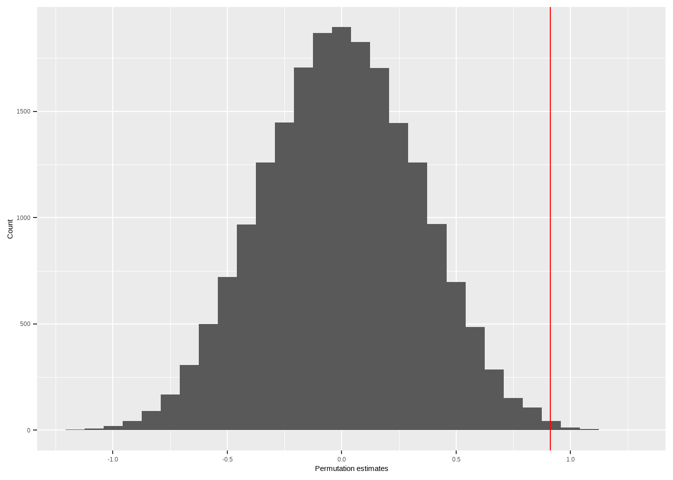
Figure 4 shows the permutation distribution for the running example.16 The vertical line is at the observed treatment effect estimate. Only 0.4% of the treatment effect estimates from the permutations are more extreme than the observed treatment effect estimate. Thus, if the null-hypothesis is true, the probability of a random assignment of subjects to treatment and control yielding a difference between the treatment and control groups as large as what we observed is extremely low. As a result, we reject the null-hypothesis and conclude that the treatment effect is not equal to 0 for all of the subjects in the sample.
Figure 4: Permutation distribution of the treatment effect estimate from the running example. The red line indicates the observed treatment effect estimate. This is based on 20,000 permutations, so it’s probably pretty accurate.
A drawback to the permutation test is that the null-hypothesis it’s testing is extremely restrictive. Rejecting a null-hypothesis of no treatment effect on any unit tells us very little about the actual effects of the intervention. A strength is that the permutation test makes no assumption about the distributions of the outcomes. Recall that a t-test and a regression both make assumptions about how the residuals are distributed. When we have lots of data, these assumptions are less important (see the unit on regression assumptions). However, in the current example, with only 20 units assigned to treatment and 20 to control, we need those assumptions to be very close to true before we believe our inferential results. The permutation test is assumption free, and the p-values it produces are valid even for small samples, though as sample size decreases the permutation test, just like any test, has more and more trouble rejecting the null hypothesis.
Causal effects in samples and populations
Notice that we haven’t been talking about populations, only about samples. This is intentional. Since causal inference in concerned with estimating mean differences in potential outcomes, and since half of the data are always missing from any given subject, we need inferential statistics just to determine the sample causal effect. This is not true when we’re working with observational data. Suppose that we were interesting in estimating differences between how willing girls and boys were to endorse women in positions of authority. If all we wanted to know was the difference between girls and boys in our sample, we could simply calculate \hat{\mu}_{GIRLS} - \hat{\mu}_{BOYS}, where \hat{\mu}_{GIRLS} is the sample mean of WAUTH for girls, and \hat{\mu}_{BOYS} is the sample mean of WAUTH for boys. We don’t need to do inference, since we can observe the sample mean directly and no data are missing.
Of course, we frequently want to know how an intervention would work in the population as a whole. It’s interesting that the intervention raised values on the women’s authority scale for these particular children, but we’d like to know if it would do the same in the larger population. This is especially true if we wanted to use this intervention to make children more comfortable with women in positions of authority; it’s probably not worth the effort if it only works for these students. Here are three ways to think about how to do that.
First, if we’re willing to assume that the subjects on whom we’ve intervened are a random sample of the population of interest, then the exact same tests that we use to estimate treatment effects in the sample are the ones we should use to estimate treatment effects in the population. We would carry out our tests exactly as we would in an observational study, but the experimental design allows us to make inferences about causation rather than just association.
Lots of researchers adopt this perspective, either explicitly or implicitly. But we have to be very careful before doing so. Remember how we described our sampling procedure. We recruited subjects by finding children of HGSE parents who were willing to participate in this intervention. However, our intervention might work very differently for children of non-HGSE parents, or for children of HGSE parents who would not be willing to enroll their children in this study. In particular, we expect that control students in our study might be much higher on WAUTH than control students in the population at large. Be careful before assuming that your sample is representative of the population you want to make inferences about unless you’ve actually taken a random sample (which you almost certainly haven’t).
A second perspective is that we should be content simply to estimate the effect of the intervention on the sample. We’re not able to make inferences about how the intervention would work in the population as a whole, so we shouldn’t worry about it. If we adopt this perspective, we don’t have to worry about how our sample was constructed, only about how the randomization was done. There’s no need for the sample to be representative of the population as a whole, because all we want to know if what the intervention does in the sample. We’d be able to build a picture of how the intervention worked in the wider population by testing it in multiple different samples, which would ideally be very different from each other in a variety of theoretically important ways. This often isn’t a very satisfying perspective, especially if we want to use our intervention in a wider population, but it might be the most realistic way to think about things.
A third perspective acknowledges that our sample is not representative of the population as a whole, but tries to use observable sample characteristics and survey statistics to generalize the sample treatment effect to the population as a whole. This is beyond the scope of this text, but the basic idea is that if we see that some group is underrepresented in our sample (for example, if the sample is only 10% African-American, but 20% of children in the country as a whole are African-American), then we weight those students’ results more heavily. This approach requires us to make a number of untestable assumptions (no set of weights will allow us to get the correct representation of children whose parents do not go to HGSE, which in the wider population is basically 100% of children, from a sample in which every child’s parent goes to HGSE), but is probably more realistic than just pretending that we’ve taken a random sample from the population as a whole.
Estimating causal effects without random assignment
The reason we needed random assignment of subjects to treatment and control is that this allowed us to guarantee that \hat{\mu}_C, the mean of the observed outcome for control subjects, would be a good estimate of what we would have seen for treated subjects if they had been assigned to control. Similarly, it allows us to use \hat{\mu}_T, the mean of the observed outcomes for treated subjects, as an estimate for what the mean outcome for control subjects would have been if they had been assigned to treatment.
To see why this matters, let’s consider a variation of this study. Suppose that, instead of randomly assigning students to be read a story with female characters in positions of authority or male characters in positions of authority, we took a survey of 1,000 children and asked them for the name of the last book they read. We could then decide whether that book had male or female characters in positions of authority, and estimate the differences on WAUTH between children who had most recently read a book with male characters in positions of authority and children who had most recently read books with female characters in positions of authority.17
One nice thing about this approach is that it’s much easier to get big samples on a survey, and much easier to get random samples of the population we want to make inferences about. However, remember the advantage that random assignment is that mean value of WAUTH for the control subjects is a good estimate of the mean potential outcome for treatment subjects if they had been assigned to control, and vice-versa. This is only true because treatment condition was assigned at random. In this observational study, there is no reason to expect that children who recently read books with male and female characters in positions of authority will have similar potential outcomes.
Table 4 illustrates this. Notice that for the four subjects displayed, there was no effect of treatment; regardless of whether they had recently read a book with male or female characters in positions of authority, they would have had the exact same values of WAUTH. However, the sample mean of WAUTH for subjects who most recently read a book with female characters in positions of authority is much higher than for subjects who most recently read a book with male characters in positions of authority. Again, this isn’t a ``treatment effect’’, it’s just that those subjects had higher values for both potential outcomes. Of course, since we’ll only see one potential outcome for each respondent, we won’t know that this is the case!
Table 4: Table for our running example. In reality, we can only observe the bolded values; all other data are missing.
Subect
Observed
Last book’s gender
Control value
Treatment value
Individual causal effect
1
8
F
8
8
0
2
7
F
7
7
0
3
4
M
4
4
0
4
2
M
2
2
0
This discussion suggests two requirements for estimating causal effects from observational data. The first is that we need to be able to identify the intervention being studied. We’re not able to estimate the causal effect of being a man on one’s wages because ``being a man’’ isn’t an intervention. The second is that, on average, the potential outcomes for subjects who experienced treatment should be the same as the potential outcomes for subjects who did not experience treatment. Estimating causal effects from observational data is generally an issue of finding ways to create comparable groups, i.e., groups which have the same expected potential outcomes.
There are multiple ways to do this, but the simplest involves identifying a set of covariates, X (often things like gender, race, and class), to match units such that treatment and control units with the same values of X have the same expected potential outcomes; then any systematic difference between the two groups are purely a function of treatment assignment.
Other techniques include regression discontinuity (if treatment is assigned based on a covariate such as a test score we can estimate the treatment effect by comparing people who are just barely eligible for treatment to those who are just barely not eligible), differences-in-differences (comparing the changes in the outcome in a treated group to the changes in a control group), propensity score matching (matching treated units with control units who were equally likely to receive treatment), and instrumental variables (identifying a third variable which is related to treatment assignment but only related to the outcome because it’s related to treatment assignment). Ultimately, however, all of these techniques are oriented around using observed covariates to create artificial control groups which can be expected to be equal to the treatment group in expectation despite not using random assignment to create the groups.
Blocking and control
NOTE: this section will make more sense once you’ve finished the section on multiple regression!
One source of uncertainty in estimating causal effects is that potential outcomes differ across individuals. Insofar as we are able to reduce the variability in the potential outcomes, we’ll have an easier time identifying the treatment effect. One way to reduce the variability in potential outcomes is by controlling for other sources of variability. In our running example, we expect that girls and boys probably differ systematically in their levels of WAUTH. We could remove this source of variability in the potential outcomes by controlling for gender in our analysis. One way to do this is to fit the model
In this model we control for gender by using an indicator for being male. This may improve the precision with which we estimate the treatment effect, \beta_1, although it can also introduce bias into our estimates. A better approach might be to estimate the treatment effect separately for male and female students and then combine these to get an ATE estimate.
This is a different use of control than we’re used to. Remember that we stressed earlier that controlling for a variable in an observational study changes the question being answered. That’s not true here. The quantity of interest, i.e., the mean difference in potential outcomes under treatment and control, is the same whether we control for subject gender or not. Adding the control predictor MALE simply allows us to get better estimates of that value.
Another way to control for a variable in an experimental study is to block on the variable. Blocking means making sure that the treatment group and control group are balanced on a given variable. In the current example, suppose we were able to enroll 14 girls and six boys into the study. We could block on gender by randomly assigning seven girls and three boys to treatment, and the other seven girls and three boys to control. This will reduce the variability in the estimated treatment effect because mean differences between girls and boys will no longer contribute to that variability. One way to think of blocking is as a non-parametric way to control for variables. We can block simultaneously on multiple variables. For example, we could ensure that the treatment and control groups had the same number of male and female five- and six-year olds. There are also techniques to block (approximately) on a continuous variable.
Another way to improve the precision of our estimates of the treatment effect is to work with change scores. We measure subjects on the scale before administering the intervention, then measure them again afterwards. Our outcome of interest is then the change in scale scores from before to after, or pre- to post-intervention. We can think of this as removing within-subject mean differences on the outcome, which frequently results in much more precise estimates of the treatment effect.
Treatment effect variability
So far we’ve only been interested in estimating average treatment effects, i.e., the mean difference in the potential outcomes across the entire sample, or even the entire population. However, frequently we will be interested in estimating different treatment effects in different subpopulations, or in testing whether effects are actually different. In our running example, we might be interested in estimating the effect of the intervention separately for female and male subjects. We might hypothesize that the intervention will have a greater effect on boys, because girls are more likely to have been exposed to female characters in positions of authority in their own reading, so encountering these characters in the intervention will have less effect on them.18
If we identify our subpopulations based on pre-treatment variables such as gender, this is simple to do. Remember, when we want to estimate different associations between and outcome and a predictor based on the level of another predictor, the way to do this is by using an interaction. If we let MALE be an indicator for whether the respondent is male, and let Z be an indicator for having been assigned to treatment, then we could fit the model
In this model, \beta_0 is the mean value of the outcome for girls assigned to the control condition, \beta_1 is the effect of treatment for girls, \beta_2 is the mean difference in the outcome between girls and boys who were assigned to control, and \beta_3 is the difference in the treatment effect for boys relative to girls. There are other ways to interpret \beta_3, but this is the most natural and the most useful. If \beta_3 is positive, the effect of treatment is larger for boys than for girls. If \beta_3 is negative, the effect of treatment is *smaller for boys than for girls. The treatment effect for boys is equal to \beta_1 + \beta_3. The estimated mean value of the outcome for boys assigned to control is \beta_0 + \beta_2.
However, researchers are also frequently interested in whether the effect of treatment varies according to a post-treatment variable. For example, suppose that, in our running example, researchers measured the attention each student was paying to the story, either by asking comprehension questions afterwards, or by observing students to see if they are paying attention. We’ll call this measure ATTENTION. Based on the reasonable hypothesis that the intervention can only work if students are paying attention, researchers might expect that the effect of the treatment would be stronger for subjects who paid more attention. They might, therefore, be interested in fitting the model
On the face of it, this model is very similar to the previous one. However, it’s different in a crucial way, and the associations this model estimates are not causal effects. The reason is that ATTENTION_i is a post-treatment variable. As such, it is possible that the amount of attention students pay to the story differs according to whether subjects were assigned to treatment or control. It may be that some students find the story with the roles reversed to be intriguing, and so they pay more attention to it. Other students may find the story with the role reversal off-putting or difficult to understand since it fails to follow a common script. What this means is that it is not reasonable to assume that students in the treatment and control conditions with the same levels of ATTENTION have the same expected potential outcomes, because their levels of ATTENTION may be dependent on their treatment assignment. Again, the parameters the model is estimating no longer have causal interpretations.
There are techniques we can use to incorporate post-treatment variables into our analyses. Some popular ones include causal mediation and principal stratification. However, these tend to be fairly complex, and so we omit them from the discussion.
Footnotes
To be precise, the Pearson correlation or Pearson product-moment correlation to distinguish it from other kinds of correlations. In almost all of statistics, this is what we mean when talk about a correlation. However, there are a handful of other definitions which are used in certain cases.↩︎
Without essential loss of generality, we’re looking at population parameters; we could get the same results by switching everything to sample estimates.↩︎
Or not. It’s been repeated so frequently that it’s essentially become a meaningless catchphrase for dismissing research and results that we don’t like.↩︎
Additionally, and perhaps more problematically, both variables might be associated with a student’s expressive style; some students might tend to answer survey questions in positive ways, leading to high scores on both scales regardless of how much they actually feel like they belong or how much self-control they actually have. Any correlation due to a tendency to give positive responses to survey items is presumably not very interesting from a substantive perspective.↩︎
This is also frequently referred to as the Rubin causal framework. Donald Rubin is a professor in the Harvard Statistics department, and has offices in the Harvard Science Center, just across the Cambridge Common from the School of Education. He’s a really big name in statistics and is still active in teaching, so think about sitting in on one of his courses in the spring.↩︎
Which condition we refer to as treatment is mathematically irrelevant, though we often naturally conceive of one condition as business as usual and the other as something new.↩︎
There are techniques to estimate causal effects as defined by the Neyman-Rubin causal framework without random assignment, but they’re generally much more complex and we don’t discuss them here.↩︎
We can also explore the effects of sex reassignment/gender confirmation surgery, but we need to be clear that the effect we are estimating is not the effect of being male or female, it is the effect of the surgery.↩︎
This is a little simplistic. To begin with, the framework allows the treatment to have multiple different levels, such as different dosages of a new drug or different books that might be offered to students. Also, the determination of which condition is treatment and which is control is arbitrary and irrelevant from a statistical standpoint, even if it’s relevant from a substantive standpoint.↩︎
All we really require is that subjects are assigned to treatment or control with known probability, and that treatment assignment is not related to their potential outcomes. However, assuming that each person has the same probability makes things simpler.↩︎
This is the convention in the statistics literature. Although this textbook is in some ways unconventional, this is a convention we’re not willing to break.↩︎
Of course, we can only observe these values because we made up the data; in general we can never observe the potential outcomes under both treatment and control for any subject. Yet another reason to make up data whenever possible! Actually, though, Joe’s dissertation has an unusual example where outcomes under either treatment or control can be observed directly. If you’re interested, ask him!↩︎
Most statistics instructors believe that the hard way is always preferable to the easy way. Since statistics instructors are presumably a random sample of statistics students, and since they have always preferred to do things the hard way, it follows that most of you also prefer to do things the hard way. Nice, nice.↩︎
If we have 2N subjects, of whom N are assigned to control, there are {2N}\choose {N} or \frac{2N!}{(N!)^2} unique permutations of treatment assignment. In a smallish study with 50 subjects, 25 of whom are assigned to control, this makes for something over 126,000,000,000,000 possible permutations. Finding 1,000 unique ones should be easy. Alternately, if the dataset is very small, we can examine every possible permutation.↩︎
In this example the permutation distribution has 184,756 different values. We used all possible permutations in testing the null.↩︎
The nature of the intervention is unclear here. We might argue that the intervention is assigning children to read books with female characters in positions of authority, but in this study no one has actually been assigned to do anything. Remember that an intervention is something that we can do; a frequent challenge in making causal estimates from observational studies is that the nature of the intervention is rarely clear.↩︎
Alternately, we might expect the intervention to have a stronger effect on girls, because the boys will tune out as soon as they realize that the story is primarily about girls.↩︎