Unit 6 - Assumption Checking for Linear Regression
Code
library(ggplot2) # for simple plotslibrary(plotly) # for the plotslibrary(dplyr) # for pipes and data managementlibrary(kableExtra) # for pretty tableslibrary(gridExtra) # for arranging plots nicelylibrary(emojifont) # for butterfly emojispop <-read.csv('nc.csv') %>%# read in the dataset for this analysisna.omit() # and drop any observations with missing dataN <-100set.seed(5092014)nc <- pop[sample(nrow(pop), N), ] # sample down to 100 observations
These course notes should be used to supplement what you learn in class. They are not intended to replace course lectures and discussions. You are only responsible for material covered in class; you are not responsible for any material covered in the course notes but not in class.
Overview
The setting
The first assumption: Linearity
The second assumption: Homoscedasticity of the residuals
The third assumption: Normality of the residuals
The fourth assumption: Independence of the residuals
Summary
The setting
As we hinted at in the previous unit, the standard errors that we calculate require us to make several assumptions about the population from which we’ve sampled. If these assumptions are incorrect, then our inferences might be badly wrong. In this unit, we’ll discuss what those assumptions are, and how we can check whether or not they’re plausible. We’ll also talk about how important each of the different assumptions are, and what we should do if one of them appears to fail. For the sake of simplicity, we’ll retain the same setting and sample as before.
As we discuss the assumptions, keep in mind that all of the assumptions are about the population, not about the sample. We use the sample to see if the assumptions might plausibly be (approximately) true in the population. The assumptions are never perfectly true for the sample. The assumptions we need to check are
Linearity
Homoscedasticity of the residuals
Normality of the residuals
Independence of the residuals
The first assumption: Linearity
The first assumption, linearity, is the most important one. We assume that the conditional means of the outcome at each value of the predictor can actually be connected with a straight line. We’re assuming that there’s actually a straight line in the population, such that
\mu_{y|x=x_0}=\beta_0+\beta_1x_0.
Another way to put this is that the residuals from the line of best fit at any given value of the predictor have a mean of 0. Mathematically these are the same claim. The residuals always have mean 0 overall, but if they have mean 0 at each value of the predictor, then the linear model holds.
How do we check it?
This assumption can be checked in a couple of ways. First, we can simply look at the scatterplot of the outcome on the predictor and see if it looks like the general trend is a straight line. Of course, it can be hard to judge whether an association is linear or not based only on a point cloud/scatterplot. One thing that can help is overlaying a smoothed curve, which uses a non-parametric method to estimate the mean of the outcome at each value of the predictor. Unlike the line of best fit, this curve is not constrained to be a straight line, and divergences can indicate non-linearity. If this curve actually looks (mostly) like a straight line, the assumption of linearity is plausible.
Code
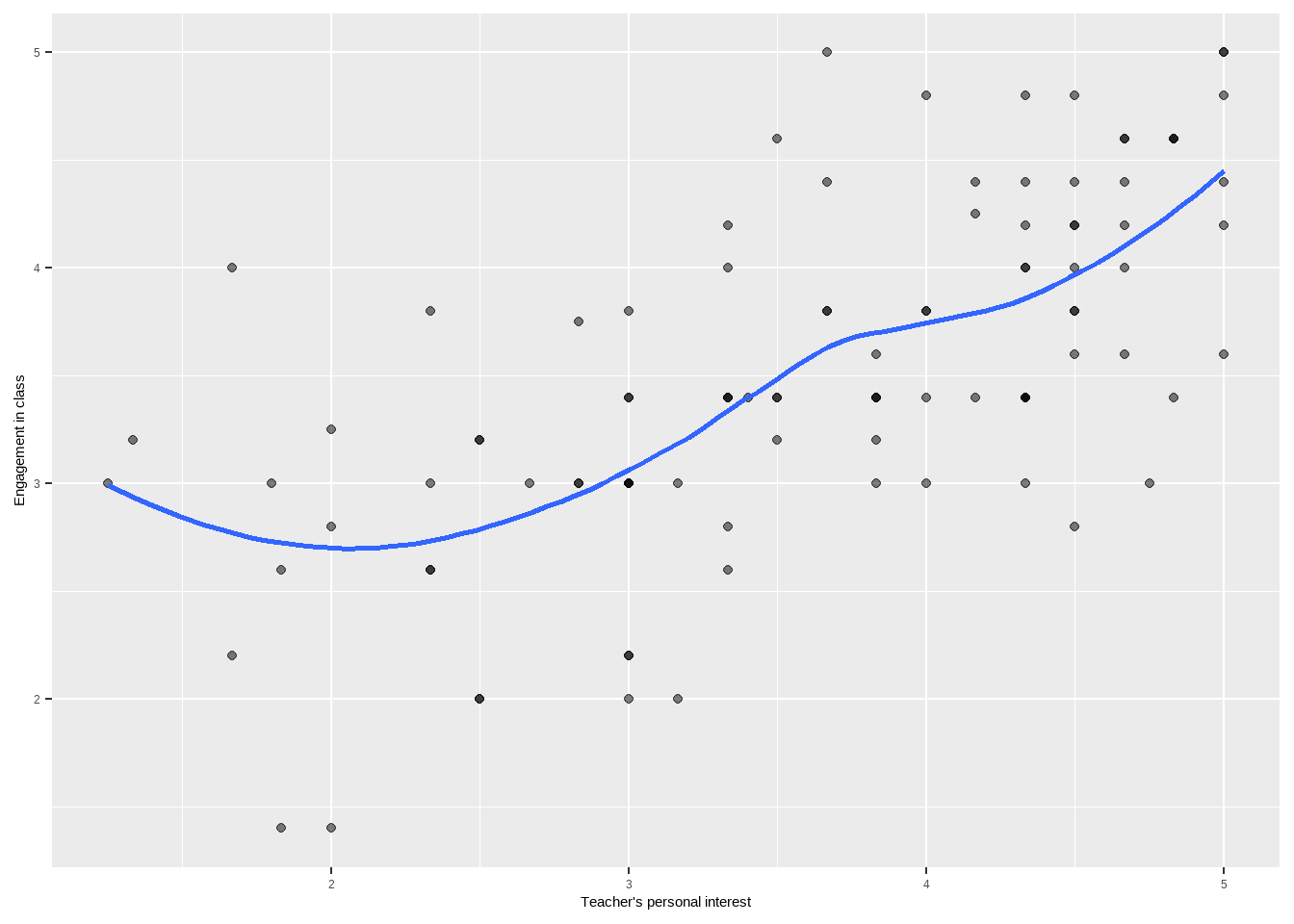
nc %>%ggplot(aes(x = interest, y = engage)) +geom_point(alpha = .5) +geom_smooth(se =FALSE, method ='loess') +labs(x ='Teacher\'s personal interest', y ='Engagement in class')
Figure 1: A scatterplot of student engagement against student perceptions of teacher personal interest in the population with an overlaid LOWESS smoothed curve. There are multiple ways of generating a smooth curve, but LOWESS (locally weighted scatterplot smoothing) is a common choice for small datasets; the LOWESS algorithm fits a series of lines of best fit which tries to minimize the variance of the residuals, but gives more weight to nearby points than distant points; if the conditional means are connected by a curve rather than a line, LOWESS can detect this non-linearity by finding these local lines of best fit rather than a single global line of best fit. Like all methods, and especially non-parametric methods, LOWESS works better with large datasets; don’t pay too much attention to what the curve is doing in areas where data are sparse.
Figure 1 shows the sample scatterplot with an overlaid LOWESS curve. The curve seems to jump a tiny bit around personal interest of 3.5, but on the whole it looks approximately like a straight line.
A related approach is to look at a plot of the residuals from the regression against the predictor (or against the predicted values; these will look the same for simple linear regressions though not for multiple regressions). If the assumption of linearity is met, then the population residuals should have a mean of 0 at each value of the predictor (by construction, residuals have mean 0 overall, but this could be because the line overpredicts in some areas and underpredicts in others; this would violate the assumption of linearity). We can check the plausibility of this assumption by looking at a plot of the sample residuals against the predictor and checking whether the mean residual is 0 at each value of the predictor. Once again, a smoothed curve can be helpful. In this case, the curve should look like the horizontal line y = 0; this corresponds to a regression line where the residuals have an average of 0 at all values of the predictor.
Code
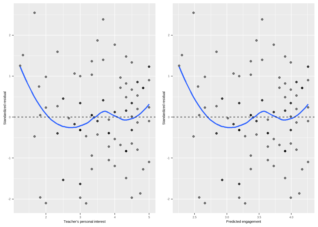
mod <- nc %>%lm(engage ~ interest, data = .)nc$pred <-predict(mod)nc$std_res <-rstandard(mod)p1 <- nc %>%ggplot(aes(x = interest, y = std_res)) +geom_point(alpha = .5) +geom_smooth(se =FALSE, method ='loess') +geom_hline(yintercept =0, lty =2) +labs(x ='Teacher\'s personal interest', y ='Standardized residual')p2 <- nc %>%ggplot(aes(x = pred, y = std_res)) +geom_point(alpha = .5) +geom_smooth(se =FALSE, method ='loess') +geom_hline(yintercept =0, lty =2) +labs(x ='Predicted engagement', y ='Standardized residual')grid.arrange(p1, p2, ncol =2)
Figure 2: The left-hand figure shows a scatterplot of the standardized residuals against INTEREST. The right-hand figure shows the standardized residuals against the predicted value of engagement. Since the predictions are a linear function of INTEREST, the two scatterplots are identical for checking residual assumptions; you can choose which plot you prefer or do both (but don’t present both, because they contain the exact same information!). This will NOT be true when we move to multiple regression; you have been warned.
Figure 2 shows this plot for our regression. This plot shows no real evidence of non-linearity. The mean residual is negative at low values of teacher’s personal interest, and jumps up briefly right around 3.5, but this probably does not indicate a violation of the assumption of linearity. We tend not to pay too much attention to what the curve is doing at the edges of the graph where there are relatively few points, because those means are estimated imprecisely and so we expect the LOWESS curve to behave a little strangely there. The tiny uptick around 3.5 seems more like a fluke than an actual pattern.
What happens if it’s violated?
This is probably the most important assumption that we have to make. If the assumption is violated, then there is no line connecting the conditional means of the outcome at the values of the predictor. There is still a line of best fit! It’s the line which minimizes the variance of the residuals. But it doesn’t mean the same thing as it did before because it no longer runs through the conditional means of the outcome.
This makes it hard to interpret \beta_1. If the linear assumption holds, then \beta_1 is the slope of the regression line, i.e. the predicted difference on the outcome between two individuals that differ by 1 on the predictor. But if there’s a curve of best fit rather than a line of best fit, then the slope differs depending on where on the regression line we’re looking. At some values of the predictor the line will be steeper than at others. There will still be a single population intercept, but it’s unlikely to be anywhere near to \beta_0. That’s less of an issue, since we don’t usually care much about interpreting the intercept. On the other hand, it does mean that our predictions will tend to be very bad except near the places where the true curve happens to cross the line of best fit.
It also means that we’re likely to get our standard errors very wrong. As a result, the p-values we calculate will be wrong, as will the confidence intervals that we construct.
What can we do about it?
We have a couple of options. First, we could transform the predictor (or, if we’re really desperate, the outcome, but down that path lies madness). We’ll cover that in the next unit, but this is probably the best approach, if you’re able to make it work (transforming the predictor, not the outcome; remember, madness).
Second, we could use a non- (or semi-) parametric approach. We don’t cover those approaches in this class, but that’s the basis for the LOWESS curve and other smoothing curves, including random trees and random forests, Bayesian additive regression trees, splines, neural networks, and so much more. These approaches try to estimate the possibly very complicated mean function using as simple a representation as possible. A drawback to these methods is that they tend to give models which cannot be interpreted in a clear way; oftentimes we use these approaches when we want to make accurate predictions but we don’t really care about how we would interpret the model.
Finally, we can partially ignore the problem. Again, even if there’s no line connecting the conditional means of the outcome, we can still make sense of the line of best fit; it’s the line which best captures the linear association between the predictor and the outcome, even if that association isn’t actually linear. We’ll need to do something about the incorrectly estimated standard errors, but we can handle that using either robust standard errors (if the sample size is large) or a bootstrap (both of these techniques were mentioned in the appendix of the previous unit, but are not covered in detail in this class). This isn’t ideal and will require you to be much more careful in your interpretation, but it’s commonly used, especially in the context of multiple regression, as we’ll see later.1
The second assumption: Homoscedasticity of the residuals
The second assumption is that the residuals are homoscedastic. The concept is somewhat harder to pronounce than it is to explain. If the residuals are homoscedastic, then they have the same variance at all values of the predictor (remember, we label the variance of the residuals \sigma^2); if they are heteroscedastic, then they may be more variable at some values of the predictor than at others. For example, residuals might be more variable at extremely large values of the predictor.
How do we check it?
There’s really only one good way to check for violations of the assumption of homoscedasticity of the residuals. We create a scatterplot of the residuals against the predictor (or the predicted values) and look for regions of the plot where the residuals are more or less variable (i.e., more or less spread out). This will often show up as a pattern of some sort, often with more variable residuals at high (or low) values of the predictor. The definition of homosecdasticity is fairly straightforward, but be aware that regions where there are relatively few points (often at extreme values of the predictor) may appear to be less variable than other areas simply because they have fewer data points (the variance is the same, but our eyes are fooled because the very few points in the region don’t appear as spread out). It can also be difficult to estimate how variable the residuals are if the assumption of linearity is not met, but in that case we have bigger problems.
In our example, we can look at Figure 2 again to check for homoscedastic residuals. We see no evidence of heteroscedasticity in the residuals. At all values of the predictor, the residuals appear (almost) equally spread out.
Heteroscedasticity can be hard to imagine, so fig-heteroscedasticity, which take up an entire page, good for it, shows some examples for you to look at.
Code
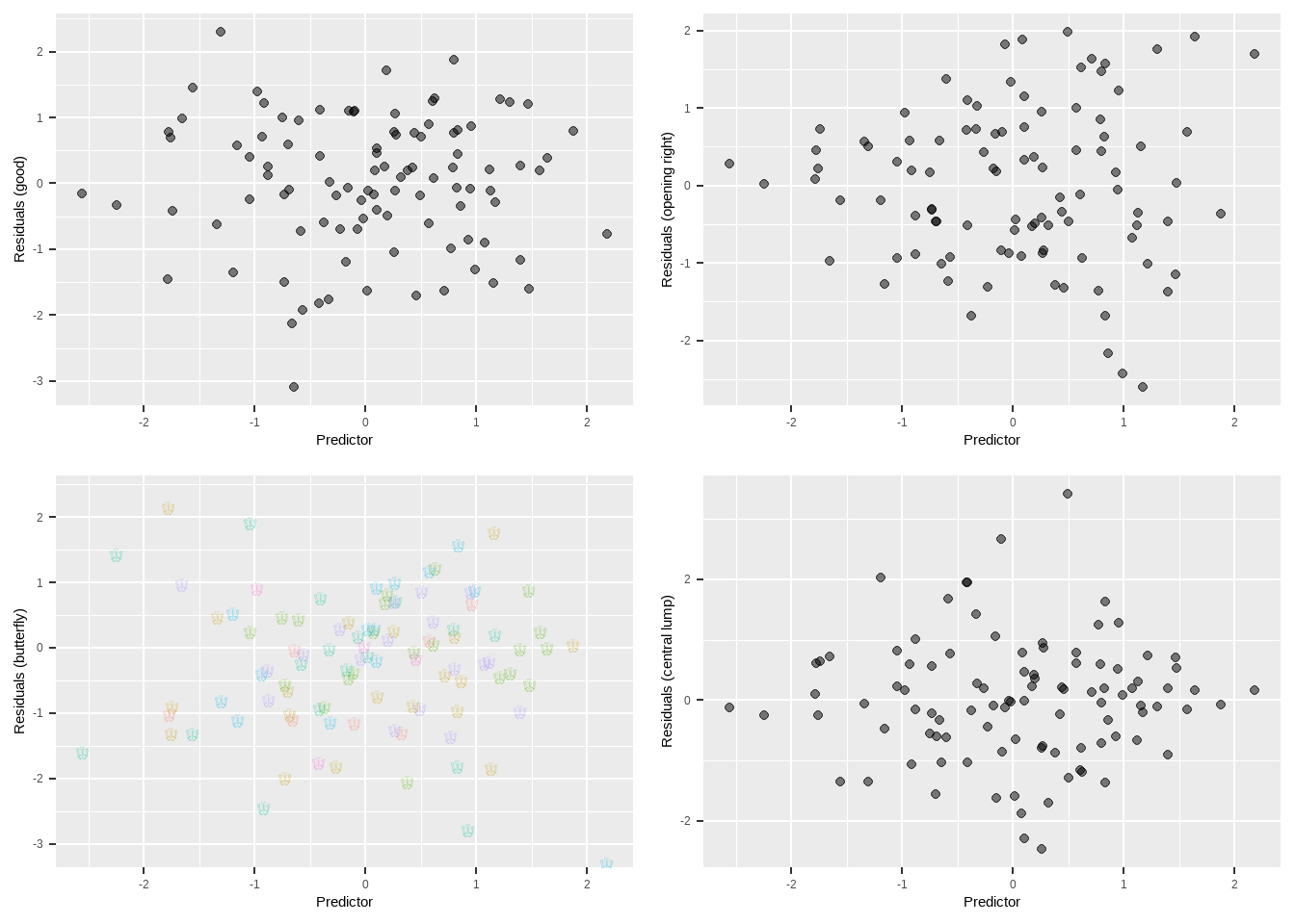
set.seed(12111978)x <-rnorm(100)y_good <-rnorm(100, mean =0, sd =1)y_right <-rnorm(100, mean =0, sd =abs(min(x)) + x +2)y_butterfly <-rnorm(100, mean =0, sd =abs(x) +2)y_lump <-rnorm(100, mean =0, sd =3-abs(x))res_good <-rstandard(lm(y_good ~ x))res_right <-rstandard(lm(y_right ~ x))res_butterfly <-rstandard(lm(y_butterfly ~ x))res_lump <-rstandard(lm(y_lump ~ x))dat_good <-data.frame(x, res = res_good)dat_right <-data.frame(x, res = res_right)dat_butterfly <-data.frame(x, res = res_butterfly)dat_lump <-data.frame(x, res = res_lump)load.emojifont('EmojiOne.ttf')symbols <-emoji('butterfly')p1 <-ggplot(dat_good, aes(x = x, y = res)) +geom_point(alpha = .5) +labs(x ='Predictor', y ='Residuals (good)')p2 <-ggplot(dat_right, aes(x = x, y = res)) +geom_point(alpha = .5) +labs(x ='Predictor', y ='Residuals (opening right)')p3 <-ggplot(dat_butterfly, aes(x = x, y = res, label = symbols, color =factor(round(runif(100) *6)))) +geom_text(family ='EmojiOne', alpha = .5) +labs(x ='Predictor', y ='Residuals (butterfly)') +theme(legend.position="none")p4 <-ggplot(dat_lump, aes(x = x, y = res)) +geom_point(alpha = .5) +labs(x ='Predictor', y ='Residuals (central lump)')grid.arrange(p1, p2, p3, p4, ncol =2)
Figure 3: The top-left scatterplot shows homoscedasticity. This is what want to see; the residuals are equally variable at each value of the predictor. This will tend to give us correct standard errors. The top-right demonstrates a conical shape we often encounter when the outcome is a count (e.g., number of suspensions received) or financial data (e.g., income); people for who we predict high values tend to be more variable than people for who we predict low values. This will tend to give us standard errors that are too small; we’ll reject more null-hypotheses than we ought to. The bottom-left shows a butterfly; I’ve never actually seen this in the wild, but I do like butterflies. Again, this will make standard errors too small. The bottom-right shows another unusual configuration, where residuals are most variable near the center. This is cool because it will make our standard errors too large; we won’t reject as many null-hypotheses as we ought to, so our rejections will be even more emphatic.
What happens if it’s violated?
This assumption is sort of halfway between the assumptions of linearity and normality (which we get to next). On the plus side, violations of the assumption of homoscedasticity don’t alter our interpretation of the parameters for the line of best fit. Yay! However, heteroscedasticity (the opposite of homoscedasticity) can result in badly biased standard errors, and consistently wrong p-values and confidence intervals. So we can easily interpret what we estimate, but we have a hard time knowing how well we’ve estimated it. =(.2
What can we do about it?
Again, we have a couple of options. First, it’s possible that we can use a transformation of the outcome to address the problem of heteroscedasticity (a transformation of the predictor can’t fix the problem, although it might make it a little less troublesome). But this is problematic unless there’s also a problem of non-linearity (in which case we’d select a transformation to fix the problem of non-linearity rather than the problem of heteroscedasticity) because a transformation of a linear association will always introduce non-linearity.
Another option is to use an approach to estimating standard errors which is robust to violations of the assumption of homoscedasticity. If the sample is large, we can use robust standard errors; if it’s small, we can use a bootstrap. If we’re not sure whether the residuals are homoscedastic or not, we can estimate the standard errors using the standard approach and then using a robust approach and see if they differ substantially. If we think we know how the variance of the residuals is associated with the predictor, we can use a generalized linear model which allows the conditional variance of the outcome to be a function of its conditional mean. S-052 introduces on generalized linear model, the logistic regression model.
The third assumption: Normality of the residuals
In addition to being homoscedastic (i.e., having the same variance at all values of the predictor), we also assume that residuals are normally distributed at each value of the predictor. We discussed the Normal distribution in Unit 2.
How do we check it?
Checking the assumption is actually very difficult. We very rarely have enough points at any particular value of the predictor to tell whether or not they’re normally distributed (estimating the conditional variance is much easier). However, it’s relatively easy to tell if the residuals as a whole are plausibly normally distributed. All we need to do is plot a histogram of the residuals and see if it looks like a normal distribution. Better would be to overlay a plot of a normal distribution on the histogram and see how closely it matches the histogram.
For technical reasons, we don’t actually want to look at a histogram of the raw residuals which are defined as \varepsilon_i=y_i-\hat{y}_i (i.e., the residuals we’ve been discussing so far). Instead, we need to look at a histogram of the standardized residuals, which have the advantage of having a standard deviation of 1 (but are, confusingly, not simply the raw residuals divided by their standard deviation).
If the assumption of the normality of the residuals is met, then the histogram of the residuals should look like a normal distribution. On the other hand, even if the histogram of the residuals is normal, it may not be the case that the residuals are normal at each value of the predictor.
Code
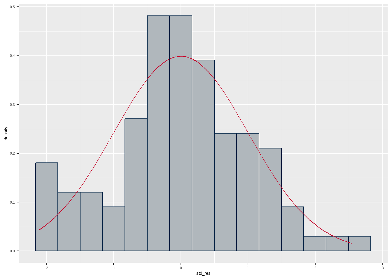
nc %>%ggplot(aes(x = std_res)) +geom_histogram(aes(y =after_stat(density)), bins =15, fill ='#B0B7BC', col ='#002244') +stat_function(fun = dnorm, col ='#C60C30')
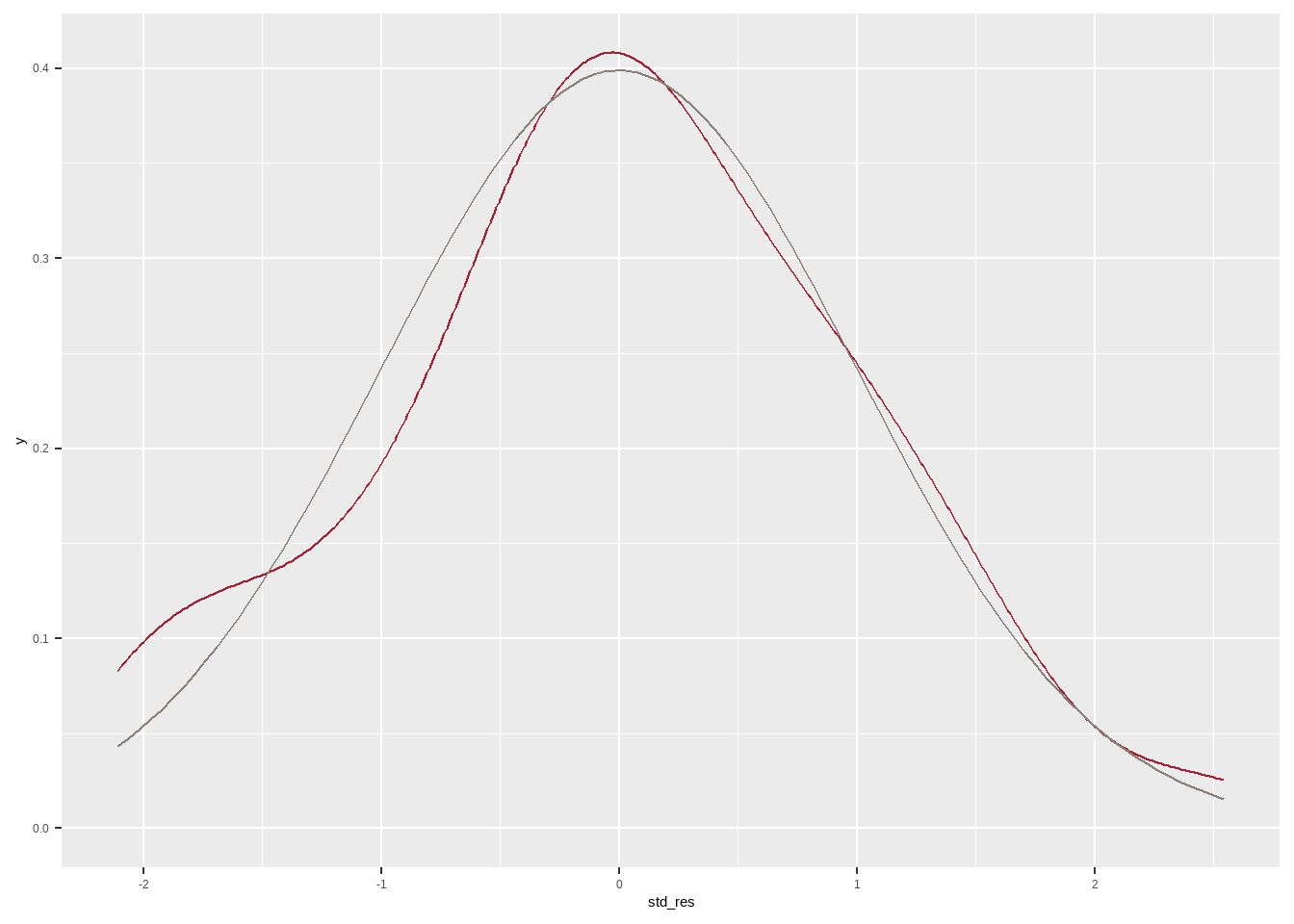
Figure 4: The figure shows a histogram of the standardized residuals from the regression with an overlaid normal distribution. This is a New England Patriots-themed histogram; the fill is new century silver (B0B7BC), the borders of the histogram bars are navy blue (002244), and the normal curve is red (C60C30). These are the team colors, according to https://teamcolorcodes.com/new-england-patriots-color-codes/, which is good enough for me.
Figure 4 shows the residual histogram from our regression with an overlaid normal distribution in red. The normal distribution matches the histogram reasonably well (remember that in a small sample we can’t expect too much agreement), and we see no real evidence that the residuals are not normally distributed. The dip in the center of the distribution is a little weird, but not hugely concerning.
Histograms can be problematic since their appearance is highly sensitive to bin width, and a little tinkering can drastically change the appearance of the histogram. A nice alternative is a kernel density or k-density plot, which can be thought of as a smoothed histogram. Kernel density plots are built by basically stacking together a bunch of normal distributions, one centered at each point in the sample.
Figure 5: The figure shows a kernel-density plot of the standardized residuals from the regression with an overlaid normal distribution. The line for the kernel density plot is crimson (A51C30), while the line for the normal curve is mortar (8C8179). These are parts of Harvard’s official palette (https://www.seas.harvard.edu/communications/identity-guidelines/color-palettes; other schools maintain similar sites).
Figure 5 shows a kernel density plot of the standardized residuals, with an overlaid normal curve with the same mean and standard deviation. Clearly they look very similar, which reinforces our decision that the assumption of normality is plausibly approximately correct.
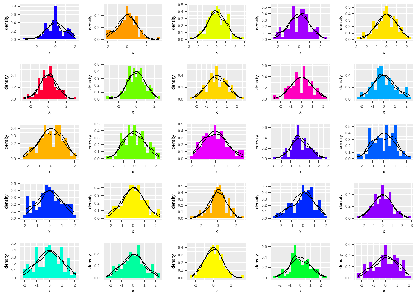
It can be hard to know whether a histogram or kernel density plot comes from a normal distribution, especially when the sample size is small. To give you a sense of how variable samples can be, Figure 6 shows 25 samples of size 100, each taken from a normal distribution.
Figure 6: 25 samples from a normal distribution, each of size 100. Notice that, while some of the histograms look a great deal like a normal distribution, other differ substantially.
What happens if it’s violated?
Short answer, usually nothing; long answer, it depends on how, and how badly, the assumption is violated. In theory, if the residual distribution has extremely heavy tails3 or really bad skew, it might bias your standard errors. This could be especially problematic if the skew/heavy tails show up at extreme values of the predictor. For example, if you assume that wealth in Medina, Washington is normally distributed, then Melinda and Bill Gates are going to ruin your standard errors.4 On the other hand, most violations of this assumption won’t cause you any problems at all, unless your sample is tiny. You really only need to be concerned if you see residuals which are much, much bigger than you should expect if they actually were normally distributed.
This is a relief, because in practice residuals are never normally distributed (it’s not hard to prove this mathematically). Usually the non-normality is small enough to be tolerable.
What can we do about it?
You probably shouldn’t do anything; again, unless the assumption violations are extremely severe, there’s nothing to be concerned about. On the other hand, it can’t hurt to check your inferences using robust standard errors or a bootstrap.
The fourth assumption: Independence of the residuals
The final assumption we make is the hardest to check empirically, and possibly the hardest to understand. We assume that, at each value of the predictor, the residuals are independent of each other; knowing that one person who reported INTEREST of 2.5 had a large positive residual shouldn’t tell us anything about the residuals of anyone else who reported INTEREST of 2.5. A common source of violations of this assumption comes from study designs which select multiple students from a single classroom, school, or district (this is referred to as nesting students in, e.g., classrooms). Students in a single classroom might be expected to report similar levels of personal interest (after all, they’re reporting on the same teacher) and similar residuals (maybe this teacher or subject tends to be especially engaging).
To give you some intuition for why this assumption matters, suppose that we sampled 50 students from two classrooms. Suppose that all of the students in one classroom reported low values of personal interest and engagement and all of the students in another classroom reported high values of personal interest and engagement. A regression model would estimate a positive association between INTEREST and ENGAGEMENT. However, it’s also possible that the teacher who had high INTEREST ratings also happened to be especially engaging, and the teacher with low INTEREST ratings was especially dull. The association might driven by the two teachers we happened to sample rather than something real in the population. Our methods would treat the sample as being much larger than it really was, calculating standard errors and p-values as though we had 50 students, rather than just two classrooms.
How do we check it?
The best way to check this assumption is with a thorough understanding of how the sampling was done in the dataset at hand. There are clever tricks for looking for non-independence graphically, but an understanding of how your data were collected beats other approaches. The more clusters we have, the less of a problem this is. The more students we have in each cluster and the stronger the association of residuals within a cluster, the more of a problem.
In our study, the assumption of independence probably does not hold. Students are nested in classrooms and classrooms are nested in schools. We especially expect that residuals are correlated within classrooms, where students are all reporting about the same teachers and subjects. On the other hand, none of the clusters are too large, so this probably isn’t a huge problem for us.5
What happens if it’s violated?
When this assumption fails, we tend to get our standard errors wrong. Specifically, our standard errors will usually be too small, which will lead us to overestimate our precision; we won’t have estimated \beta_1 and \beta_0 as precisely as we think we have. Think back to the example where 50 students are nested within two classrooms. If we ignore the nesting, we might imagine that we have 50 observations to use to estimate the association between INTEREST and ENGAGEMENT. But more realistically, if we think of INTEREST and ENGAGEMENT as being at least partially a function of the particular teachers, we actually only have two observations, the two teachers (or maybe somewhere between 2 and 50, because residuals aren’t perfectly correlated).
What can we do about it?
One approach we can take is to use models which allow residuals to be correlated, i.e., a model that accounts for the clustering. Some common approaches include hierarchical models, which we won’t cover, and models with fixed effects (which is a special case of multiple regression with a polychotomous predictor), which we’ll briefly mention. Usually these models require us to assume that residuals are uncorrelated within clusters, but this is typically much more reasonable than assuming that they’re uncorrelated across clusters. We might use these approaches if we’re actually interested in what’s happening at the cluster level.
Another method is to use an approach to estimating standard errors which is robust to clustering (assuming we know what the source of non-independence is). Some statistical software packages allow us to compute cluster robust standard errors which are asymptotically correct as the number of clusters grows large. Bootstrapping at the cluster level is another option.6 With these approaches we don’t really care about the clusters, we just want to get our standard errors right
Summary
Here’s the big takeaway of this unit: the almost magical ability to make inferences about a huge population using only a small sample (and especially the ability to estimate the standard deviation of a sampling distribution using only a single sample) comes because we make a lot of assumptions about the population. If those assumptions aren’t plausible, we need to use different models or different approaches to estimation or else we’re likely to have very wrong ideas of how precisely we’ve estimated the parameters of interest.
Here’s how we might summarize our assumption checking: Having regressed ENGAGEMENT on INTEREST, we checked our residuals to ensure that our estimates were trustworthy. We found no real evidence of non-linearity. There was no evidence of heteroscedasticity; we saw evidence of approximately constant variance at all levels of the predictor. Similarly, the assumption of normality was plausible. The residuals as a whole appeared to be normally distributed, and there was no evidence that the conditional distributions were not normal. Finally, given that we sampled students who were nested within classrooms and schools, the assumption of the independence of residuals is not plausible; however, given that there are many clusters and cluster sizes were small, this should not threaten our inference.
Appendix
Does the linear model hold in the population?
Remember, the assumptions are about the population, not the sample. Non-linearity in the sample doesn’t threaten our inferences if the population association is linear. Usually we have to look at the sample to draw inferences about the population because we can’t actually observe the full population. However, in this case we also have direct access to the population (the 1762 students in the full sample). So we can see how our assumptions hold up when we look at the population as a whole.
Code
mod.pop <- pop %>%lm(engage ~ interest, data = .)pop$std_res <-rstandard(mod.pop)pop$pred <-predict(mod.pop)p1 <- pop %>%ggplot(aes(x = interest, y = engage)) +geom_point(alpha = .5) +geom_smooth(se =FALSE, method ='loess') +labs(x ='Teacher\'s personal interest', y ='Engagement in class')p2 <- pop %>%ggplot(aes(x = pred, y = std_res)) +geom_point(alpha = .5) +geom_smooth(se =FALSE, method ='loess') +geom_hline(yintercept =0, lty =2) +labs(x ='Predicted engagement', y ='Standardized residual')grid.arrange(p1, p2, ncol =2)
Figure 7: The figure shows a scatterplot of student engagement against student perceptions of teacher personal interest in the population with an overlaid LOWESS smoothed curve and a plot of the residuals against the predictor with a LOWESS curve overlaid.
We’ll just be looking at the linearity assumption in this case. Figure 7 shows the population scatterplot of ENGAGEMENT against INTEREST and the scatterplot of the standardized residuals from a regression of ENGAGEMENT on INTEREST against INTEREST. As you’ll note, it looks pretty linear. The LOWESS curve wiggles around a little bit but there’s nothing to worry about. It looks like the assumption of linearity was correct.
What are the assumptions about?
Remember that we’re making assumptions about residuals, not about the predictor and outcome themselves. If we have a highly skewed outcome or predictor, that can be a problem, but it doesn’t necessarily violate the regression assumptions, if the residuals are okay. You should still look at the predictor and outcome distributions, but don’t use them to assess the plausibility of the regression assumptions.
Footnotes
In multiple regression it becomes almost impossible to really check the assumption of linearity, and some researchers prefer to assume that the assumption is wrong (lol) and proactively protect themselves from potential violations.↩︎
Also, somewhat more technically, ordinary least squares, or OLS, is not the best approach for fitting regression lines to heteroscedastic data. We don’t want to count residuals as much if they occur in highly variable regions as if they occur in less variable regions. A better approach is something called generalized least squares, or GLS, which allows us to put different weights on different residuals, depending on how variable we estimate them to be. We don’t cover GLS in this class, although heteroscedasticity-robust standard errors, which we introduce in the appendix, do something similar.↩︎
You should check out the tails on that Cauchy distribution (but do it discretely)!↩︎
Why are you ruining my standard errors like that, guys!?!↩︎
If we’re only interested in estimating the association in these schools, this is even less of a problem; if we want to generalize to a wider population, then it’s more of an issue.↩︎
Another reason to love the bootstrap is that it has some awesome variants. There’s the wild bootstrap, the weird bootstrap, and the cluster-robust wild bootstrap-t. Wow.↩︎