These course notes should be used to supplement what you learn in class. They are not intended to replace course lectures and discussions. You are only responsible for material covered in class; you are not responsible for any material covered in the course notes but not in class.
Overview
The setting
A few simple linear regressions
Adding multiple predictors
Interpreting the multiple regression model
Statistical inference in multiple regression
Model assumptions
Summary
The setting
So far all of our models have incorporated only a single predictor. However, we’re frequently interested in estimating associations using more than one predictor. In a later unit, we’ll talk in more detail about what this means and how we should, and should not interpret the results. For now, we’ll just take the idea and run with it.
We’re going to return to the example from Unit 4, but this time we’re going to add some new predictors. Recall that 100 students were sampled from a number of schools. The students were given a survey; two of the scales included on the survey measured students’ perceptions of their teachers personal interest in them (INTEREST), and students’ levels of engagement in the class (ENGAGEMENT). However, the survey also included other scales. The other scale that we’re going to consider are scales measuring the extent to which students value the subject covered in the class (VALUE). The survey also included a scale measuring the extent to which students consider their teacher to be an effective instructor (EFFECTIVE). It’s important to reiterate that all of these values are reported by students; students might mistakenly believe that a teacher is interested in them even though she or he is not;1 they might consider a teacher to be ineffective even though she or he is actually highly effective.
We know that there is a positive association between INTEREST and ENGAGEMENT. However, we suspect that students who value the subject in which they’re enrolled also tend to be more engaged, and might consider their teachers to be more interested in them (kids who like a subject might have an easier time forming relationships with their teachers). Therefore, we’d like to estimate the association between INTEREST and ENGAGEMENT when we only look at kids who have the same level of VALUE; this way differences in how much students value the subject won’t be showing up in our estimates of the association, because we’ll only be looking at kids with the same levels of VALUE. One way of saying this is that we want to estimate the association between INTEREST and ENGAGEMENT while controlling or adjusting for VALUE.
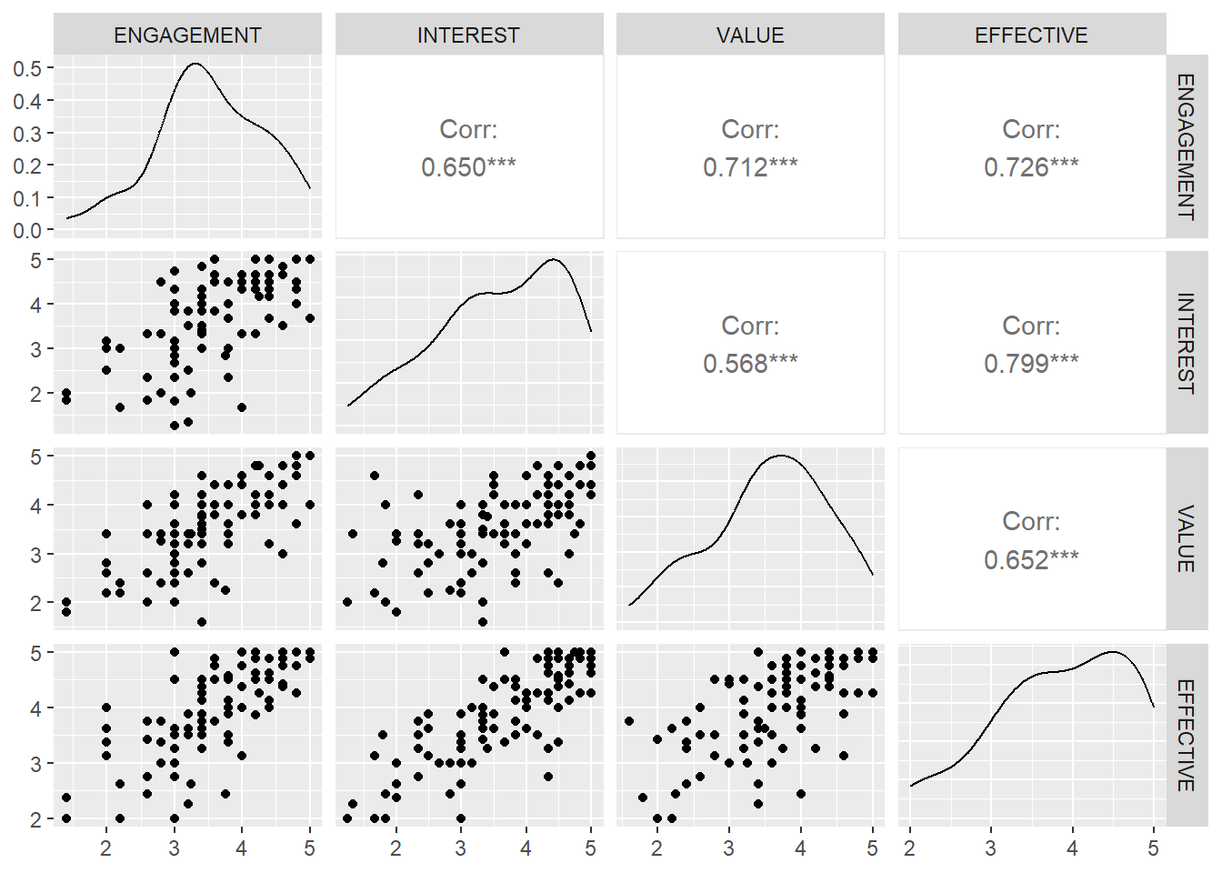
Figure 1: Scatterplot matrix of variables of interest. Each cell beneath the diagonal shows a scatterplot of the row variable on the column variable. The cells on the diagonal show kernel density plots for each variable, while the cells above the diagonal report the correlations between the row and column variables.
In Figure 1 we display the scatterplots of each of INTEREST, ENGAGEMENT, VALUE, and EFFECTIVE against each other. This display is referred to as a scatterplot matrix, although this particular figure contains additional information, including kernel density plots and correlations. For any plot in the same row as VALUE, VALUE is on the y-axis. For any plot in the same column as VALUE (column 3), VALUE is on the x-axis. This is a handy way of simultaneously displaying multiple scatterplots. Darker points indicate more than one overlapping dot. Note that, for each pair of variables, there’s a moderately strong, positive, linear association with no unusual observations, making the associations appropriate for simple linear regressions.
Table 1 shows a correlation matrix for the variables of interest. The cell in the INTEREST row and the ENGAGEMENT column shows the correlation between INTEREST and ENGAGEMENT. We don’t present correlations above the diagonal because the correlation between, e.g., INTEREST and ENGAGEMENT is the same as the correlation between ENGAGEMENT and INTEREST, so the correlations above the axis would simply be repeating the information below the diagonal. All of the correlations are moderate to strong. We frequently see this with personality scales or scales measuring student experiences at school; students tend to be self-similar across a wide variety of measures. The fact that all of these scales are measuring student perceptions of the same instructor and class only strengthens this tendency.
Code
datasummary_correlation(dat)
Table 1: Correlation matrix for variables of interest
tinytable_6zie6r6obo5losl88b1o
ENGAGEMENT
INTEREST
VALUE
EFFECTIVE
ENGAGEMENT
1
.
.
.
INTEREST
.65
1
.
.
VALUE
.71
.57
1
.
EFFECTIVE
.73
.80
.65
1
A few simple linear regressions
Let’s start by running a few simple linear regressions. First, we have
\hat{ENGAGEMENT}_i=1.72 + 0.45INTEREST_i
Regressing ENGAGEMENT on VALUE gives us
\hat{ENGAGEMENT}_i=0.30 + 0.84VALUE_i.
It’s hard to compare this equation to the previous one, because the predictors are measured on such very different scales. A one scale-point difference in INTEREST means something different than a one scale-point difference in VALUE. More informative is the fact that the correlation between INTEREST and ENGAGEMENT (r=.65) is quite a bit smaller than the correlation between INTEREST and EFFECTIVE (r=.71).
The final regression we want to look at is of INTEREST on VALUE (or VALUE on INTEREST). This gives us
\hat{INTEREST}_i = 1.15 + 0.65VALUE_i.
The correlation between INTEREST and VALUE (r=.57) is lower than the other correlations.
What we’ve seen is basically what we saw in the scatterplot matrix, the correlation matrix, and what we expected to find based on experience and theory: there are positive, moderately strong associations between each pair of variables. So what we might wonder is whether part of the association we saw between ENGAGEMENT and INTEREST comes from the fact that students who report that they value their classes more also report higher levels of both personal interest and engagement. If we only look at students who report that they value the subject the same amount (whether they all assign the class a high value of a low value), we might see a weaker association between INTEREST and ENGAGEMENT, because it will no longer be capturing the association between VALUE and those variables (because we’re holding VALUE constant by only looking at students who value the class the same amount).
Adding multiple predictors
It’s not actually possible to fit the regression only to students with the same VALUE score, because we simply don’t have enough of them for any level of VALUE. There are only a handful of students who reported any given score of VALUE, nowhere near enough to fit a regression with.
Fortunately, we can achieve the same thing with a model, as long as we’re willing to make certain assumptions. We’re going to assume that
If this model holds in the population and we hold VALUE_i constant at some value, VALUE_0, then a one scale-point difference in INTEREST predicts a \beta_1 scale-point difference in ENGAGEMENT. To see this, suppose two students report the same level of VALUE, but student i reports INTEREST of INTEREST_0, and student j reports INTEREST of INTEREST_0+1.
Notice that this is true regardless of what VALUE_0 and INTEREST_0 actually are. If we choose VALUE_0 = 1, the \beta_1 coefficient will mean the exact same thing as if we choose VALUE_0 = 5; it’s the predicted difference in the outcome associated with a one-unit difference in INTEREST, between students who have the same score on VALUE.
This point is so important, we want to go over it once more: in this model, \beta_1 is the predicted difference between two students with the same value of VALUE who differ by one scale-point on INTEREST.
If the rest of this section isn’t helpful to you, feel free to skip it. The geometry behind multiple regression is a little less straightforward than for simple linear regression.
Readers with a mathematical background might recognize the equation
as representing a plane in three-dimensional space. \beta_1 and \beta_2 represent the slopes of the plane in the direction of INTEREST and VALUE, respectively, and the intercept represents the intercept of the plane, i.e., the mean value of ENGAGEMENT when both INTERESTandVALUE are 0. The slope of the plane in the direction of INTEREST is the mean difference in ENGAGEMENT associated with a one scale-point difference in INTEREST when holding VALUE constant (because we’re moving perpendicular to the VALUE direction).
Code
axis_x <-seq(min(dat$INTEREST), max(dat$INTEREST), 1)axis_y <-seq(min(dat$VALUE), max(dat$VALUE), 1)pred_data <-expand.grid(INTEREST = axis_x, VALUE = axis_y, KEEP.OUT.ATTRS =FALSE)mod_mult <- dat %>%lm(ENGAGEMENT ~ INTEREST + VALUE, .)pred_data$ENGAGEMENT <-predict(mod_mult, newdata = pred_data)pred_data <-acast(pred_data, INTEREST ~ VALUE, value.var ="ENGAGEMENT")dat %>%plot_ly(x =~INTEREST, y =~VALUE, z =~ENGAGEMENT, type ="scatter3d", mode ="markers", marker =list(size =1)) %>%add_trace(x = axis_x, y = axis_y, z = pred_data, type ='surface', opacity = .3)
Figure 2: 3d scatter of engagement on interest and valuing, with plane of best fit.
Figure 2 shows the plane of best fit for this model and dataset. The rgl package in R makes it simple to create a similar plot which can be rotated to give you different views (we lose this funcitonality when we embed the image in a pdf). If you look at the line formed by the plane of best fit and the rear or front wall of the box, the slope of that line is equal to \beta_1 (because the from and back of the box move in the direction of INTEREST). Similarly, the slope of the line formed by the plane of best fit and the left or right wall of the box is \beta_2 (because the left and right walls move in the direction of VALUE). Just like the line of best fit, the plane of best fit is the single plane which minimizes the variance of the residuals or, equivalently, the sum of squared residuals.
We can interpret the coefficients as follows. \hat{\beta}_0=0.17 is the predicted engagement of students who report interest and value of 0. Obviously there are no such students; the lowest possible response on any of these scales is a 1. We only require an intercept to shift the plane of best fit up or down and give our model some flexibility; omitting the intercept is the same as constraining it to be equal to 0, which is usually a strange choice.
The coefficient for INTEREST, \hat{\beta}_1=0.12 is the predicted difference in engagement between two students who differ by 1 on INTEREST, and report the same VALUE. Students who report higher levels of INTEREST tend to also report higher levels of VALUE, but, again, our model tries to estimate the association between ENGAGEMENT and INTEREST while holding VALUE constant. In the context of a model, we can refer to this as the controlled association between the predictor and the outcome, but keep in mind that the controlled association will differ depending on what we control for; there is no single association, controlled or otherwise, between INTEREST and ENGAGEMENT.
The coefficient for VALUE, \hat{\beta}_2=0.77, has a parallel interpretation. It is the predicted difference in engagement between two students who differ by 1 on VALUE, and report the same INTEREST. Notice that in this model, the particular level of INTEREST that the two students report is irrelevant; all that matters is that it is the same. This is referred to as the main effects assumption, and it holds that the association between VALUE and ENGAGEMENT is the same, regardless of the level of INTEREST that students report. In a later unit we’ll loosen this assumption.
Glancing at this output, we might be tempted to infer that valuing a subject is more important to students’ engagement than perceiving a teacher as personally interested in them. This is problematic for two reasons. First, and most importantly, the concept of ‘’more important’’ doesn’t have a strict statistical definition. It can mean different things to different people and in different contexts, and many of these meanings aren’t observable in the regression coefficients. In this way it’s also a sort of sneaky way of introducing causal claims into our analysis, because it sounds an awful lot like claiming that valuing a subject causes students to be more engaged in that class.
It’s also problematic because the scales on which valuing of the subject and teacher’s personal interest are measured are not directly comparable. This, at least, is something we can fix. An easy way to set all of the variables on the same scale is to standardize them first by taking
x^{std}_i=\frac{x^{raw}_i-\bar{x}}{s_x}.
In other words, we first subtract the mean of the variable from each observation (which only matters for the intercept), and then divide by the sample standard deviation (which sets each variable on a standard deviation scale). Then, if we fit the model
we can interpret, e.g. \beta_1^{std}, as the standard deviation difference in ENGAGEMENT associated with a one standard-deviation difference in INTEREST, adjusting for VALUE.3 In this case, the variable with the larger regression coefficient can be said to have a stronger controlled association with the outcome than the variable with the smaller coefficient.
indicating that VALUE has a stronger controlled association with the outcome than INTEREST does (\beta_0 is 0 because of the standardization). However, strength here is meant in a purely statistical sense, similar to correlation, and does not map onto all of the possible meanings of importance in a straightforward way. Certainly this does not mean that the best way to raise students’ engagement in class is to try to make them value the subject more; some researchers make this mistake in interpreting their results.
Note that the intercept is omitted because it is constrained to be 0; when we fit a regression of a scaled outcome on scaled predictors, the intercept will always be 0. This is because in a planar model, when both predictors are at their means (and therefore their scaled versions are 0), we always predict that the outcome will be at its mean.
Statistical inference in multiple regression
The basics of inference in multiple linear regression are very similar to their counterparts in simple linear regression. We conduct t-tests and construct confidence intervals as before, and the concept of R^2 is similar (i.e. the proportion of variability in the outcome which can be explained by the predictors). The standard errors are once again proportional to the standard deviation of the residuals; the more precisely we predict the outcome, the more precisely we estimate the regression coefficients. The degrees of freedom for the t-distribution are equal to n-p where p is the number of \beta terms we have to estimate (including the intercept), and the standard errors are now also proportional to \frac{1}{\sqrt{n-p}} (see the discussion of degrees of freedom in Unit 5, which tries to motivate the n-p terms). One consequence of this is that, if the number of parameters becomes large relative to the size of the dataset the standard errors become very large, the degrees of freedom for the t-distribution become very small, and our estimates become very imprecise. If n is close to p, then n-p will be very small, which will make the standard errors large. Overparameterize your model at your own peril!
In our running example, the estimated standard error for the coefficient on the regression coefficient for INTEREST, \hat{\beta_1} is \hat{se}(\hat{\beta_1})=0.07, which is slightly smaller than the standard error for the coefficient from the simple linear regression (the standard error was .08, this is largely a coincidence and is not always the case, as we’ll see later). The estimated standard error for the regression coefficient for VALUE from the multiple regression model, \hat{se}(\hat{\beta}_2) is .09; in the simple linear regression, it was 0.08, so we’ve estimated the controlled association slightly less precisely than we estimated the simple, or marginal, association.
Noting that the critical value for a t-distribution with 98 degrees of freedom is 1.98, we obtain a 95% confidence interval for \beta_1 equal to
(0.12-1.98*0.07,0.12+1.98*0.07)=(-0.03,0.26).
For any value, \beta_1^0, in this range, we would fail to reject the null-hypothesis H_0:\beta_1=\beta_1^0 at an \alpha of .05. Recall that, over repeated random samples, 95% confidence intervals will contain the true parameter of interest 95% of the time, though we have no way of knowing if this is one of those times. Notice that this confidence interval includes 0, which means that we do not have evidence that there is an association between INTEREST and ENGAGE after controlling for VALUE.
Now we’re going to briefly discuss some of the nuances which are introduced by moving from simple linear regressions to multiple regressions.
R^2
The first concept we’re going to talk over is the model R^2. As before, we can think of the R^2 as the proportional decrease in the variance of the residual from a model with no predictors (i.e., the variance of the outcome) to the full model (i.e., the variance of the residuals, \sigma^2_\varepsilon). We can also think of it as the square of the correlation between the predicted values and the observed outcome.
As we add new predictors, the R^2 of the fitted model will never decrease. In fact, it will almost always increase, though sometimes by only negligible amounts. This is because R^2 is a summary of how close our predictions come, on average, to the observed values. If, controlling for the other predictors, the new predictor gives us no more information about the outcome, it will have a \hat{\beta} coefficient of 0, the predictions will not change, and R^2 will remain the exact same. We can’t possibly worsen our predictions. If the new predictions are at all closer than the old ones, the R^2 for the model will increase.
On the other hand, increases in the R^2 of the fitted model may not accurately reflect gains in the R^2 of the population model. In general, due to chance alone, adding new predictors will always result in higher values of R^2 in the sample, even if those predictors add no new information in the population (i.e., even if the true controlled value of \beta_{new} is equal to 0). The sample R^2 is actually a biased estimate of the population R^2, and tends to be higher than the population value. Most software provides you with an adjusted R^2, which is an unbiased estimator of the population R^2, and is always lower than the sample R^2. If adding a new variable to a model results in predictions that are no better, or only a little better, than the previous model, the adjusted R^2 can actually decline. It can also be less than 0, though the sample and population R^2 can never be smaller than 0. Looking for decreases in the adjusted R^2 is one way of deciding whether a new variable explains any additional variability in the outcome in the population. This becomes especially important as the number of parameters in the model becomes large relative to the number of observations.
An easy mistake to make is to assume that the R^2 of a multiple regression is equal to the sum of the R^2 values from the simple regressions of the outcomes on the predictors. This is not correct. In fact, the R^2 of the multiple regression is typically less than or equal to the sum of the simple regressions. The reason for this is that if the predictors are correlated, then some of the variability that they explain is overlapping, and cannot be explained twice. If the two predictors are perfectly uncorrelated, then (and only then) the R^2 values will sum to give the R^2 for the multiple regression.
The R^2 value for the multiple regression is .55, indicating that 55% of the sample variability in ENGAGEMENT is explained by the model; or that the square of the correlation between \hat{ENGAGEMENT} and ENGAGEMENT is .55; or, finally, that the variance of the residuals from the full model, \sigma^2_\varepsilon, is 55% smaller than (i.e. 45% as large as) the variance of ENGAGEMENT, \sigma^2_{ENGAGEMENT}.
Standard errors
Standard errors also change a little when we move to multiple regression (not how they’re used, but how they’re calculated). Recall from before that the standard error of the regression coefficient for a predictor, X, depended on three things: the standard deviation of the residuals, \sigma_\varepsilon, the sample size, n, and the standard deviation of the predictor, \sigma_X. Typically adding new predictors causes \sigma_\varepsilon to decrease, because the additional predictors allow us to predict the outcome more precisely.
This is all true in multiple regression, but the standard error now also depends on the correlation between the predictor and the other predictors. The more highly correlated the predictor is with the other predictors (actually, the higher the R^2 from a regression of the predictor on all the other predictors), the larger the standard error will be. Intuitively, this should make sense (though not necessarily right away!). If two predictors are closely related to each other, such as INTEREST and VALUE, it can be difficult to see how the outcome, ENGAGEMENT is associated with each while controlling for the other. Students who report high levels of personal interest also report valuing the subject matter and the model has a hard time estimating the association of the outcome and one predictor when holding the other predictor constant; we never really see one predictor differ while the other is constant. This results in imprecise estimates of each regression coefficient, which is reflected in the large standard errors.
Notice that the standard error of the regression coefficient for VALUE actually increased when we added a new predictor, even though the standard deviation of the residuals decreased. This is because the correlation between VALUE and INTEREST is high enough to more than offset the decrease caused by the reduction in \hat{\sigma}_\varepsilon.
The upshot of this is that it can be extremely difficult to estimate the individual regression coefficients for closely related variables with any sort of precision. We’ll talk more about this and about what to do about it in Unit 9.
F-tests
Sometimes we just want to know if the model is predicting anything at all. A null-hypothesis of no association between any of the predictors and the outcome would be
H_0:\beta_1=\beta_2=\beta_3=...=\beta_p=0,
i.e. that all of the regression coefficients are equal to 0. We test this null-hypothesis using an F-test. This is not information which is contained in any of the t-tests; it’s possible for there to be evidence that at least one of the coefficients is non-0 (reject the F-test) even if we can’t say that any particular coefficient is non-0 (fail to reject any of the t-tests). It’s also possible to reject a t-test, but to have no evidence that the model as a whole is predicting any variability in the outcome (fail to reject the F-test); we cover this in a little more detail in chapter 11, but the basic idea is that we can reject individual tests by chance even though the model as a whole doesn’t seem to be predicting anything. As exception is that in a simple linear regression,the p-value for the F-test is identical to the p-value for the t-test for that coefficient. This is because in a simple linear regression both tests are testing the same null-hypothesis.
An F-test has two different degrees of freedom; the first is p, where p is the number of predictors in the model; the second is n-p-1, where n is the sample size. The value of the F-test is roughly equal to
Think of the numerator as the amount of variance in the outcome which has been explained by the model, divided by the number of predictors we used. The larger the difference is, the more the model predicted; the more parameters we used, the less impressive that is. The denominator is the amount of variance we didn’t explain. If H_0 is true, the F-statistic has an expected value of close to 1. If the F-statistic is much larger than 1, that counts as evidence against the null-hypothesis, because that F-statistic would be unusual if H_0 were true. As always, rely on your software to compare the F-statistic to the appropriate F-distribution and report the p-value.
In our running example, we have F_{2,98}=120.1, p<.001, indicating that it would be extremely unlikely to draw a sample with an F-statistic as large as or larger than the observed one if the null-hypothesis were true. We conclude that at least one of the model parameters is non-0. The 2 and the 98 in the subscript refer to the degrees of freedom for the F test.
Model assumptions
As with simple linear regression, when we conduct multiple regression analyses, we make several assumptions about the population. As before, we assume that the form of the model is correct (we’ll see how restrictive this can be, and how we can loosen this assumption in another unit, but keep in mind that transforming predictors is still an option, and interpretations are parallel to what they were in simple linear regression), that the residuals are homoscedastic at each combination of the predictors, that the residuals are normally distributed at each combination of the predictors, and that the residuals are independent of each other at each combination of the predictors.
These assumptions are exceedingly difficult to check, because they require us to look at the residuals at each combination of the predictors; this is not a simple line, it’s a plane with one axis for INTEREST and one axis for VALUE. We could assess the residuals on a plane with some difficulty, but things become impossible with three or more predictors, except in very special cases. Instead, we propose a practical alternative. Conduct checks of residual violations exactly as you would in a simple linear regression by looking at the residuals against
each predictor, separately, and
the predicted values, \hat{y}
Check for linearity by looking for a LOWESS curve which stays close to the 0 line and check for homoscedasticity by looking for constant variance at each value of the predictor. Do both of these checks in each plot. Check for normality by looking at the marginal distribution of the residuals as a whole. It’s possible, though somewhat unlikely, that the model could pass all of these tests, but still fail to satisfy the assumptions. On the other hand, if the assumptions are correct, the checks we’ve described should look okay. This constitutes a pragmatic approach to checking the model assumptions which should detect the most problematic violations, but is relatively straightforward to carry out.
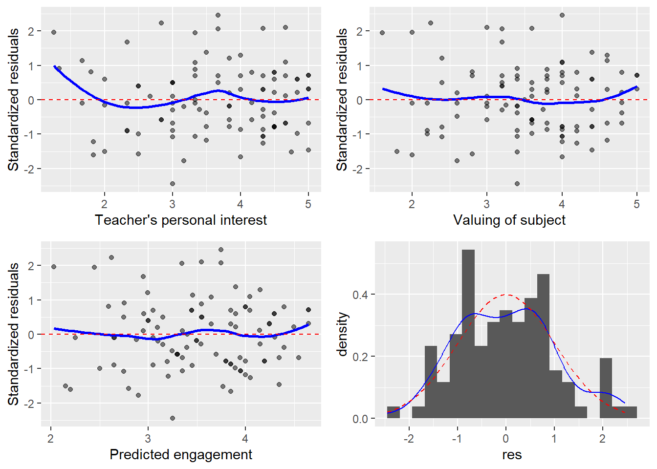
Figure 3 shows the diagnostic plots for this example. You may note some evidence of non-linearity in the scatterplot of the standardized residuals against valuing of subject and against the predicted engagement. There may be modeling violations, though possibly not severe enough to worry about; the largest divergences are at the very edge of the plots, where we expect the LOWESS curve to fail due to scarce data. The distribution of the residuals appears to be very close to Normal.
Code
dat$preds <-predict(mod_mult)dat$res <-rstandard(mod_mult)p1 <-ggplot(dat, aes(x = INTEREST, y = res)) +geom_point(alpha = .5) +geom_smooth(se =FALSE, col ='blue') +geom_hline(yintercept =0, col ='red', lty =2) +xlab('Teacher\'s personal interest') +ylab('Standardized residuals')p2 <-ggplot(dat, aes(x = VALUE, y = res)) +geom_point(alpha = .5) +geom_smooth(se =FALSE, col ='blue') +geom_hline(yintercept =0, col ='red', lty =2) +xlab('Valuing of subject') +ylab('Standardized residuals')p3 <-ggplot(dat, aes(x = preds, y = res)) +geom_point(alpha = .5) +geom_smooth(se =FALSE, col ='blue') +geom_hline(yintercept =0, col ='red', lty =2) +xlab('Predicted engagement') +ylab('Standardized residuals')p4 <-ggplot(dat, aes(x = res)) +geom_histogram(aes(y =after_stat(density)), bins =20) +geom_density(col ='blue') +stat_function(fun = dnorm, col ='red', lty =2)grid.arrange(p1, p2, p3, p4, ncol =2)
Figure 3: Residual diagnostic plots.
Plotting the results
Plotting the results of a multiple regression can be difficult, because we have one outcome and at least two predictors, but only two-dimensions to work with. As a result, making plots of multiple regressions is more of an art than a science. You won’t always want to follow the advice we’re going to give you, although it will be helpful in many situations.
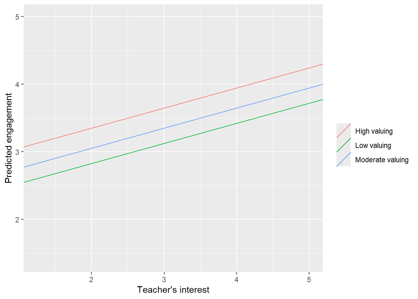
The first thing to do is to determine what the key predictor is. In our running analysis, the most interesting predictor from a substantive perspective is INTEREST, because that’s the predictor driving our research question. So we’re going to construct a plot with INTEREST on the x-axis and the outcome, ENGAGEMENT, on the y-axis. From our model, we know that the slope of the line that we plot is going to be \hat{\beta}_1 = 0.12, because that’s the controlled association. However, to get the height of the line right, we need some constant value for the other predictor, VALUE; if we just use the intercept from the regression, that’s essentially plotting the line of best fit for people with VALUE of 0, i.e., people who loathe the subject (actually, the lowest possible score on the VALUE scale is 1, so a 0 isn’t even meaningful). One solution is to set VALUE to some central number (e.g. the mean, the median, the mode, or the center of the scale, which is 3 in this case), and plot the association between ENGAGEMENT and INTEREST for respondents who have that number for VALUE. This is a prototypical value for the predictor. For example, the sample median of VALUE is 3.6. If we plug that into the regression equation, we get
This is an equation with one outcome and one predictor, and is easy to plot. However, there’s no need to limit ourselves to a single prototypical line; we can easily add others at, say, the 25th and 75th percentiles of VALUE (other good choices might be the mean plus or minus one standard deviation or at VALUE of 2 and 4).
Figure 4: Line of best fit of regression of student engagement on teachers’ personal interest, holding valuing of subject constant at its 25th, 50th, and 75th percentiles.
Figure 4 displays the plot we described above. It shows the positive controlled association between INTEREST and ENGAGEMENT in the positive slopes of the lines of best fit (later we’ll learn to relax our assumption that these lines have to have the same slope). It also shows the positive controlled association between VALUE and ENGAGEMENT in the vertical distances between the lines (those are caused by setting VALUE to higher numbers). The big jump between the green line (25th percentile) and the blue line (50th percentile) is due to the negative skew of the distribution of VALUE; the 25th percentile is well below the median, while the 75th percentile is only slightly higher.
Summary
We need to display and summarize our results. We’ll start by presenting a table displaying the various regressions we’ve fit, of ENGAGEMENT on INTEREST, VALUE, and on both INTEREST and VALUE, simultaneously.
Code
mod_int <- dat %>%lm(ENGAGEMENT ~ INTEREST, .)mod_val <- dat %>%lm(ENGAGEMENT ~ VALUE, .)htmlreg(list(mod_int, mod_val, mod_mult))
Table 2: Taxonomy of fitted models.
Statistical models
Model 1
Model 2
Model 3
(Intercept)
1.60***
1.00***
0.66**
(0.24)
(0.26)
(0.25)
INTEREST
0.53***
0.30***
(0.06)
(0.06)
VALUE
0.70***
0.50***
(0.07)
(0.08)
R2
0.42
0.51
0.60
Adj. R2
0.42
0.50
0.59
Num. obs.
100
100
100
***p < 0.001; **p < 0.01; *p < 0.05
Table 2 shows the results of all three regressions. Beneath each estimated coefficient is its associated confidence interval; another common convention is to report standard errors in parentheses beneath the estimate. It was produced using texreg, a package in R. stargazer is another package which produces similar output and was created by a Harvard graduate student. Stata offers similar packages as well. Recall from Unit 4 that the RMSE in the bottom row of the table is actually the estimated standard deviation of the residuals, \hat{\sigma}_\varepsilon.
We’ve already done a lot of the interpretations, but here’s how we might summarize the results. We regressed students self-reported engagement in their courses on their reports of their teachers’ personal interest in them and the extent to which they value the subject of the class. We estimate that a positive one scale-point difference in reported personal interest is associated with a positive 0.12 scale-point difference in reported engagement in class when holding valuing of subject constant (\hat{\beta}_1=0.24, t_98=1.58, p=.119, 95\%-CI=[-0.03,0.26]). After accounting for how much students value the subject they are taking, there is no evidence that their perceptions of their teacher’s personal interest in them is associated with how engaged they are in class.
Appendix
Residuals and multiple regression models
It turns out that there’s a deep connection between residuals and regression coefficients. This can actually be instructive, so we’ll examine it in a little detail here. One way to think of the association between INTEREST and ENGAGEMENT controlling for VALUE is as the association between the variation in INTEREST which is not explained by VALUE and the variation in ENGAGEMENT which is not explained by VALUE. But the part of INTEREST which is not explained by VALUE is the residual from a regression of INTEREST on VALUE; and similarly, the part of ENGAGEMENT which is not explained by VALUE is the residual from a regression of ENGAGEMENT on VALUE. So now let
Then the estimated slope coefficient from this model, \hat{\beta}_{31}, will be identical to \hat{\beta}_1, the regression coefficient for INTEREST from a model regressing ENGAGEMENT on INTEREST and VALUE simultaneously. Again, this is consistent with the idea that the association between a pair of variables while controlling for a third is the same as the association between the part of the outcome which cannot be explained by the second predictor, and the part of the first predictor which cannot be explained by the second predictor.
Other approaches to standard errors
As before, we have alternatives to the typical OLS standard errors, significance tests, and confidence intervals. We can once again use robust standard errors, or one of a wide variety of bootstraps. Again, these approaches are only asymptotically correct (i.e., they only work as the sample size becomes large, and the number of observations we need for these methods to work grows as we add predictors), but they will work even if the model assumptions are violated. It’s worthwhile to check our inferences using one or both of these alternative techniques to ensure that they agree.
The (linear) algebra behind multiple regression
This is a fairly brief treatment of extremely technical material. You have been warned.
Ultimately, model fitting is all about linear algebra. Think of the observed outcomes as forming a vector in n-dimensional space (n is the number of observations in the sample) defined by the coordinates (Y_1, Y_2, ..., Y_n). If you could imagine an n dimensional space, this would be a single point.
Now consider the n\times (p) (where p is the number of predictors in the model including the intercept) matrix X, where each row i of X is equal to respondent i’s values on the predictor (this means that the columns are equal to the values of the variables being used for prediction; everyone has a 1 for the intercept, which is usually the first column).
Absent collinearity (discussed in the next unit), the matrix X defines a p-dimensional subspace of the n-dimensional space in which we have located Y. This is referred to as the column space or model space of the matrix, and consists of every possible vector of predicted values which we can obtain by multiplying X by a vector of regression coefficients. That is, the subspace consists of every vector \hat{Y} where \hat{Y} = X\beta. It turns out that this is only a p-dimensional subspace, because there are vectors that we simply can’t predict (as a very simple example, there’s no way to predict that two units with the exact same values of every predictor will have different values of the outcome, even though it’s quite possible for two units with the exact same values of the predictors to actually have different values of the outcome).
The goal of regression, using linear algebra language, is to project the vector Y into the p-dimensional subspace defined by X. Essentially this means thinking of Y as a line in n-dimensional space, and finding the line, \hat{Y}, which lies in the p-dimensional subspace which comes closest to Y. The value of (the vector) \beta which gives X\beta = \hat{Y} are the regression coefficients.
Fortunately for us, projecting a vector into a subspace is a solved-problem in linear algebra. If we take
\beta = (X^TX)^{-1}X^TY,
this will give us the value of \beta which accomplishes the projection. That may look complicated, but it’s basically the matrix equivalent of multiplication, squaring, and division, and is pretty simple for a computer.
Some geometric intuition
This might not seem super-intuitive, but it turns out that it can provide us with some important insights. Think of the vector of observed outcomes as defining a line in n-dimensional space stretching from a point located at Y = (\bar{y}, \bar{y}, ..., \bar{y}) (every observation is predicted to be at the mean of y) to the observed values. Think of the model space as representing a line or plane, or hyperplane, defined by every possible set of predictions we could make for the observations in the data. Projecting the vector of observed values onto the model space means finding the set of possible predictions which are as close as possible to the observed data (with distance defined as usual). As you may recall, a line drawn from Y to the closest point on the model space will intersect with the model space at a right angle. This means that we can think of the line from the mean point (everyone has the mean of the outcome) to the observed Y as representing a hypotenuse of a right triangle, and the line from the mean point to the predicted values, \hat{Y}, the projection of Y onto the model space, as a leg of the triangle. The final leg of the triangle is defined by the line leading from \hat{Y} to Y represents the residuals, which are orthogonal to (meet at a right angle with) the predicted values of Y; they’re the part of the outcome which are independent of the predictors.
We can also use geometry to think about some important statistics. The standard deviation of a variable can be thought of as (proportional to) its distance from the mean vector in n-dimensional space. This is why the model variance and the residual variance add to give the total variance; it’s just the Pythagorean theorem where the length of the hypotenuse squared (the variance of Y) is equal to the sum of the squared lengths of the legs (the variance of the model predictions and the variance of the residuals).
Common misconceptions
In a multiple regression, a coefficient is negative. So people who are higher on that variable tend to be lower on the outcome. This is incorrect.4 If we want to estimate the association between one predictor and another, we should fit a simple linear regression. A multiple regression estimates the association between a predictor and an outcome for people with the same value on some other predictor. The next unit explores what this means, but remember that adding additional predictors does not give us a truer estimate of an association, it gives us an estimate of a different association.